OpenSearch is growing into a full observability platform with support for logs, metrics, and traces. Using Data Prepper, you can ingest these three signal types in OpenTelemetry (OTel) format. Logs are well supported by the search index and other core OpenSearch and OpenSearch Dashboards features. Traces have their own section within the Observability plugin, providing flame graphs, service maps, and much more. OpenSearch metrics support is geared toward the integration of an external Prometheus data source. Analysis of metrics ingested using Data Prepper requires custom-built visualizations. This blog post explores these visualizations and the underlying data model. It is built on SAP Cloud Logging, through which I created predefined dashboards for customers.
Outline
- Example setup
- OpenTelemetry data model
- Discover and search the data
- Visualizations with TSVB
- Standard visualizations
- Vega
Example setup
Let’s start with a common and easily reproducible metrics generation scenario. In this case, we can assume a running Kubernetes (K8s) cluster for which we want to analyze container metrics. These metrics can be generated by the OpenTelemetry Collector using the Kubelet Stats Receiver. See the linked documentation for information about how to best set up the receiver in your cluster. There are several options for K8s endpoint authentication.
To export data to Data Prepper, all you need is an otlp exporter using the gRPC protocol:
exporters:
  otlp:
    endpoint: "<your-DataPrepper-url>"
    tls:
      cert_file: "./cert.pem"
      key_file: "./key.pem"
This example uses mTLS, but you can also use other authentication options. The corresponding Data Prepper configuration looks something like this:
metrics-pipeline:
    source:
    otel_metrics_source:
        ssl: true
        sslKeyCertChainFile: "./cert.pem"
        sslKeyFile: "./key.pem"
    processor:
    - otel_metrics:
    sink:
    - opensearch:
        hosts: [ "<your-OpenSearch-url>" ]
        username: "otelWriter"
        password: "<your-password>"
        index: metrics-otel-v1-%{yyyy.MM.dd}
This example uses basic authentication for OpenSearch. It requires the otelWriter backend role with sufficient permissions for Data Prepper. This is similar to trace ingestion.
The complete data flow of this setup is shown in the following diagram.
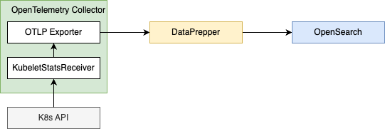
When this setup is complete, OpenSearch will contain many metrics available for analysis. See the kubeletstats documentation for information about the metrics and metadata emitted by the Kubelet Stats Receiver.
Hint: If you are a service provider for development teams, this setup can be automated and transparent to your users. Within SAP BTP, this is achieved by the Kyma Telemetry module in connection with SAP Cloud Logging. It is this solution that forms the foundation of this blog post.
OpenTelemetry metrics data model
OTel uses a well-documented Metrics Data Model. The linked article provides information about the various supported metric types. We will take a less thorough approach and inspect example points to collect the necessary information. With our example setup, we can find data points similar to those in this (shortened) example:
{
  "_source": {
    "name": "container.cpu.time",
    "description": "Total cumulative CPU time (sum of all cores) spent by the container/pod/node since its creation",
    "value": 120.353905,
    "flags": 0,
    "unit": "s",
    "startTime": "2024-04-10T06:49:56Z",
    "time": "2024-05-03T07:50:22.197391185Z",
    "kind": "SUM",
    "aggregationTemporality": "AGGREGATION_TEMPORALITY_CUMULATIVE",
    "isMonotonic": true,
    "serviceName": "otel-emailservice",
    "instrumentationScope.name": "otelcol/kubeletstatsreceiver",
    "instrumentationScope.version": "0.97.0",
    "resource.attributes.k8s@namespace@name": "example",
    "resource.attributes.k8s@deployment@name": "otel-emailservice",
    "resource.attributes.k8s@pod@name": "otel-emailservice-7795877686-r2lrt",
    "resource.attributes.k8s@container@name": "emailservice",
    "resource.attributes.service@name": "otel-emailservice"
  }
}
We can see that OTel separates metrics by the name. Each point contains the generic value and time, which form the basic time series for the visualizations. This schema is a at first glance suboptimal for OpenSearch, where having a field with key name and a value containing the numerical value is more easily accessible. For our example, this would look like { "container.cpu.time": 120.353905}. However, if we ingest a lot of different metrics, we may reach the field limit of 1,000 per index fairly quickly.
There is additional information about the kind that introduces semantics to the time series. This example uses a SUM (a counter), which is monotonic. The AGGREGATION_TEMPORALITY_CUMULATIVE tells us that the value will contain the current count started at startTime. The alternative AGGREGATION_TEMPORALITY_DELTA would contain only the difference between startTime and time with non-overlapping intervals. We need to take these semantics into account, for example, if we want to visualize rate of change.
Finally, there are additional metadata fields that we can use to slice our data by different dimensions. There are three different groups:
- Resource attributes describe the metric source. You can see the K8s coordinates in the example.
- Metric attributes describe particular aspects of the metric. There is no such attribute in our example, but you can think of memory pools as working similarly.
- Instrumentation scope describes the method of metrics acquisition. In our case, this is the Kubelet Stats Receiver of the OpenTelemetry Collector.
Note that the attributes contain a lot of @ characters. In the OpenTelemetry semantic conventions that specify attributes and metric names, there are dots “.” instead. Because OpenSearch treats those dots as nested fields, Data Prepper applies this . to @ mapping to avoid conflicts.
Hint: If you want to manipulate OTel data with Piped Processing Language (PPL) in OpenSearch, you need to use backticks around field names containing the @ symbol.
Now we have everything we need to create our first visualizations: We need to access the value over time selected by name. Additional dimensions come from the attributes.
Discover: Inspecting the raw data and saved searches
Now that we know what data model to expect, we can investigate the metrics using the Discover plugin. The following screenshot shows metrics for the OpenTelemetry Demo collected using our example setup.
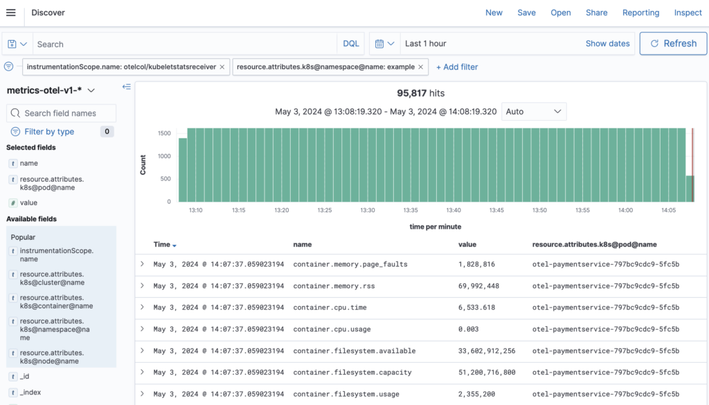
Note the filtering by instrumentation scope and K8s namespace.
We can use the Discover plugin to develop Dashboards Query Language (DQL) expressions for data filtering, such as name:k8s.pod.cpu.time, or create saved searches. Both will be used for visualizations.
One of the main benefits of Discover is easy access to metric attributes. The plugin provides discovery of present attributes and their potential values.
Visualizations with TSVB
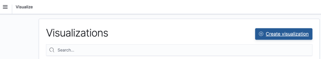
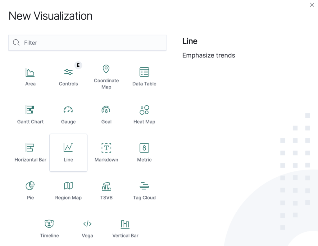
The Time-Series Visual Builder (TSVB) offers a class of visualizations specifically for time-series data, which will work very well for the metrics we want to analyze. We start at the Visualize plugin.
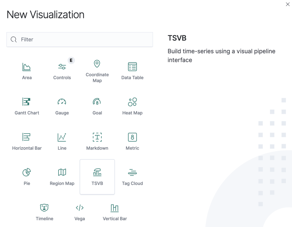
We create a new visualization and choose TSVB.
As a first step, we navigate to Panel options below the graph.
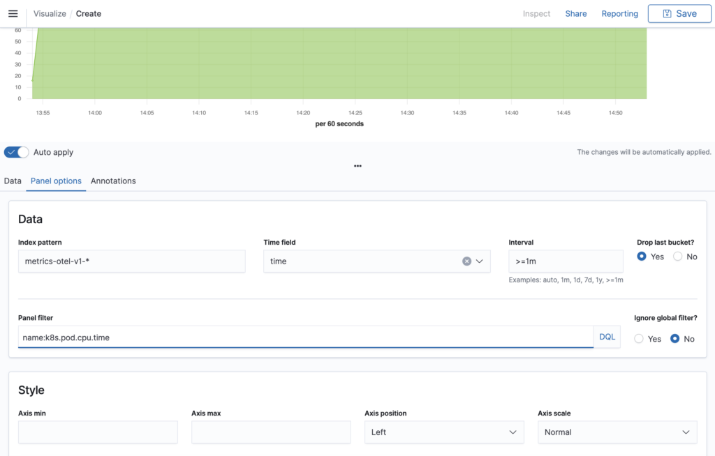
We select:
- Our example index pattern
metrics-otel-v1-* - The time field
timefrom the Data Prepper/OTel data model - An interval of at least 1 minute
- The panel filter DQL expression
name:k8s.pod.cpu.timewe explored with Discover
The index pattern might be different in your configuration. Use the same pattern as in Discover.
The minimum interval is important for shorter search intervals. TSVB will calculate the interval length automatically and only connect points between adjacent intervals. If there are intervals without values, the dots will not be connected.
Choosing the panel filter name:k8s.pod.cpu.time filters the metrics for the Pod CPU time. This is the metric we want to visualize first.
We now switch back to the Data tab.
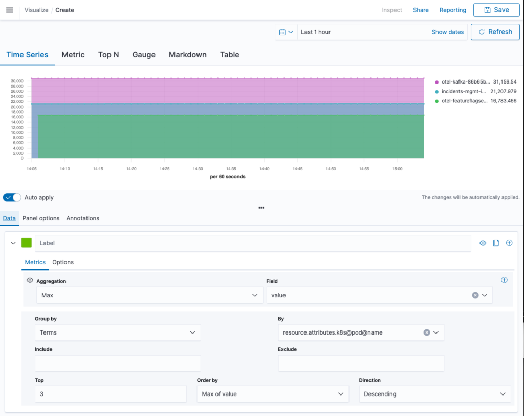
Here we will configure the data that we want to visualize. We start by selecting aggregation Max of field value. This aligns well with the cumulative aggregation temporality. In each interval the maximum (last) CPU time is placed as a dot on the diagram. We group by a Terms aggregation on the K8s pod name to get the CPU times per pod. To avoid overcrowding of our graph, we select Top 3 ordered by “Max of value” in descending direction. This provides us with a timeline of CPU time by the top 3 pods.
If we were visualizing a metric of kind gauge, this would be it. However, with our sum, there is more to be done. The graph looks fine, but the arbitrary startTime differing between the pods makes the values hard to compare. In the next step we calculate the rate of our sum, as shown in the next image.
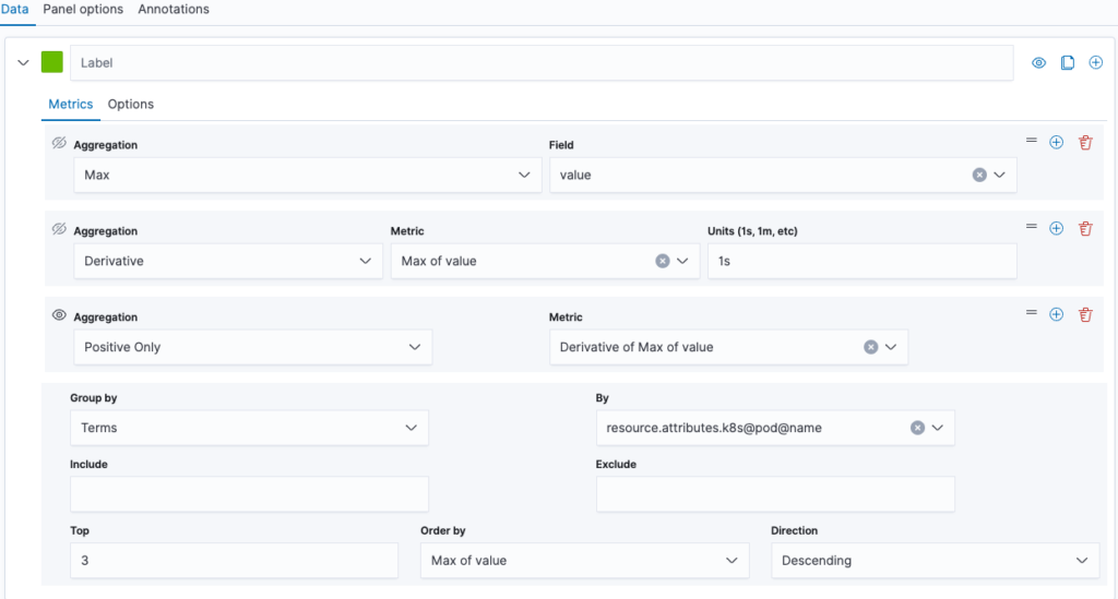
We extend the aggregations by a derivative with unit 1s. This calculates the share of time spent by the CPU on that pod. We add another aggregation to filter for positive values only. This suppresses artifacts from pod restarts.
Note that as a shortcut, you can replace the original Max aggregation with Positive Rate. However, this comes at a cost to the ordering. On the bottom line of the screenshot, you can see that we can only sort by the max of value. This is the best we can do. If we used Positive Rate, even that option would become unviable.
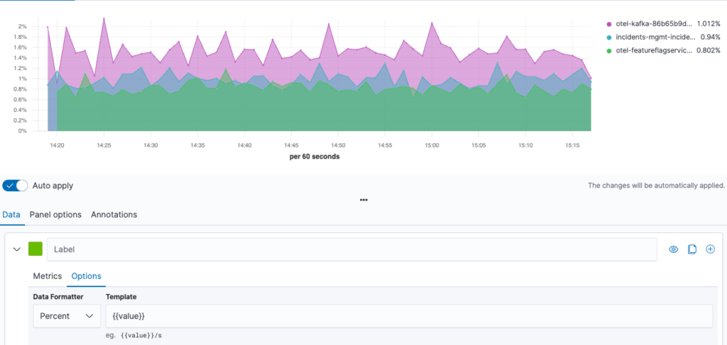
We can improve the graph by choosing percent as the Data Formatter under the Options tab. This provides a nice view of the CPU utilization history by pod, as shown in the following image.
We can re-aggregate this timeline data by a cumulative sum. This yields the CPU time spent during the selected interval. Let’s also switch the graph type to Top N to get the visualization in the following image.
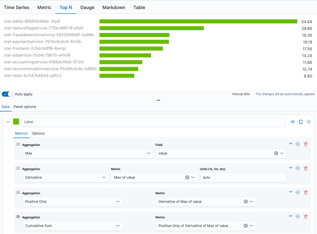
Now we have an ordered bar chart of our top 10 pods (we need to adjust the number of items in the group by options).
We have now created two different visualizations of pod CPU utilization. We can save our visualizations at any point in time and add them to dashboards, that combine multiple visualizations. TSVB allows you to configure whether global filters should be respected or not. This allows you to embed the visualizations into larger scenarios sharing filters. There are many more features in TSVB that allow for the creation of more elaborate graphs. Highlights of TSVB are its relatively easy access to time-series visualization and its graph adjustment options, especially the option to adjust the data formatter.
Standard visualizations
We will now take a look at the standard visualizations offered by OpenSearch Dashboards. Compared to TSVB, these visualizations are a little more elaborate to build. However, they allow the creation of filters that can be applied to the entire dashboard instead of only to the current visualization. This makes them ideal as selectors.
A data table for K8s namespaces
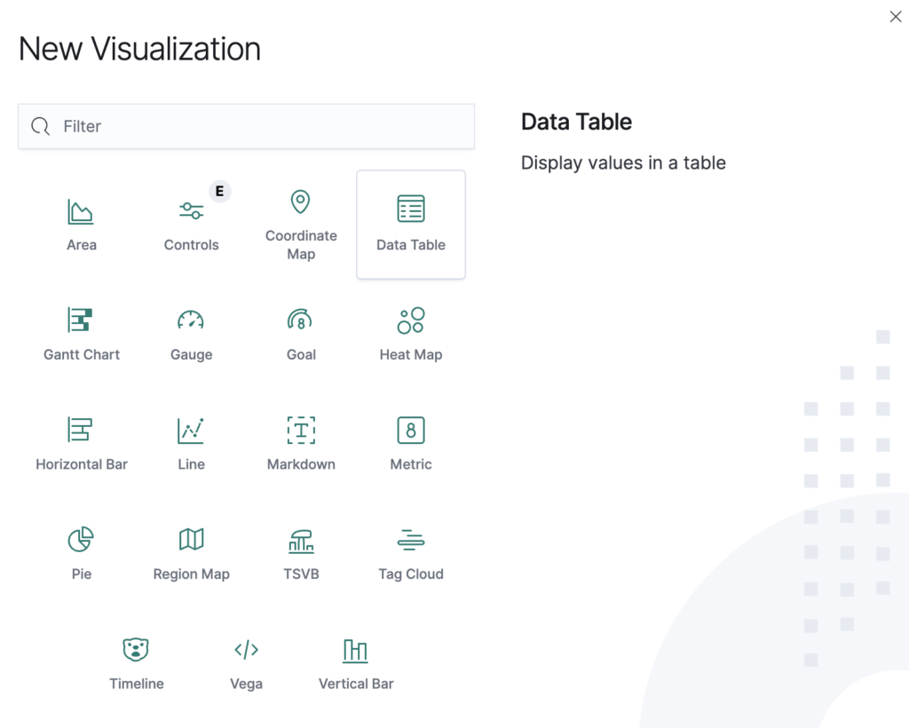
We start with a data table showing us the number of pods and containers by namespace. For this, we create a new visualization and choose Data Table.
We are asked to select the index or saved search as the data source. For our table, we can use the entire OTel metrics index. Let’s take a look at the finished table in the following image and then walk through the steps required to generate it.
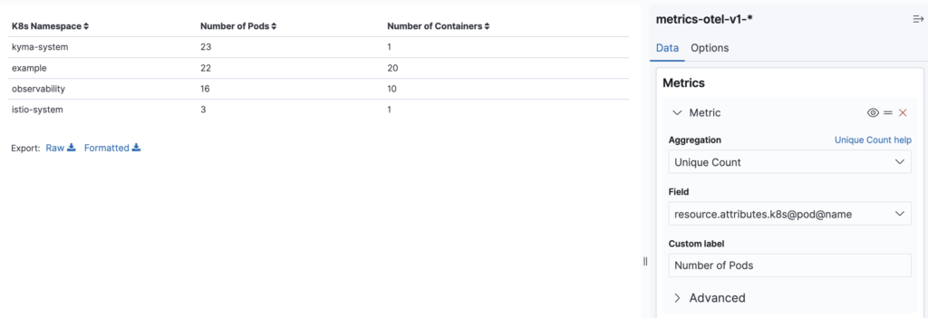
Each table row lists the number of pods and containers. Note that in the example, the kyma-system namespace consists of 23 pods all running just one Istio container. This explains the lower number of unique containers compared to the number of pods.
On the right, we can see how the number of pods is calculated: It is the unique count of values in field resource.attributes.k8s@pod@name, which contains the pod name. We could have used the pod ID as well, but pod names contain a unique suffix, so this is semantically identical. Note that the pod name is filled in by the Kubelet Stats Receiver as resource attribute.
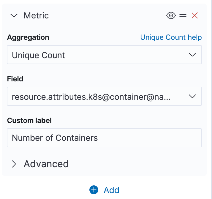
The container count can be added by selecting the plus sign button with a very similar configuration.
Note that providing custom labels produces nicer table headings. Any changes to our configuration are not applied automatically. Use the Update button on the bottom right to sync the visualization.
We still need to provide separate lines per namespace. This is achieved with a bucket aggregation, as shown in the following image.
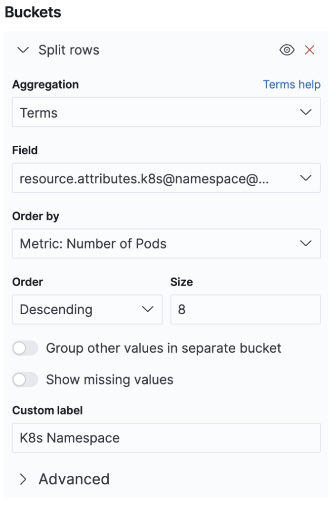
We choose *+split rows** and a Terms aggregation for field resource.attributes.k8s@namespace@name and order our table by the number of pods. We could also choose the number of containers or any of the other metrics we defined above, and there is also the option to use a completely separate metric.
We can also select the number of entries that we want to retrieve maximally. The Options tab allows us to paginate this result by specifying the number of rows per page, and we can also select a total function on the same tab. But in our case, only summing the number of pods will provide a correct number. The container count might double count containers that appear in different namespaces, so this option was left unchecked.
On the Data tab, we could also opt to create a missing values bucket. This may somewhat reduce query performance. We can always check the query performance with the inspect dialog by looking at the Requests and Response tabs.
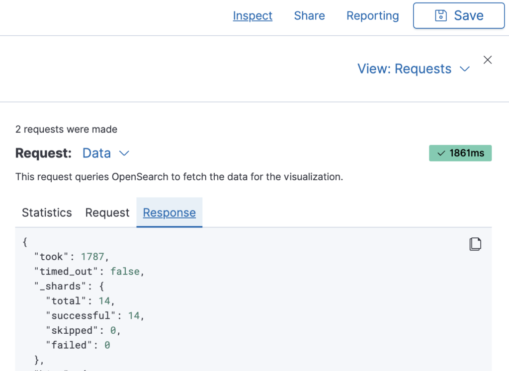
The value reported as "took": 1787 indicates a latency of 1787 ms. We can always use this feature to analyze the impact of different aggregations and metric configurations on the query runtime. This can be very helpful for complicated visualizations.
One of the main benefits of standard visualizations is that they allow you to create global filters. In our table, the first column allows filtering on a specific namespace (plus sign) or excluding it (minus sign).
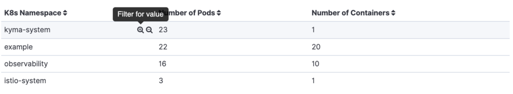
Selecting either icon will create the corresponding filter and reload the entire dashboard. This makes the data tables good candidates for providing selectors by different dimensions. The metrics can help users make decisions about what data to focus on. In our example, we provide a general overview of the size and variety of a namespace.
A line chart for timelines
We will now push the standard line chart to its limits by trying to recreate the earlier TSVB visualization of the Pod CPU time. Actually, we will go a little beyond that and attempt to visualize the container CPU time for each pod.
For our data table we created in the last subsection, we used an index pattern. This time, we will create a proper saved search in the Discovery plugin. We need to filter our OTel metrics index by the metric name container.cpu.time.
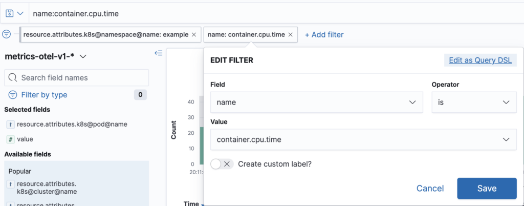
This screenshot shows both possibilities: Either use DQL in the search input or create the equivalent filter. Our example contains an additional filter for the namespace to show the possibility of adding additional filters. We save our search, so that we can reference it, when we create our line chart. The major benefit of this approach is that we can refine our saved search during the creation of our visualization.
We now need to provide several configurations. Let’s start with the x-axis, which needs to be a date histogram. This divides the time interval selected on the upper right of the screen into time buckets.
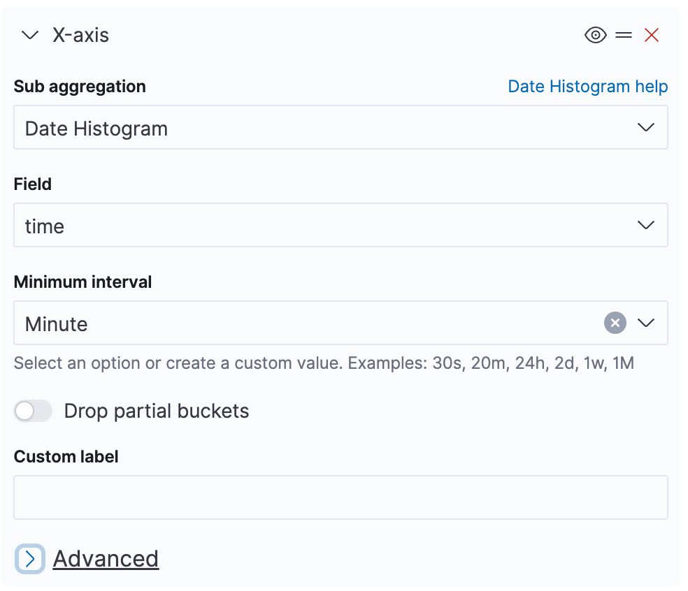
The default time field for OTel metrics is time. The minimum bucket length needs to be at least the reporting interval in order to avoid empty buckets. The actual length will be selected from the chosen interval.
We can now configure our y-axis.
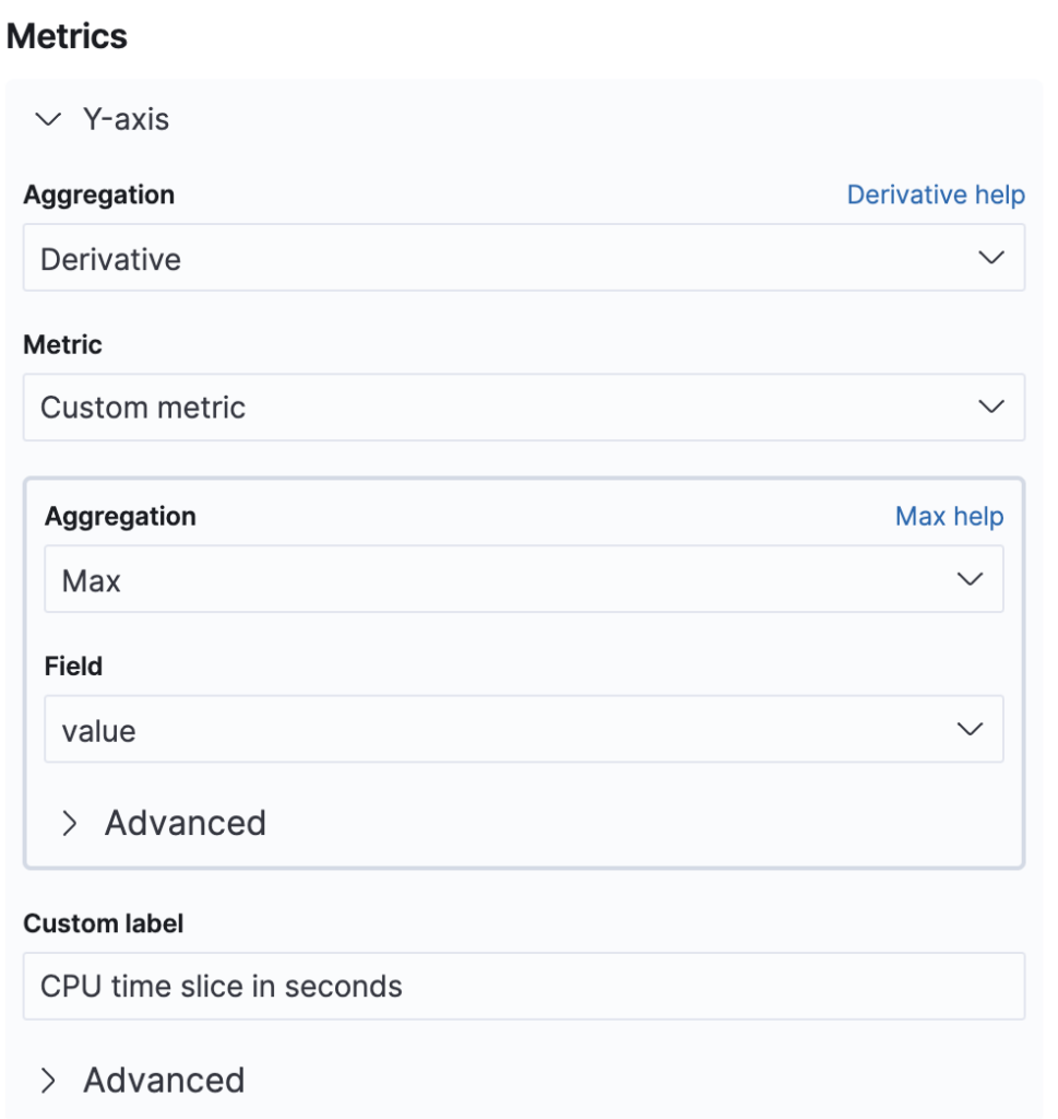
We want to use the derivative of each interval. Because this is a parent aggregation, we need a time bucket aggregation as well. Here we use the maximum because the metric is a monotonically increasing counter.
In comparison with TSVB, we have no control over the derivation scale. This means that the derivative will be dependent on the interval length. This is why we did not give the x-axis a custom label—so that it will print the interval length. This is the first limitation of the standard line chart that we encounter.
Note that configuring the date histogram on the x-axis is required for using the derivative aggregation.
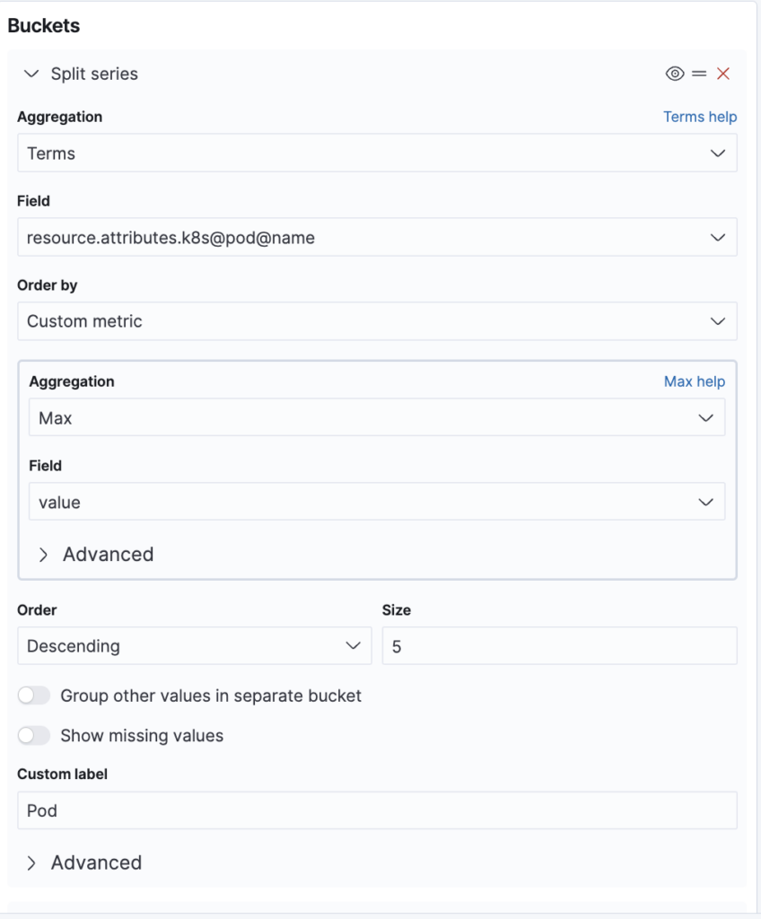
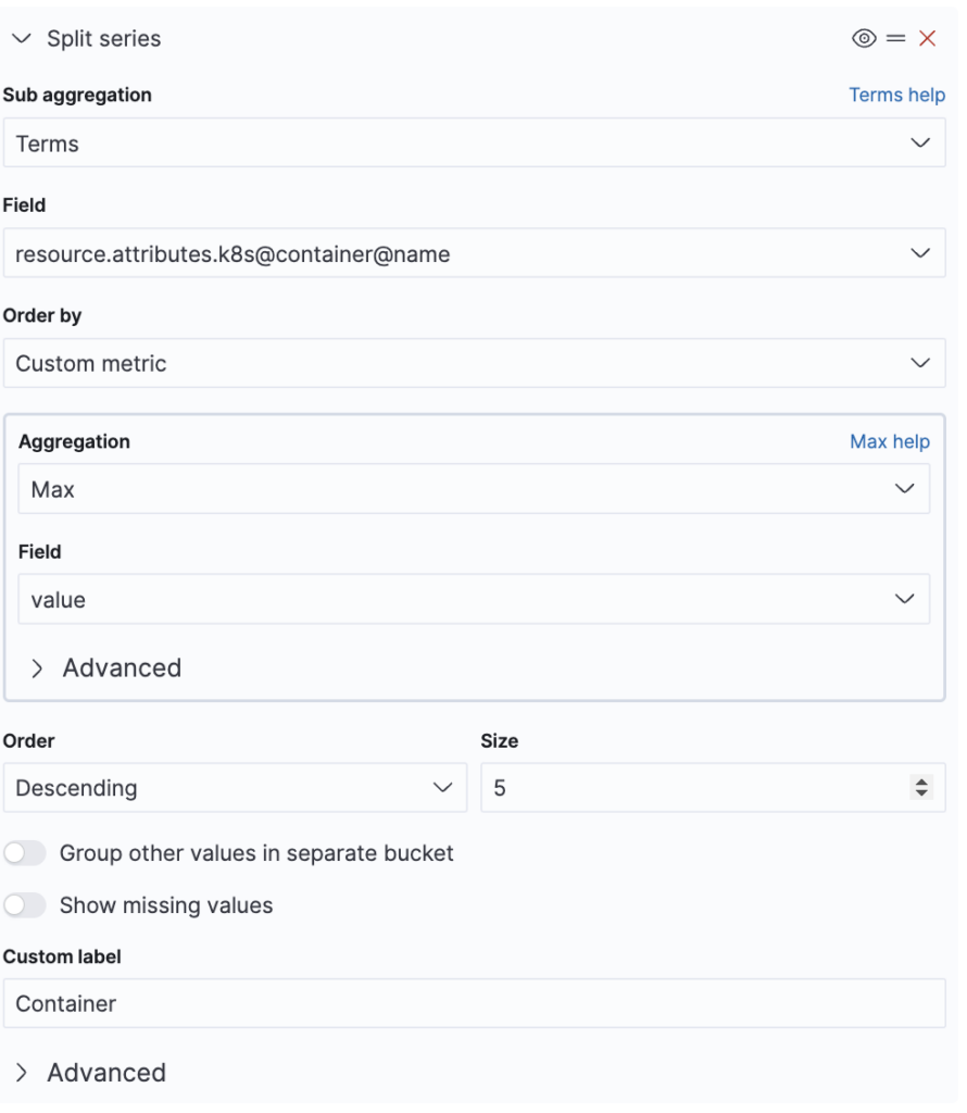
As a finishing touch, we will now split our data series by K8s pod name and K8s container name. This is something we could not do in TSVB, which only supported grouping by one field. We start with the pod name, as shown in the following image.
Note that for ordering, we are again restricted to the max aggregation. We cannot sort by the derivative well, just as with TSVB. After the pod, we split again by container name, as shown in the following image.
When you add the “split series” configuration, OpenSearch Dashboards notify you that the date histogram needs to be the last visualization. You can rearrange the bucket aggregations by dragging and dropping them on the = icon.
With all that configuration done, we select the Update button to inspect the graph.
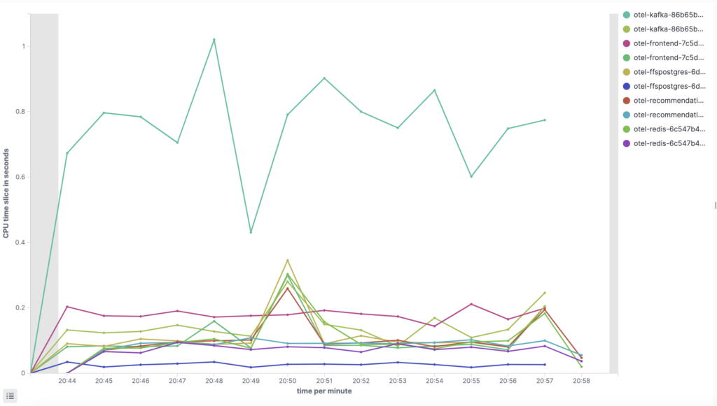
We get a line showing the CPU time used by time interval for each container. The labels consist of the pod name first and the container name second. We can control this ordering by changing the order of our aggregations. Similarly to TSVB, we have a problem distinguishing long labels in the legend. This does not improve even if we move the legend to the bottom of the screen with the panel options.
If we hover over a data point, we get additional information.
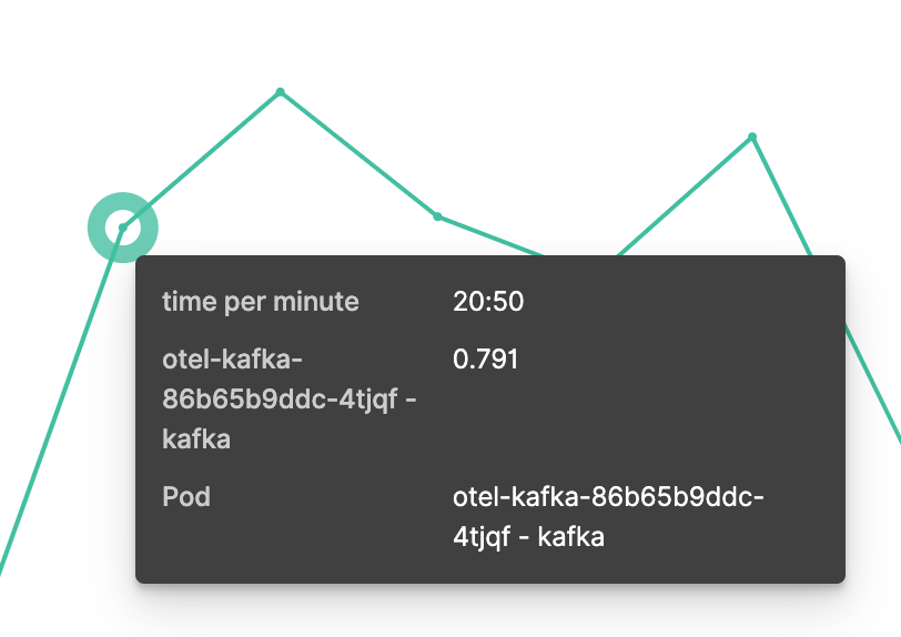
We can see the timestamp and CPU time used. The labels for pod and container names are presented but are hard to recognize. This is caused by the double aggregation, and using only pod names would have been a much better choice. An alternative approach would be to use split series for container names and split chart for pod names.
Selecting a data point brings up a filter creation dialog.
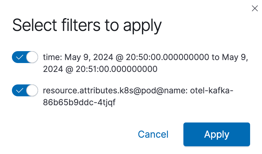
We can use these options to slice our data. These filters are applied across the entire dashboard.
We have pushed our timeline visualization to the limits of what standard charts can support. This gives us a good understanding of its capabilities. The visualization has its benefits in terms of creating filters and grouping by multiple attributes, but TSVB offers easier options for formatting data.
Outlook: Vega
We have explored how to set up and present OTel metrics using TSVB and standard visualizations. Both approaches allow the creation of useful charts that provide powerful insights, but they also present some limitations. To overcome those limitations, OpenSearch Dashboards offers Vega as another powerful visualization tool. Vega lets you use any OpenSearch query and provides a grammar for transforming and visualizing the data with D3.js. It allows you to access global filters and the time interval selector to create well-integrated exploration and analysis journeys in OpenSearch.
Vega may have a steeper learning curve, and explaining Vega visualizations would warrant a separate blog post. See Vega Visualizations for a short introduction and to get further inspiration.