You're viewing version 2.10 of the OpenSearch documentation. This version is no longer maintained. For the latest version, see the current documentation. For information about OpenSearch version maintenance, see Release Schedule and Maintenance Policy.
PerfTop dashboards
Dashboards are defined in JSON and composed of three main elements: tables, line graphs, and bar graphs. You define a grid of rows and columns and then place elements within that grid, with each element spanning as many rows and columns as you specify.
The best way to get started with building custom dashboards is to duplicate and modify one of the existing JSON files in the dashboards directory.
Table of contents
Summary of elements
- Tables show metrics per dimension. For example, if your metric is
CPU_Utilizationand your dimensionShardID, a PerfTop table shows a row for each shard on each node. - Bar graphs are aggregated for the cluster, unless you add
nodeNameto the dashboard. See the options for all elements. - Line graphs are aggregated for each node. Each line represents a node.
Position elements
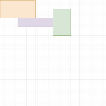
PerfTop positions elements within a grid. For example, consider this 12 * 12 grid.

The upper-left of the grid represents row 0, column 0, so the starting positions for the three boxes are:
- Orange: row 0, column 0
- Purple: row 2, column 2
- Green: row 1, column 6
These boxes span a number of rows and columns. In this case:
- Orange: 2 rows, 4 columns
- Purple: 1 row, 4 columns
- Green: 3 rows, 2 columns
In JSON form, we have the following:
{
  "gridOptions": {
    "rows": 12,
    "cols": 12
  },
  "graphs": {
    "tables": [{
        "options": {
          "gridPosition": {
            "row": 0,
            "col": 0,
            "rowSpan": 2,
            "colSpan": 4
          }
        }
      },
      {
        "options": {
          "gridPosition": {
            "row": 2,
            "col": 2,
            "rowSpan": 1,
            "colSpan": 4
          }
        }
      },
      {
        "options": {
          "gridPosition": {
            "row": 1,
            "col": 6,
            "rowSpan": 3,
            "colSpan": 2
          }
        }
      }
    ]
  }
}
At this point, however, all the JSON does is define the size and position of three tables. To fill elements with data, you specify a query.
Add queries
Queries use the same elements as the REST API, just in JSON form:
{
  "queryParams": {
    "metrics": "estimated,limitConfigured",
    "aggregates": "avg,avg",
    "dimensions": "type",
    "sortBy": "estimated"
  }
}
For details on available metrics, see Metrics reference.
Add options
Options include labels, colors, and a refresh interval. Different elements types have different options.
Dashboards support the 16 ANSI colors: black, red, green, yellow, blue, magenta, cyan, and white. For the “bright” variants of these colors, use the numbers 8–15. If your terminal supports 256 colors, you can also use hex codes (e.g. #6D40ED).
All elements
| Option | Type | Description |
|---|---|---|
label | String or integer | The text in the upper-left corner of the box. |
labelColor | String or integer | The color of the label. |
refreshInterval | Integer | The number of milliseconds between calls to the Performance Analyzer API for new data. Minimum value is 5000. |
dimensionFilters | String array | The dimension value to display for the graph. For example, if you query for metric=Net_Throughput&agg=sum&dim=Direction and the possible dimension values are in and out, you can define dimensionFilters: ["in"] to only display the metric data for in dimension |
nodeName | String | If non-null, lets you restrict elements to individual nodes. You can specify the node name directly in the dashboard file, but the better approach is to use "nodeName": "#nodeName" in the dashboard and include the --nodename <node_name> argument when starting PerfTop. |
Tables
| Option | Type | Description |
|---|---|---|
bg | String or integer | The background color. |
fg | String or integer | The text color. |
selectedFg | String or integer | The text color for focused text. |
selectedBg | String or integer | The background color for focused text. |
columnSpacing | Integer | The amount of space (measured in characters) between columns. |
keys | Boolean | Has no impact at this time. |
Bars
| Option | Type | Description |
|---|---|---|
barWidth | Integer | The width of each bar (measured in characters) in the graph. |
xOffset | Integer | The amount of space (measured in characters) between the y-axis and the first bar in the graph. |
maxHeight | Integer | The maximum height of each bar (measured in characters) in the graph. |
Lines
| Option | Type | Description |
|---|---|---|
showNthLabel | Integer | Which of the xAxis labels to show. For example, "showNthLabel": 2 shows every other label. |
showLegend | Boolean | Whether or not to display a legend for the line graph. |
legend.width | Integer | The width of the legend (measured in characters) in the graph. |
xAxis | String array | Array of labels for the x-axis. For example, ["0:00", "0:10", "0:20", "0:30", "0:40", "0:50"]. |
colors | String array | Array of line colors to choose from. For example, ["magenta", "cyan"]. If you don’t provide this value, PerfTop chooses random colors for each line. |