OpenSearch 2.5 introduced new multilayer maps for visualizing geographical data. Displaying multiple layers on a map lets you show data from different sources at different zoom levels. Let’s say you’re building a real estate application. Suppose you have one index with the number of houses available at the county level, another index with the number of houses available at the city level, and a third index with detailed information about individual houses. Initially, you may want to show the user a map with county boundaries and data. As the user zooms in, you’ll show city boundaries and data. As the user zooms in even more, you’ll display each house with information like the price, number of bedrooms, and so on. With the new multilayer maps, you can build various data layers from different data sources to accomplish this task.
Multilayer maps let you:
- Add multiple layers to visualize your data.
- View or analyze geographical data that comes from different data sources.
- View different data at different zoom levels.
- Visualize additional data with tooltips.
- Continuously refresh data for a real-time dataset.
Additionally, in OpenSearch 2.6, you can add multilayer maps to dashboard panels within OpenSearch Dashboards, which makes it easier to analyze your geospatial data in the context of other visualizations.
Getting started
To get started, try out the new maps on the OpenSearch Playground, which is currently on version 2.6 and includes all the latest features.
To explore a prebuilt example map, perform the following steps:
- On the top menu, go to OpenSearch Plugins > Maps.
- Select [Flights] Flights Status on Maps Destination Location.
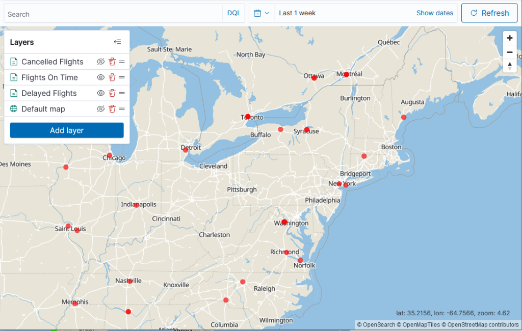
You’ll see the following example map that is based on the Sample flight data dataset.
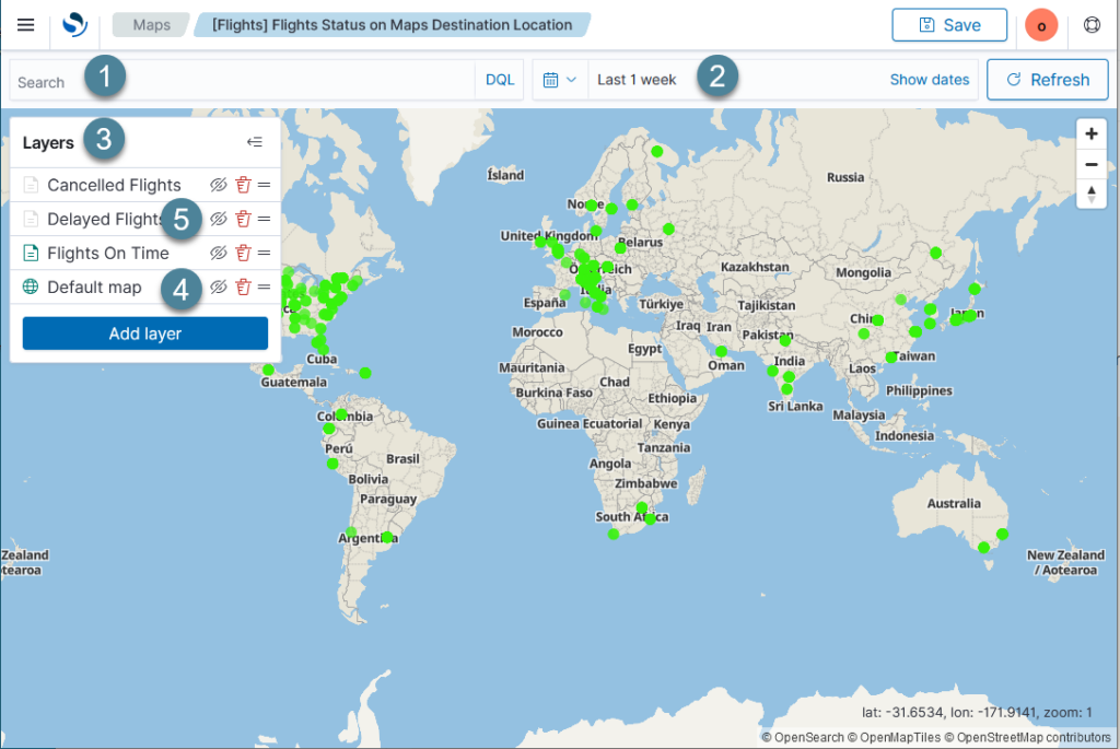
Let’s get familiar with the map’s components:
- The search bar (1) lets you search or filter the data that is displayed.
- The time filter (2) lets you customize the date range for displayed data.
- The Layers panel (3) shows the layers configured for this map. The example map consists of a basemap called Default map (4) and three additional document layers: Cancelled Flights, Delayed Flights, and Flights On Time (5).
All about that basemap
The basemap (Default map in the preceding image) serves as a canvas for the data. In this case, the basemap is the default map provided by OpenSearch (see the attribution in the lower-right corner of the map). The OpenSearch basemap is a vector tile map and therefore offers faster loading times and smoother zooming than a raster tile map. It supports zoom levels 0–22.
You can add more than one basemap or change the basemap to your own or a third-party map by adding a custom map layer. To add a custom basemap, in the Layers panel select Add layer and then select Custom map. For detailed instructions on configuring a custom map, see Adding a custom map.
Dressing your map in data layers
The map in the preceding image has three additional layers: Cancelled Flights, Delayed Flights, and Flights on Time. All three are document layers. To examine each layer, select the layer name from the Layers panel on the upper right of the map.
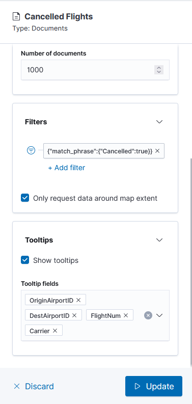
For example, if you select the Cancelled Flights layer, you’ll see the layer’s configuration, as shown in the following image.
From the settings panel, explore the following tabs:
- The Data tab provides information about the data settings for the layer, for example:
- The layer is based on the
opensearch_dashboards_sample_data_flightsdata source.The number of documents in the layer is limited to 1,000.The layer displays theDestLocationfield with the following filter applied:
- The layer is based on the
 {
 "query": {
     "match_phrase": {
     "Cancelled": true
     }
 }
 }
To apply a different filter, select Add filter and then edit the filter in the UI or select Edit as Query DSL.
- The Style tab indicates how the layer is displayed on the map, for example:
- The data points for the layer are displayed in red.
- The Settings tab contains other settings, for example:
- The layer is visible at zoom levels 4–22.
- The layer’s opacity is 70%.
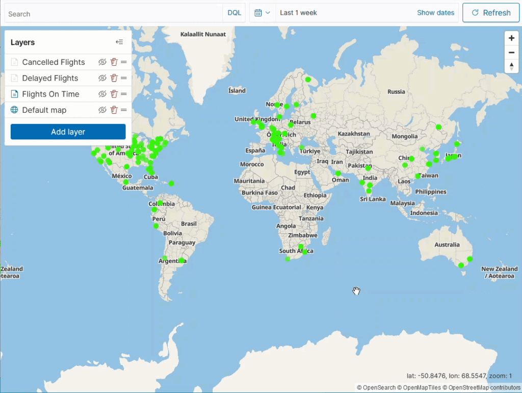
It’s an illusion: The disappearing dots
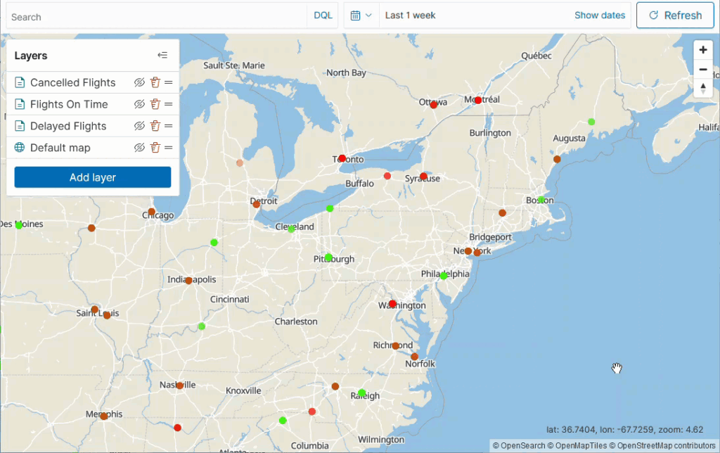
You might have one question at this point: “Where are the red dots that signify cancelled flights?”
In fact, in the example map all the dots are green. Are no flights cancelled? The answer: You have to look closer.
The Cancelled Flights layer is visible only at zoom levels 4–22, so you’ll have to zoom in to see the cancelled flight data points, as shown in the following image.
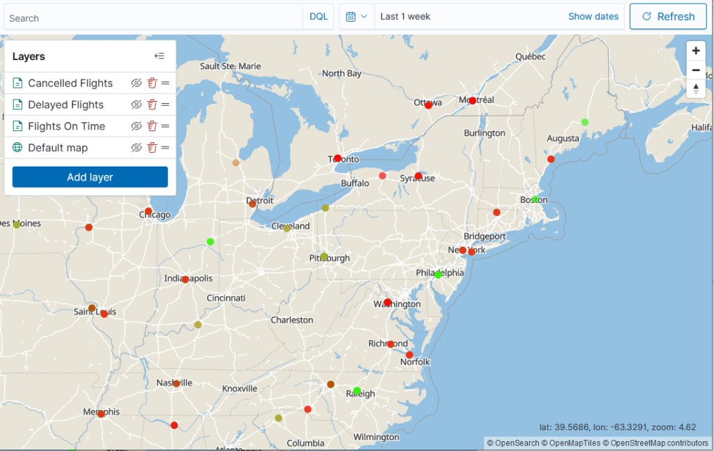
Another question that you might have is, “Why are there only three document layers, but the dots on the map come in more than three colors?”
The answer to this question lies in the opacity and the order of the layers.
If you examine the colors for all three document layers by selecting each one in turn, you will map the layers to the following colors:
- Cancelled Flights: Red
- Delayed Flights: Orange
- Flights On Time: Green
However, all layers are set to 70% opacity so that if one data point coincides with another, you’ll see a nice blend of the preceding colors.
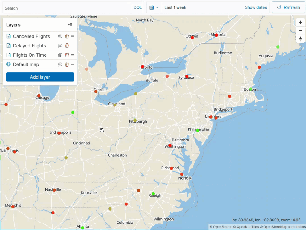
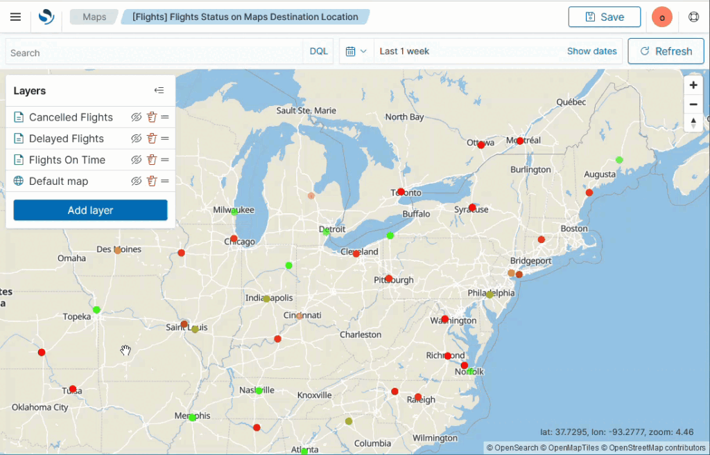
Moreover, try reordering the layers by dragging them by the handlebar (two horizontal lines) next to the layer names. You will see the data points change color, as shown in the following image.
To view only the Cancelled Flights layer, in the Layers panel, hide the Delayed Flights and Flights On Time by selecting the crossed-out eye icon next to the layer name. Now you see only the red dots that correspond to the Cancelled Flights layer, as shown in the following image.
Tooltips are appreciated
The red data points alone don’t convey much information about your dataset. In this case, a tooltip can be worth a thousand words. The Cancelled Flights layer has tooltips configured, so if you hover over a city, you will see the information for the first cancelled flight. For example, hovering over Washington, D.C., lets you see that it had four cancelled flights. To view the information for all cancelled flights, select the tooltip again and use the arrows in the tooltip to paginate through the flights.
To add, remove, or change fields that are shown in the tooltip, in the Cancelled Flights pane, select the Data tab. Then add or delete tooltip fields in Tooltip fields, as shown in the following image.
If multiple layers coincide in one city, the tooltip displays the information for all layers. If you reapply the Delayed Flights and Flights On Time layers, hover over Washington, D.C., once more, and select the tooltip, you’ll see that the tooltip now contains 13 flights. You can select the layer you’re interested in from the dropdown list in the tooltip. Each layer type may have different fields in the tooltip. For example, the Flights On Time layer is the only layer that displays the FlightTimeMin field. To see all layers, select All layers, as shown in the following image.
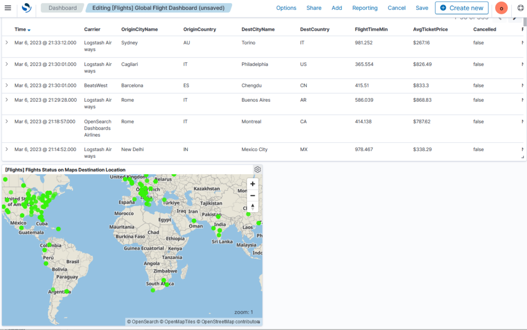
A dashing dashboard map
In OpenSearch Dashboards version 2.6, you can not only create a map but also add it to a dashboard. The caveat? You have to start from a dashboard, either new or existing.
To add the example map to a dashboard, perform the following steps, as shown in the following image.
- On the top menu, go to OpenSearch Dashboards > Dashboard.
- Select [Flights] Global Flight Dashboard.
- In the upper-right corner, select Edit.
- From the top menu, select Add.
- In the Types dropdown list, select Maps.
- Select [Flights] Flights Status on Maps Destination Location.
After closing the Add panels flyout, you’ll see the example map on the bottom of the dashboard, as shown in the following image.
What’s next?
After trying out the new maps on the OpenSearch Playground, make sure to download OpenSearch 2.6 locally to create maps from your dataset. For detailed information about map features, see Using maps in the OpenSearch documentation.
In the next OpenSearch version release, we’re planning to add the ability to draw boundaries on a map and a new type of layer (cluster layer) that will help you aggregate data on geopoints and geoshapes. For a full list of features planned for the upcoming release, see the OpenSearch Project Roadmap. If you have any feedback or suggestions, we’d love to hear from you on the OpenSearch community forum. To learn how you can contribute, see the dashboards-maps repo and the geospatial repo.