You're viewing version 2.15 of the OpenSearch documentation. This version is no longer maintained. For the latest version, see the current documentation. For information about OpenSearch version maintenance, see Release Schedule and Maintenance Policy.
Trace Analytics plugin for OpenSearch Dashboards
The Trace Analytics plugin offers at-a-glance visibility into application performance based on OpenTelemetry (OTel) protocol data that standardizes instrumentation for collecting telemetry data from cloud-native software.
Installing the plugin
See Standalone OpenSearch Dashboards plugin install for instructions on how to install the Trace Analytics plugin.
Setting up the OpenTelemetry Demo
The OpenTelemetry Demo with OpenSearch simulates a distributed application generating real-time telemetry data, providing you with a practical environment in which to explore features available with the Trace Analytics plugin before implementing it in your environment.
Step 1: Set up the OpenTelemetry Demo
- Clone the OpenTelemetry Demo with OpenSearch repository:
git clone https://github.com/opensearch-project/opentelemetry-demo. - Follow the Getting Started instructions to deploy the demo application using Docker, which runs multiple microservices generating telemetry data.
Step 2: Ingest telemetry data
- Configure the OTel collectors to send telemetry data (traces, metrics, logs) to your OpenSearch cluster, using the preexisting setup.
- Confirm that Data Prepper is set up to process the incoming data, handle trace analytics and service map pipelines, submit data to required indexes, and perform preaggregated calculations.
Step 3: Explore Trace Analytics in OpenSearch Dashboards
The Trace Analytics application includes two options: Services and Traces:
- Services lists all services in the application, plus an interactive map that shows how the various services connect to each other. In contrast to the dashboard (which helps identify problems by operation), the Service map helps you identify problems by service based on error rates and latency. To access this option, go to Trace Analytics > Services.
- Traces groups traces together by HTTP method and path so that you can see the average latency, error rate, and trends associated with a particular operation. For a more focused view, try filtering by trace group name. To access this option, go to Trace Analytics > Traces. From the Trace Groups panel, you can review the traces that comprise a trace group. From the Traces panel you can analyze individual traces for a detailed summary.
Step 4: Perform correlation analysis
- Select Services correlation to display connections between various telemetry signals. This allows you to navigate from the logical service level to the associated metrics and logs for that specific service.
Schema dependencies and assumptions
The plugin requires you to use Data Prepper to process and visualize OTel data and relies on the following Data Prepper pipelines for OTel correlations and service map calculations:
Standardized telemetry data
The plugin requires telemetry data to follow the OTel schema conventions, including the structure and naming of spans, traces, and metrics as specified by OTel, and to be implemented using the Simple Schema for Observability.
Service names and dependency map
For accurate service mapping and correlation analysis, adhere to the following guidelines:
- Service names must be unique and used consistently across application components.
- The
serviceNamefield must be populated using the Data Prepper pipeline. - Services must be ingested with predefined upstream and downstream dependencies to construct accurate service maps and understand service relationships.
Trace and span IDs
Traces and spans must have consistently generated and maintained unique identifiers across distributed systems to enable end-to-end tracing and accurate performance insights.
RED metrics adherence
The plugin expects metric data to include rate, error, and duration (RED) indicators for each service, either preaggregated using the Data Prepper pipeline or calculated dynamically based on spans. This allows you to effectively compute and display key performance indicators.
Correlation fields
Certain fields, such as serviceName, must be present to perform correlation analysis. These fields enable the plugin to link related telemetry data and provide a holistic view of service interactions and dependencies.
Correlation indexes
Navigating from the service dialog to its corresponding traces or logs requires the existence of correlating fields and that the target indexes (for example, logs) follow the specified naming conventions, as described at Simple Schema for Observability.
Trace analytics with OTel protocol analytics
Introduced 2.15
Trace analytics with OTel protocol analytics provide comprehensive insights into distributed systems. You can visualize and analyze the following assets:
- Service: The components of a distributed application. These components are significant logical terms used to measure and monitor the application’s building blocks in order to validate the system’s health.
- Traces: A visual representation of a request’s path across services into requests’ journeys across services, offering insights into latency and performance issues.
- RED metrics: Metrics for service health and performance, measured as requests per second (rate), failed requests (errors), and request processing time (duration).
Trace analytics visualizations
Services visualizations, such as a table or map, help you logically analyze service behavior and accuracy. The following visualizations can help you identify anomalies and errors:
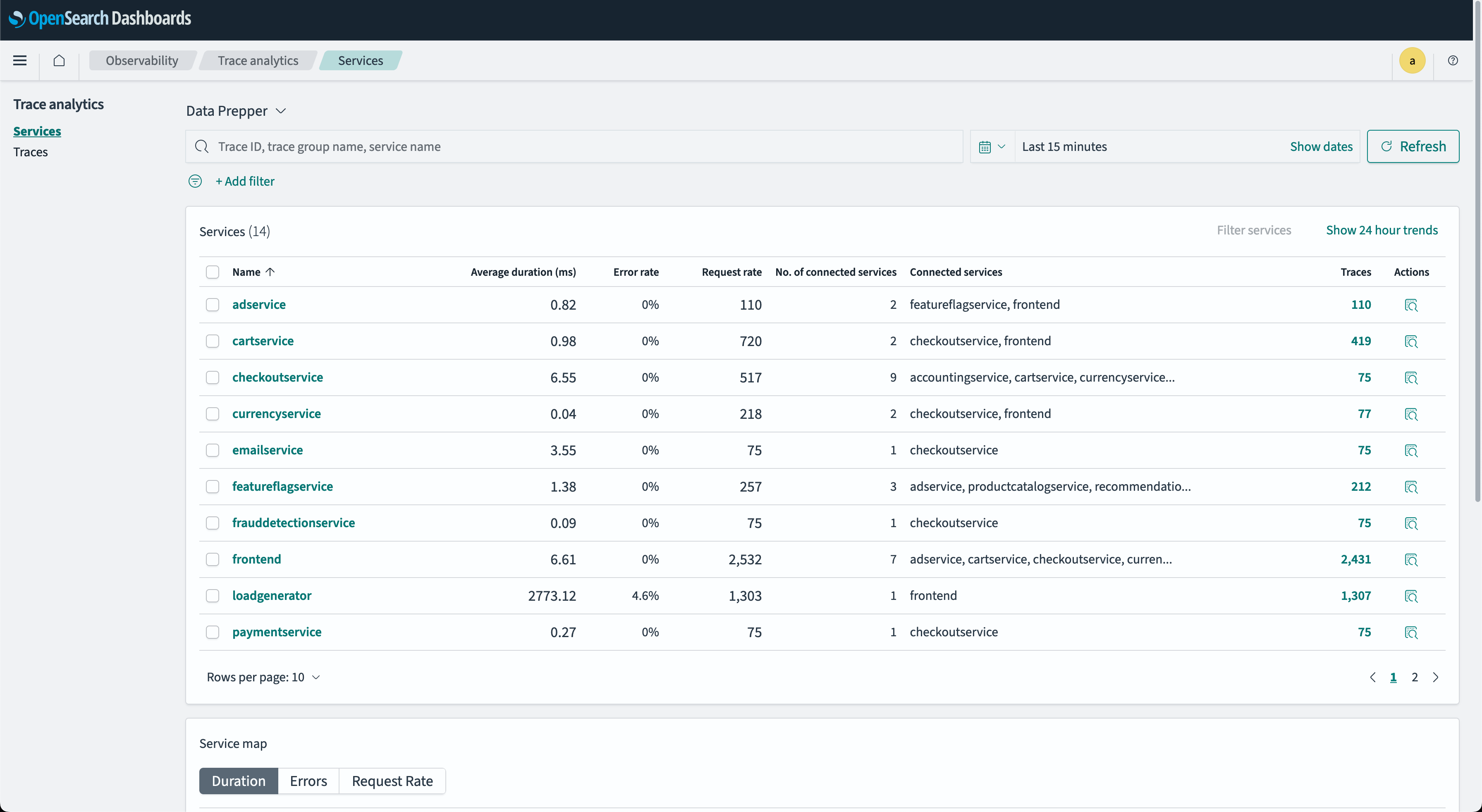
- Services table
- A RED indicator, along with connected upstream and downstream services and other actions, is indicated in each table column. An example Services table is shown in the following image.
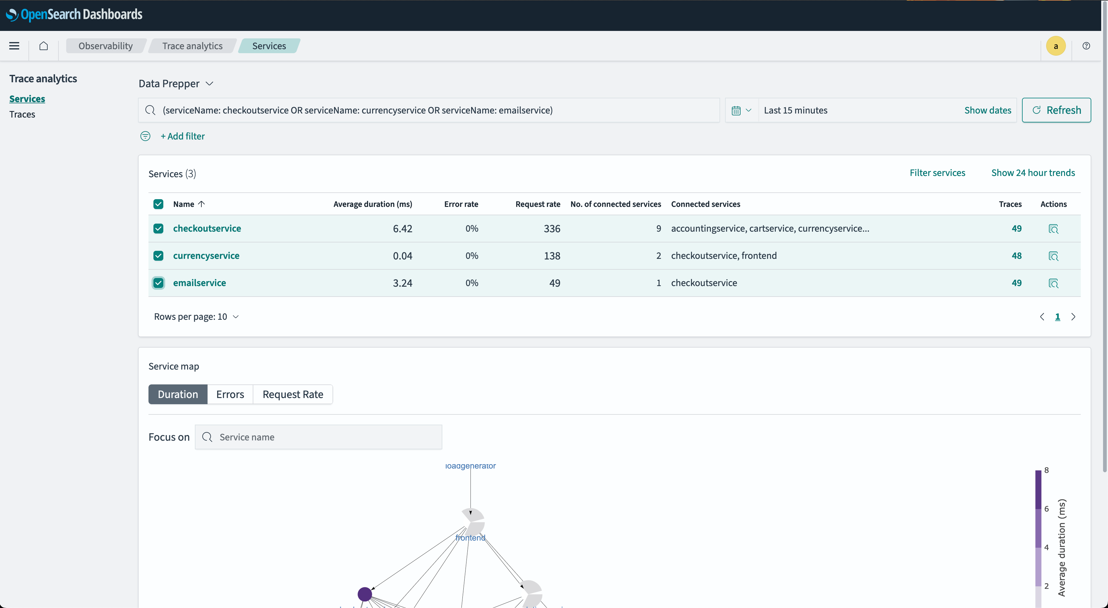
- General-purpose filter selection is used for field or filter composition. The following image shows this filter.
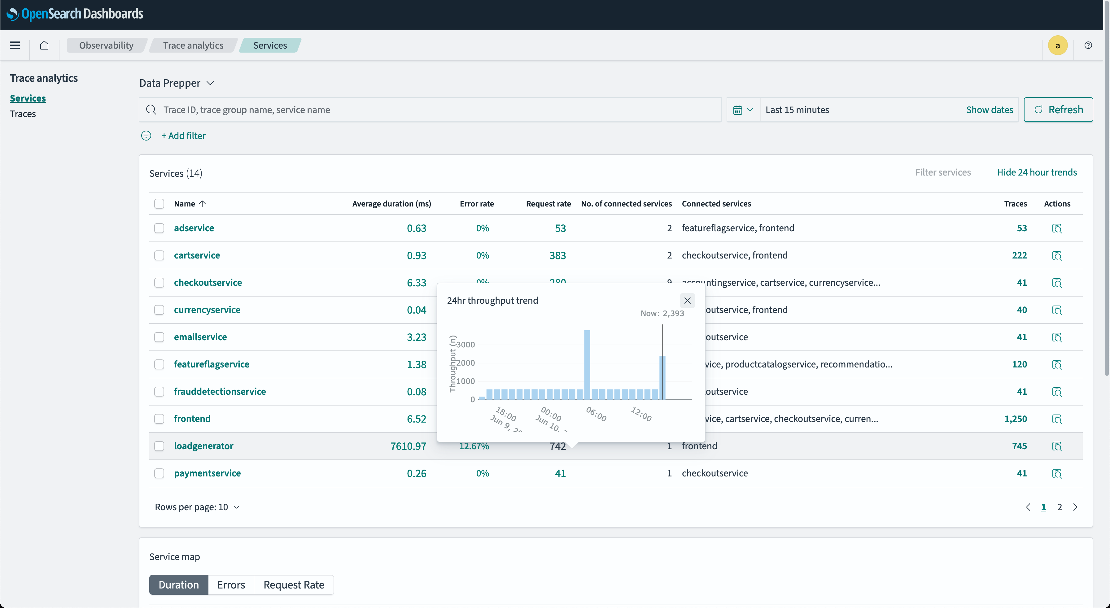
- The Services throughput tooltip provides an at-a-glance overview of a service’s incoming request trend for the past 24 hours. The following image shows an example tooltip.
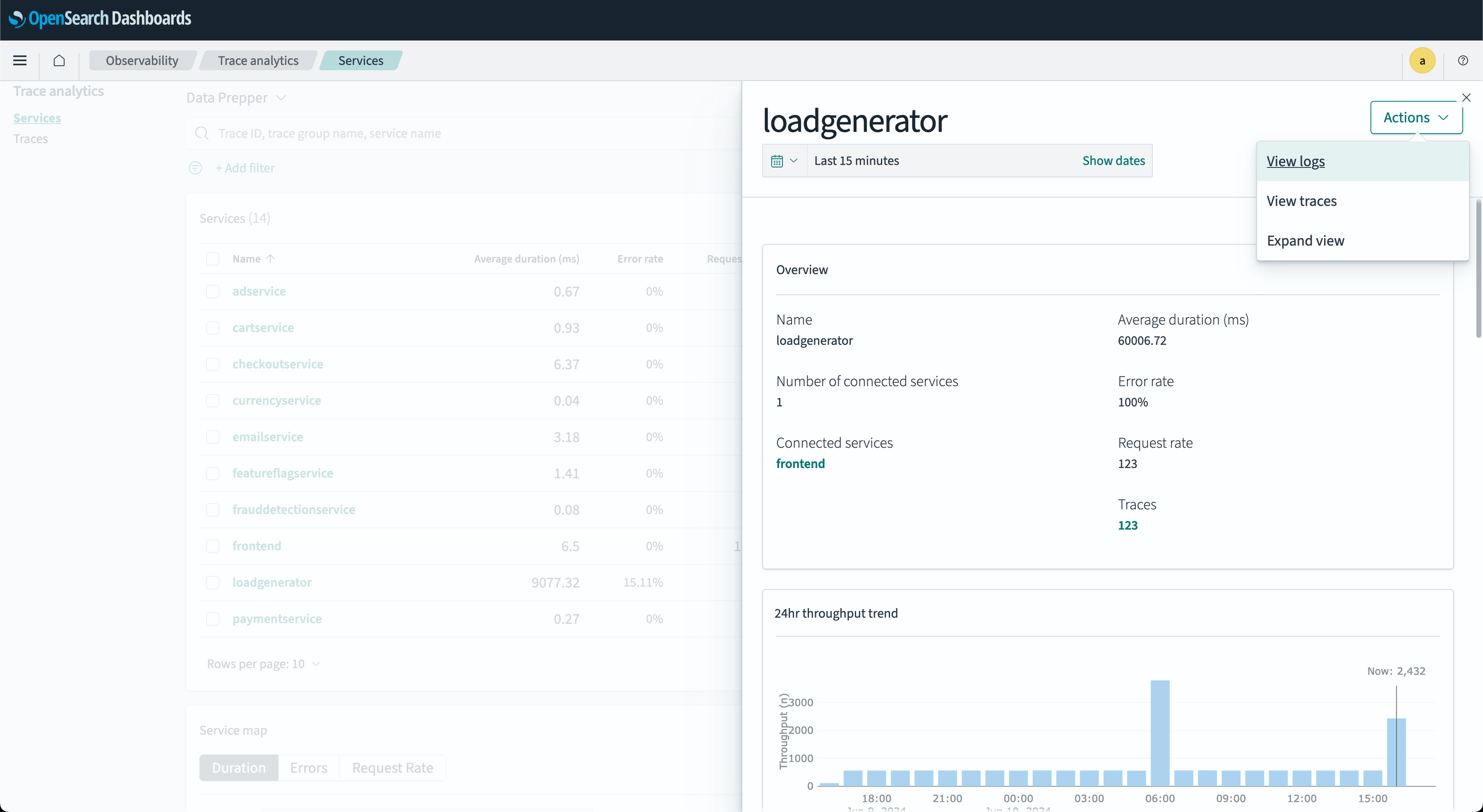
- The Services correlation dialog window provides an at-a-glance overview of a service’s details, including its 24-hour throughput trend. You can use these details to analyze correlated logs or traces by filtering based on the
serviceNamefield. The following image shows this window.
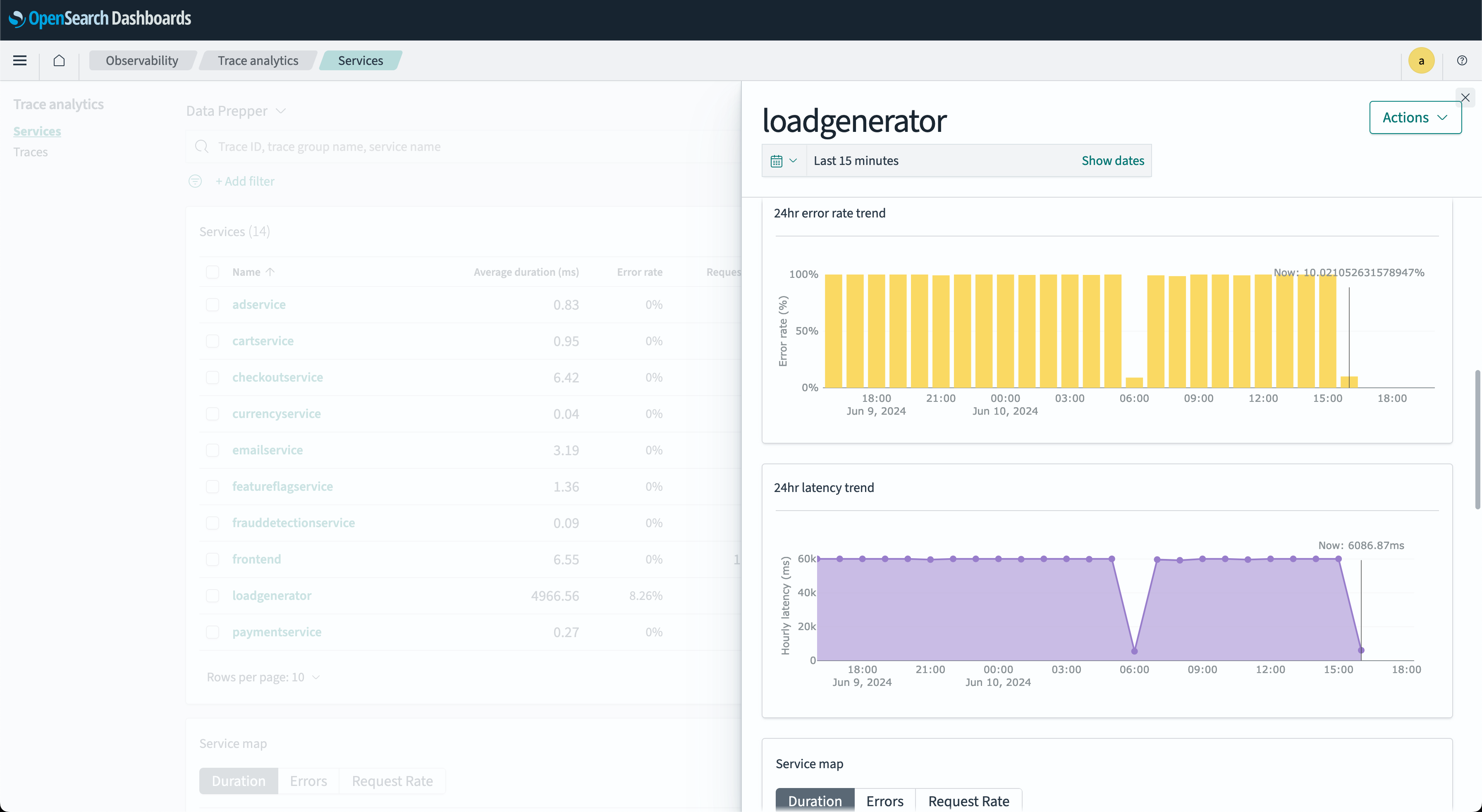
- The Services RED metrics dialog window provides an at-a-glance overview of a service’s RED metrics indicators, including 24-hour error, duration, and throughput rate. The following image shows this window.
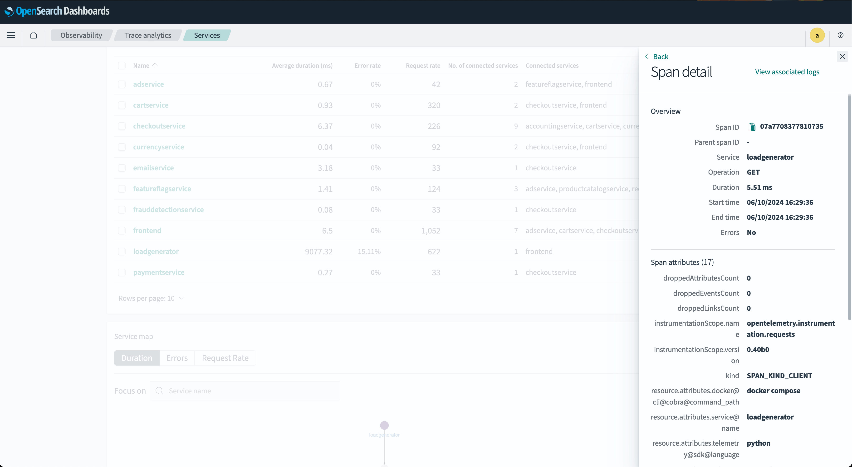
- The Span details dialog window provides the details of a trace. You can use this information to further analyze a trace’s elements, such as attributes and associated logs. The following image shows this window.
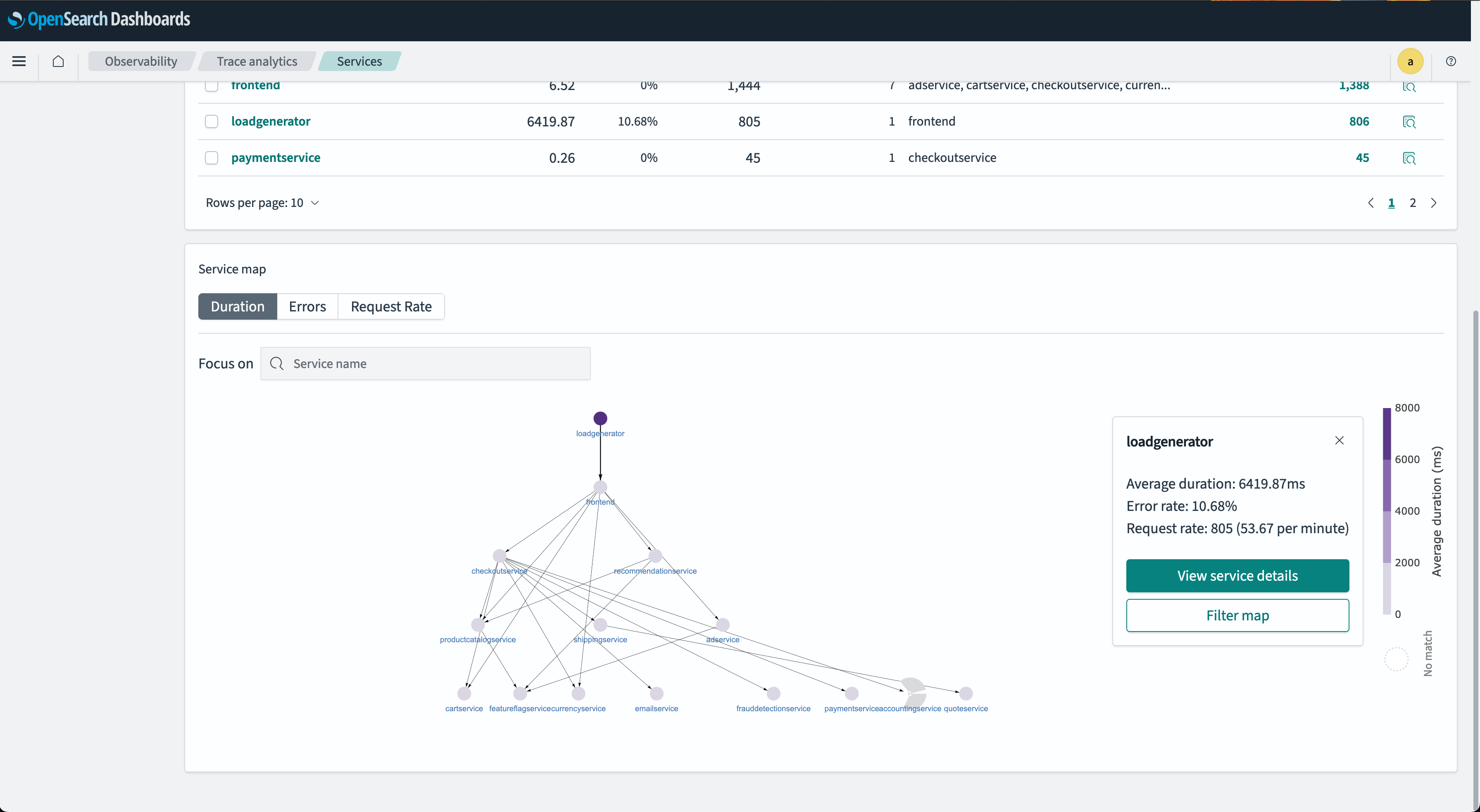
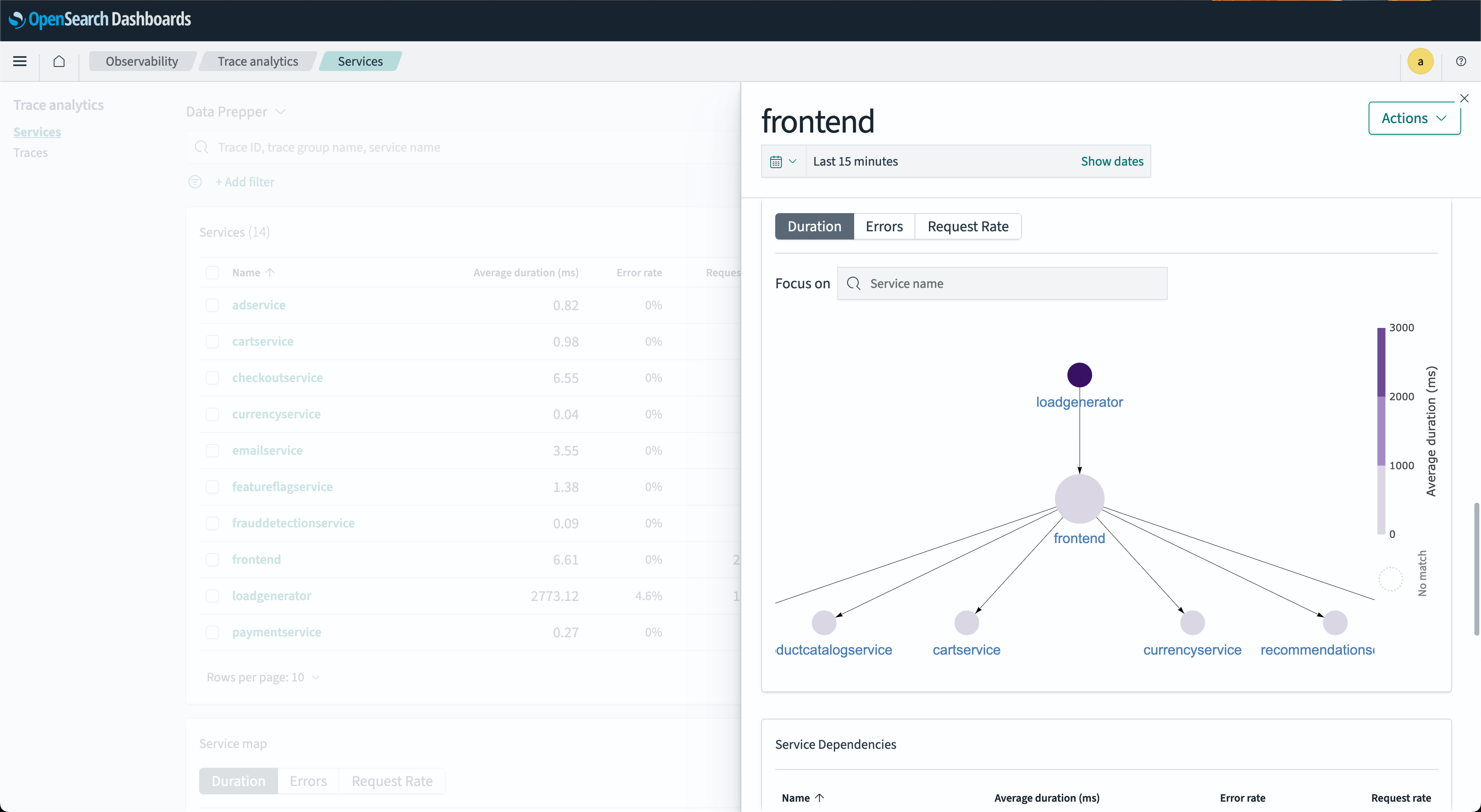
- Service map
- The Service map displays nodes, each representing a service. The node color indicates the RED indicator severity for that service and its dependencies. The following image shows a map.
-
You can select a node to open a detailed dialog window for its associated service. This interactive map visualizes service interconnections, helping identify problems by service, unlike dashboards that identify issues by operation. You can sort by error rate or latency to pinpoint potential problem areas.
-
In the Service map dialog window, nodes represent connected downstream services dependent on the selected service. The node color indicates the RED indicator severity for that service and its downstream dependencies. The following image shows this dialog window.
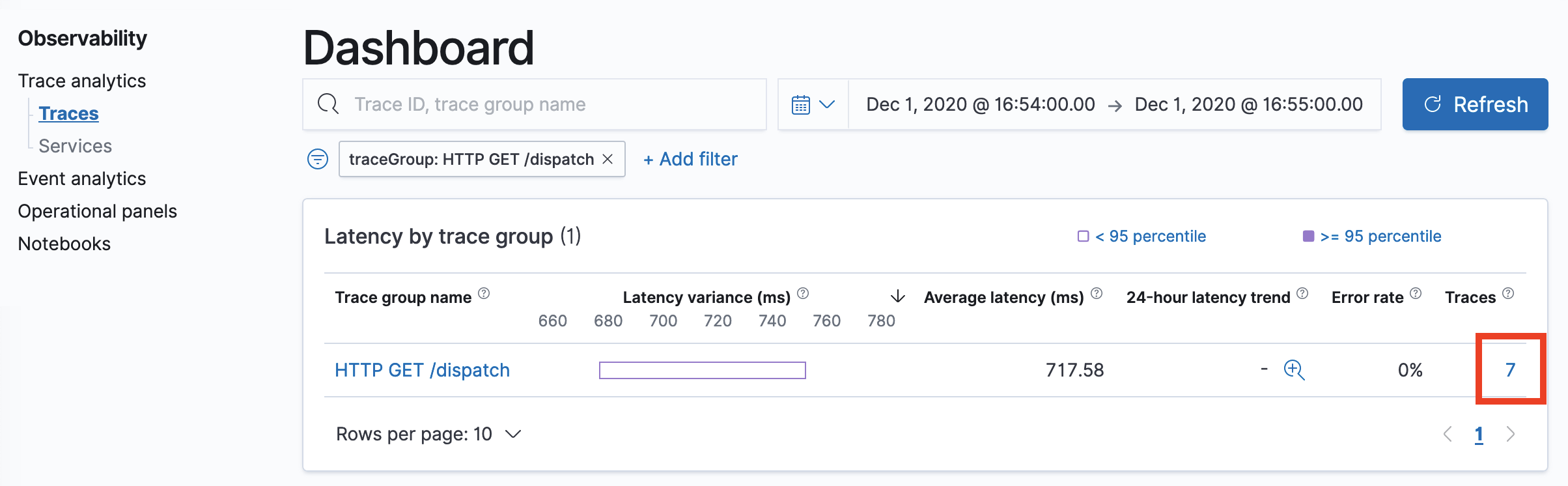
- Trace groups
- Traces are grouped by their HTTP API name, allowing clustering based on their business functional unit. Traces are grouped by HTTP method and path, displaying the average latency, error rate, and trends associated with a particular operation. You can filter by trace group name. The following image shows the Trace Groups window.
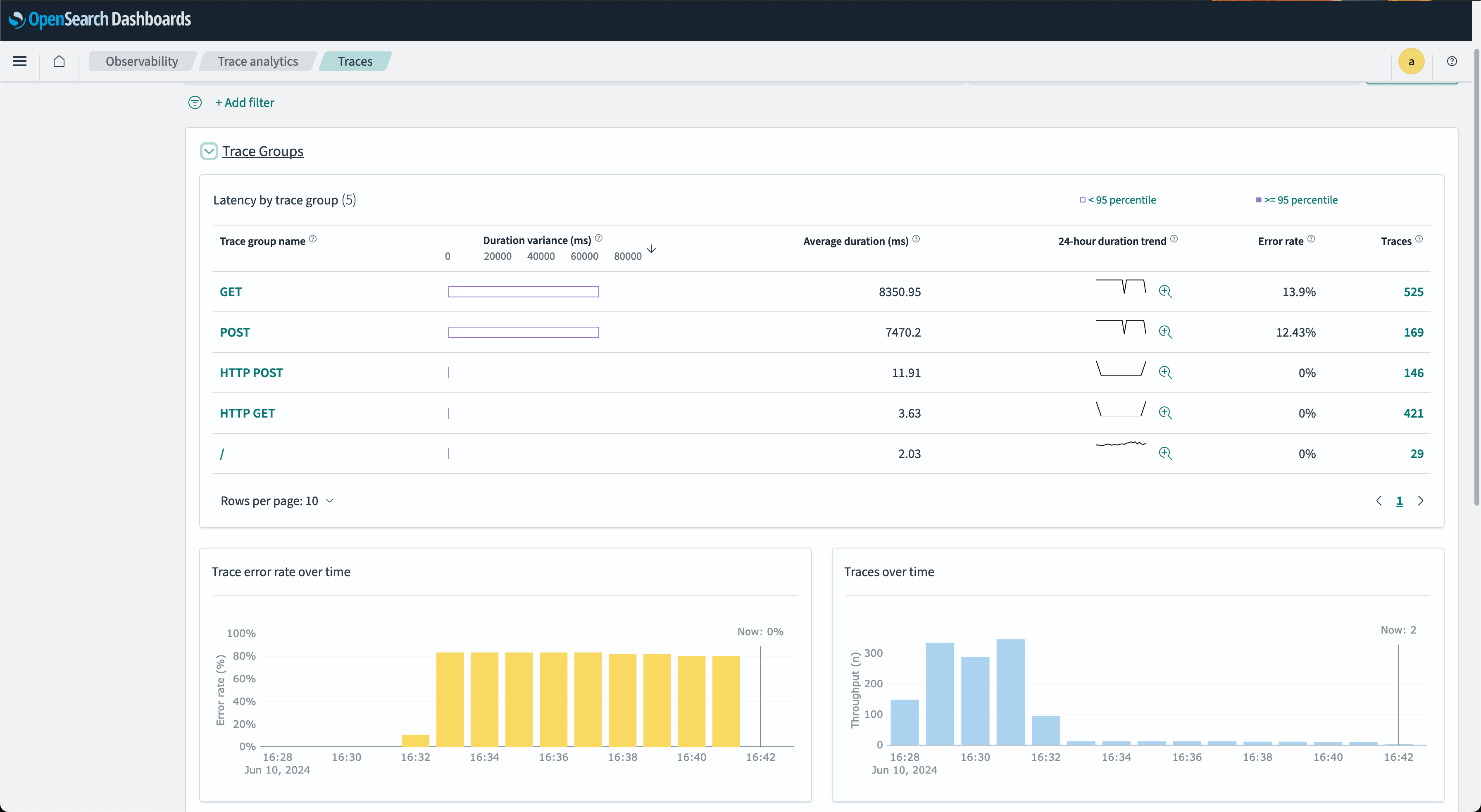
- In the Trace Groups window, you can filter by group name and other filters. You can also analyze associated traces. To drill down on the traces that comprise a group, select the number of traces in the right-hand column and then choose an individual trace to see a detailed summary.
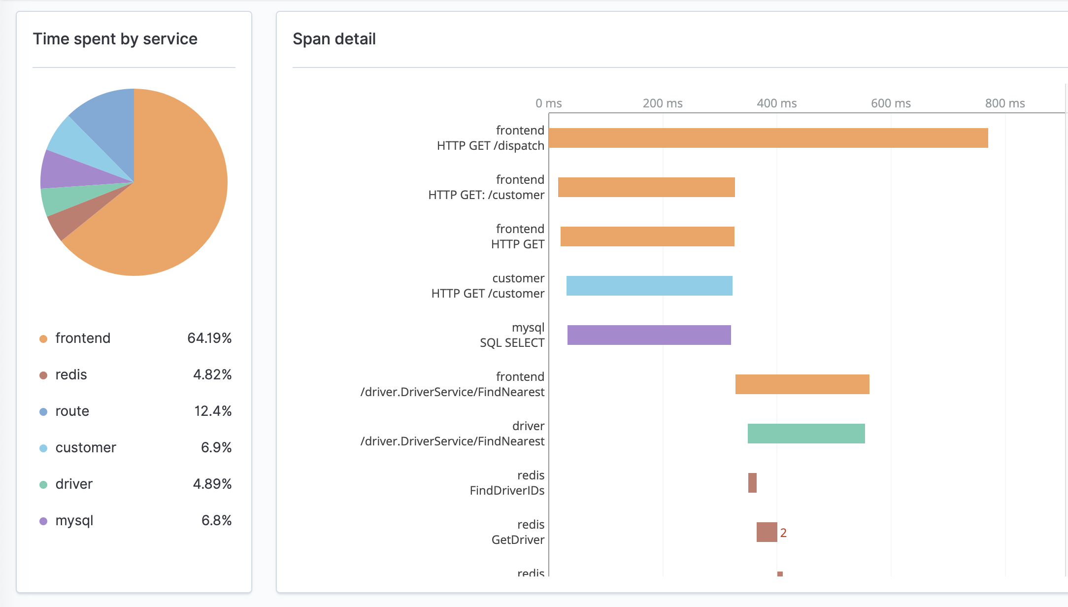
- The Trace details window displays a breakdown of a single trace, including its corresponding spans, associated service names, and a waterfall chart of the spans’ time and duration interactions. The following image shows this view.