| TL;DR: OpenSearch Query Insights now has built-in dashboards with real-time live query monitoring, historical Top N analysis, heatmaps, and per-query latency breakdowns. Quickly pinpoint slow queries, identify hot nodes or indexes, spot recurring problem patterns, and drill down to the exact execution phase causing the bottleneck. |
When your users report slow searches or your cluster shows unexpected resource spikes, you need to quickly understand what’s happening and why. OpenSearch Query Insights now provides a full visual experience within OpenSearch Dashboards, with interactive charts, heatmaps, and detailed views that make it easier to identify and resolve query performance issues.
In this post, we’ll explore the visualizations available on the Live Queries and Top N Queries pages and show how to use them to diagnose and troubleshoot real-world performance issues.
Getting started
To access Query Insights dashboards, navigate to the Query Insights page from the OpenSearch Dashboards left navigation.
Top N query monitoring is enabled by default for latency, CPU, and memory. You can verify or adjust the configuration—for example, set a longer monitoring window and track the top 20 queries—by using the following request:
PUT _cluster/settings
{
  "persistent": {
    "search.insights.top_queries.latency.window_size": "30m",
    "search.insights.top_queries.latency.top_n_size": 20
  }
}
With monitoring active, the dashboards automatically populate with query performance data. The following sections explore what each page offers.
Live queries: Real-time visibility into active search operations
The Live Queries page gives you an immediate view of every search query currently running on your cluster. This is your primary starting point when users report slowness or you notice unusual resource consumption.
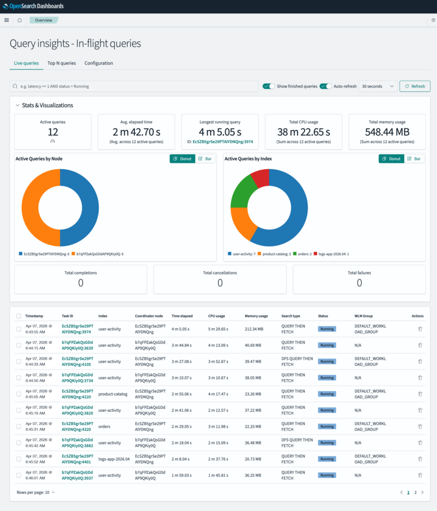
Metric overview panels
At the top of the page, five metric panels provide an at-a-glance summary of your cluster’s current search activity, as shown in the following image.

The metric panels provide the following information:
- Active Queries: The total count of currently running queries.
- Avg. Elapsed Time: The average time that all active queries have been running.
- Longest Running Query: The duration of the single longest-running query, along with its task ID.
- Total CPU Usage: The combined CPU time consumed across all active queries.
- Total Memory Usage: The combined memory used across all active queries.
When you receive alerts about cluster performance, these panels give you an instant health check. A high Active Queries count combined with a long Avg. Elapsed Time often signals that queries are queuing up or contending for resources. If the Longest Running Query shows a duration far above your expected query times, that single query could be the root cause of broader slowness.
Distribution charts: Queries by node and index
Below the metric panels, two distribution charts break down your active queries by node and index, as shown in the following image. Each chart can be toggled between a donut chart and a horizontal bar chart, depending on your preference.
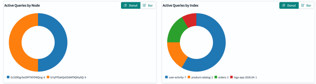
- Queries by Node: Shows how queries are distributed across your cluster’s coordinator nodes. A color-coded legend maps each node to its query count.
- Queries by Index: Shows which indexes are receiving the most search traffic right now.
An uneven distribution in the Queries by Node chart may indicate a hot node—one node handling a disproportionate share of queries, potentially due to client-side routing configuration or an unbalanced workload. If the Queries by Index chart shows one index dominating, you’ve identified where to focus your optimization efforts, whether that means improving the index’s mapping, adding replicas, or investigating the query patterns targeting it.
Live query table
The interactive table at the bottom of the page lists all information about every active query, including the timestamp, task ID, target indexes, coordinator node, elapsed time, CPU usage, memory usage, search type, and the query’s current status (running or canceled), as shown in the following image.
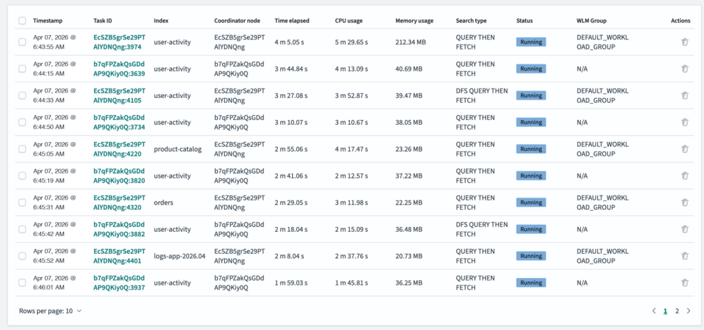 You can filter the results by index, search type, or coordinator node to focus on specific workloads. Select any numeric column header to sort by that metric—for example, sort by elapsed time to surface the slowest queries. The table also supports query cancelation: you can select one or more queries and cancel them directly from the dashboard. This is useful for stopping queries that are consuming excessive resources. The page supports configurable auto-refresh intervals, so you can monitor the query stream continuously during incident response.
For a deeper investigation, you can use the dashboard along with the Live Queries API. For example, to retrieve the five most CPU-intensive queries with their full query source, send the following request:
GET /_insights/live_queries?verbose=true&sort=cpu&size=5
Top N queries: Understanding query performance patterns
While the Live Queries page shows you what’s happening now, the Top N Queries page helps you understand what has been happening over a configurable time range. This is where you can analyze patterns, identify recurring problematic queries, and track performance trends.
Percentile metric panels
At the top of the page, six panels display key percentile metrics across your top queries, as shown in the following image.
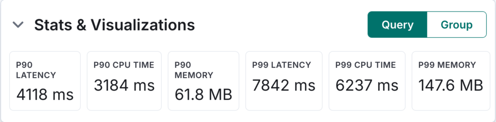 The panels include the following:
- P90 Latency: 90th percentile query latency (ms)
- P90 CPU Time: 90th percentile CPU consumption (ms)
- P90 Memory: 90th percentile memory usage (MB)
- P99 Latency: 99th percentile query latency (ms)
- P99 CPU Time: 99th percentile CPU consumption (ms)
- P99 Memory: 99th percentile memory usage (MB)
These percentile metrics help you distinguish between occasional outliers and systemic issues. If the P90 latency is within acceptable bounds but the P99 is extremely high, you’re experiencing tail latency—a small percentage of queries taking significantly longer. Conversely, if even the P90 is elevated, you likely have a widespread performance problem affecting the majority of queries.
Query distribution chart
The query distribution chart is an interactive pie (donut) chart that shows how queries are distributed across a dimension you choose: node, index, username, or workload management (WLM) group. The chart is accompanied by a data table showing each segment’s name, query count, and percentage of the total query count across all segments. Hovering over a segment displays a tooltip with the exact count and percentage, as shown in the following image.
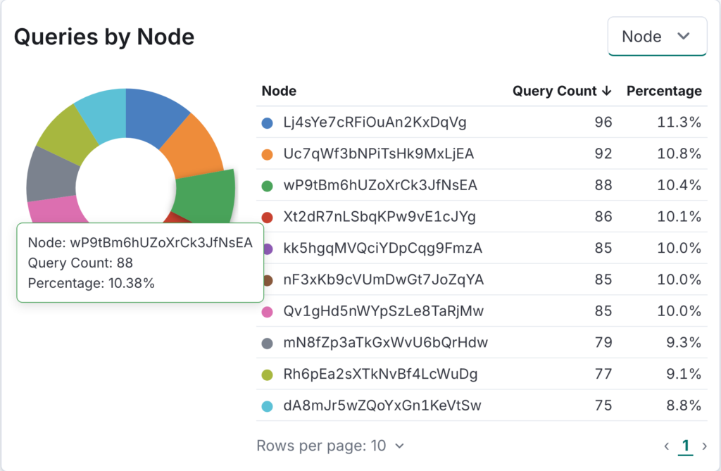 Use the following grouping dimensions to analyze different aspects of query distribution:
- To determine whether top queries are concentrated on specific coordinator nodes, group queries by node. This can indicate an unbalanced routing configuration or a node-level resource constraint.
- To view the indexes that generate the largest top query count, group queries by index—these are the indexes for which query optimization will have the greatest impact.
- To identify whether a specific user or application is responsible for a disproportionate share of resource-intensive queries, group queries by username.
- To understand how different workload classes contribute to the top query list, group queries by WLM group (if you’re using workload management).
Performance analysis: Line chart and heatmap
The performance analysis section offers two chart types that you can use depending on your investigation goals.
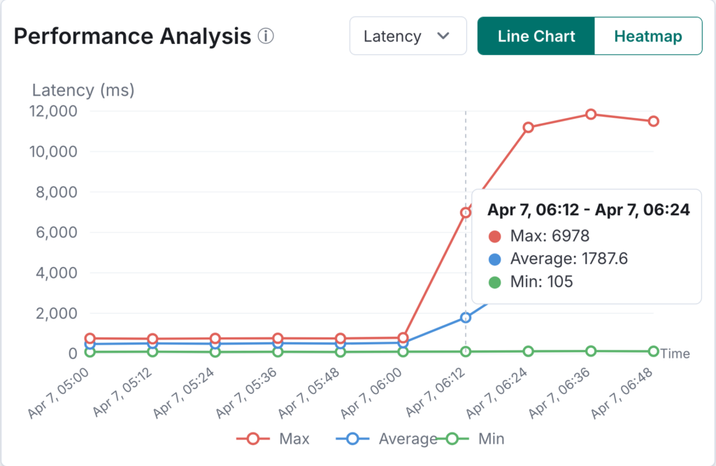
Line chart: Performance trends over time
The line chart tracks three series over your selected time range:
- Max (red): The maximum metric value per time bucket.
- Average (blue): The average metric value per time bucket.
- Min (green): The minimum metric value per time bucket.
You can toggle the Y-axis metric between latency, CPU, and memory, as shown in the following image.
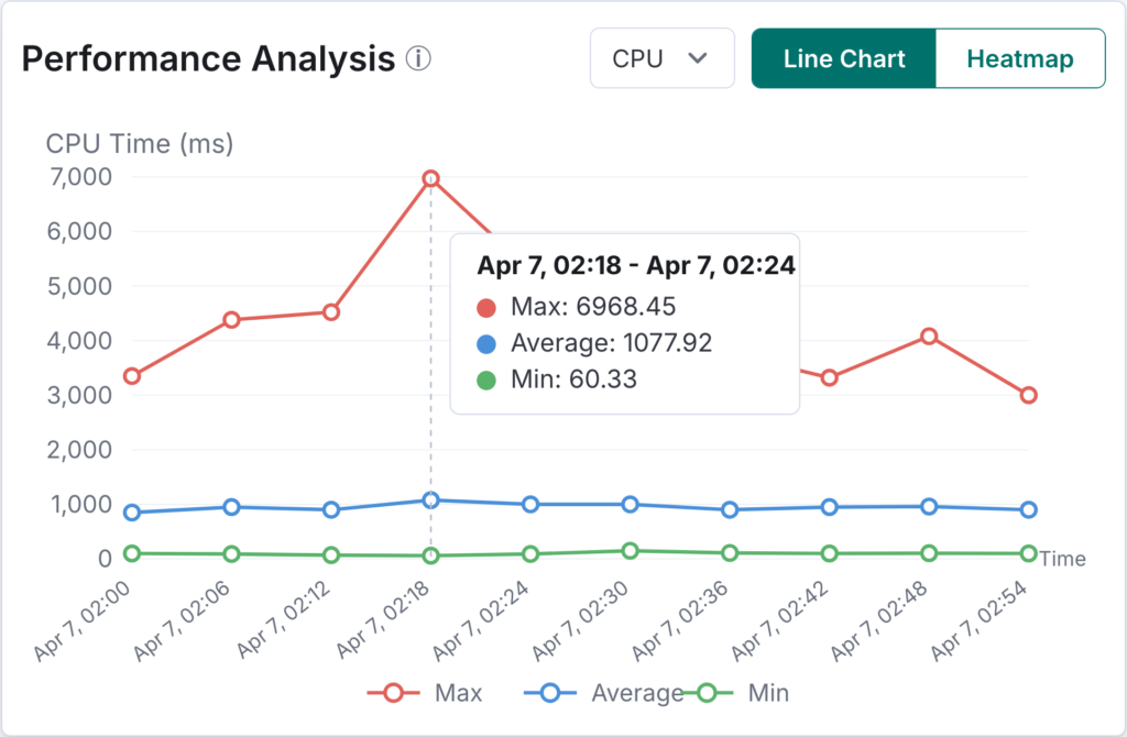 The line chart is ideal for spotting performance regressions or correlating query behavior with external events. If you see the max latency spike at a specific time, compare that time against deployment logs, index operations, or changes in query patterns. A widening gap between the max and average lines suggests increasing variability—some queries are degrading while others remain normal.
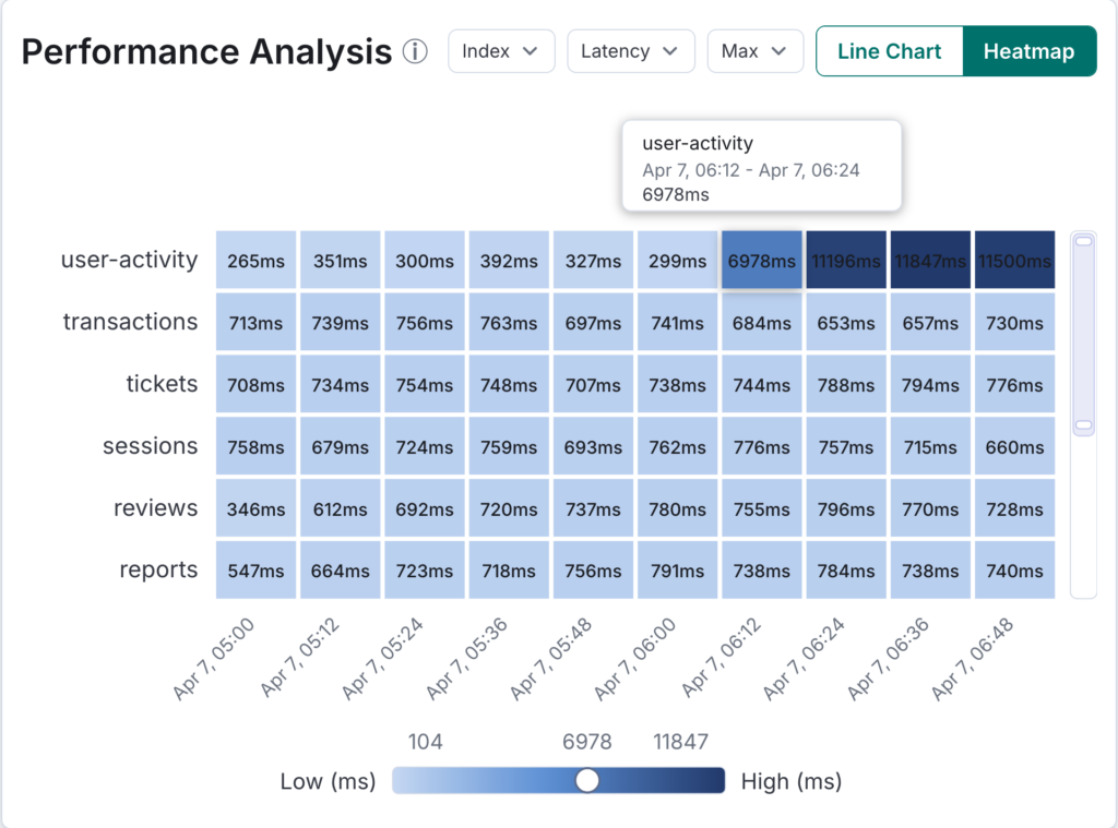
Heatmap: Multi-dimensional performance analysis
The heatmap provides a dense visualization of query performance across two dimensions: time (X-axis) and a grouping dimension (Y-axis) such as index, node, username, user roles, or WLM group, as shown in the following image.
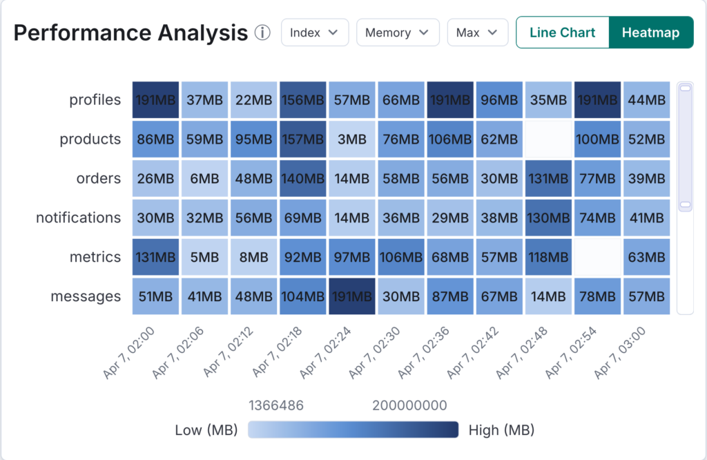 Each cell is color-coded based on a metric value, with lighter colors representing lower values and darker colors representing higher values. You can choose from several metrics—latency, CPU, or memory (with average, max, or min aggregations) as well as count (the number of top queries in each cell).
The heatmap excels at revealing patterns that are hard to spot in tables or line charts. Look for “hot” rows—indexes or nodes that are consistently dark across time—to identify persistent bottlenecks. Look for “hot” columns—time periods where multiple rows show dark cells—to identify cluster-wide performance degradation events. The combination of time and grouping dimensions lets you answer questions like “Is the latency spike limited to one index, or is it affecting the whole cluster?”
Once you’ve identified a problematic time window in the heatmap, you can examine the specific period through the API:
GET /_insights/top_queries?type=latency&from=2026-04-01T14:00:00.000Z&to=2026-04-01T16:00:00.000Z
Top query data table
The data table lists all top queries or query groups within your selected time range in a sortable, filterable view.
Key columns include the query ID (linked to the details page), Type (query or group, when grouping by similarity is enabled), Query Count, Timestamp, Indexes, Search Type, Coordinator Node ID, Total Shards, and the core performance metrics: Latency, CPU Time, and Memory Usage. You can filter by type, indexes, search type, coordinator node, and WLM group to narrow results.
When investigating a specific performance issue, start by sorting the table by the relevant metric (for example, latency for slow queries or CPU for resource-intensive queries). If grouping by similarity is enabled, pay attention to groups with high Query Count values—these represent recurring query patterns for which even a small per-query improvement will multiply into significant resource savings.
Query details: Viewing individual queries and groups
Selecting a query ID in either the Live Queries or Top N Queries table takes you to a detailed view of that specific query.
Query summary and source
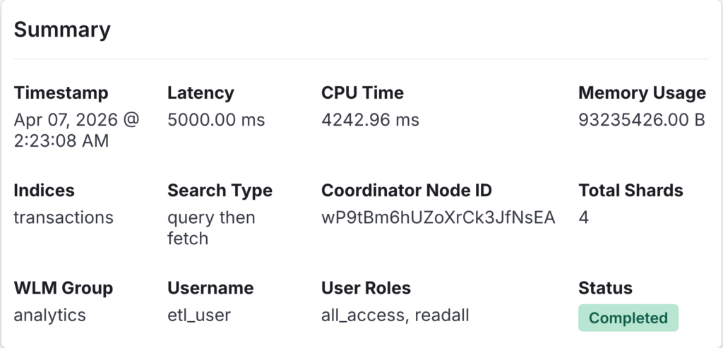
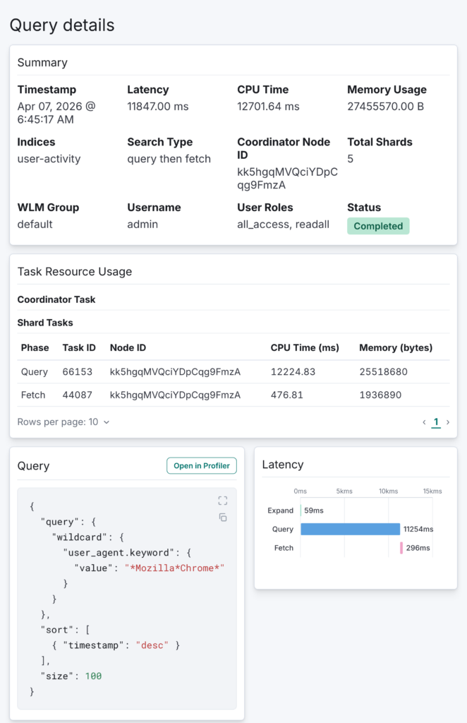
The summary panel displays all available metadata: timestamp, latency, CPU time, memory usage, indexes, search type, coordinator node ID, total shards, WLM group, username, user roles, and status, as shown in the following image.
 Task resource usage
When verbose mode is enabled (verbose=true), the query details page includes a Task Resource Usage panel that breaks down resource consumption at the task level, as shown in the following image. The panel shows a coordinator task summary followed by a paginated shard tasks table listing each phase (query, fetch), its task ID, node ID, CPU time (ms), and memory usage (bytes).
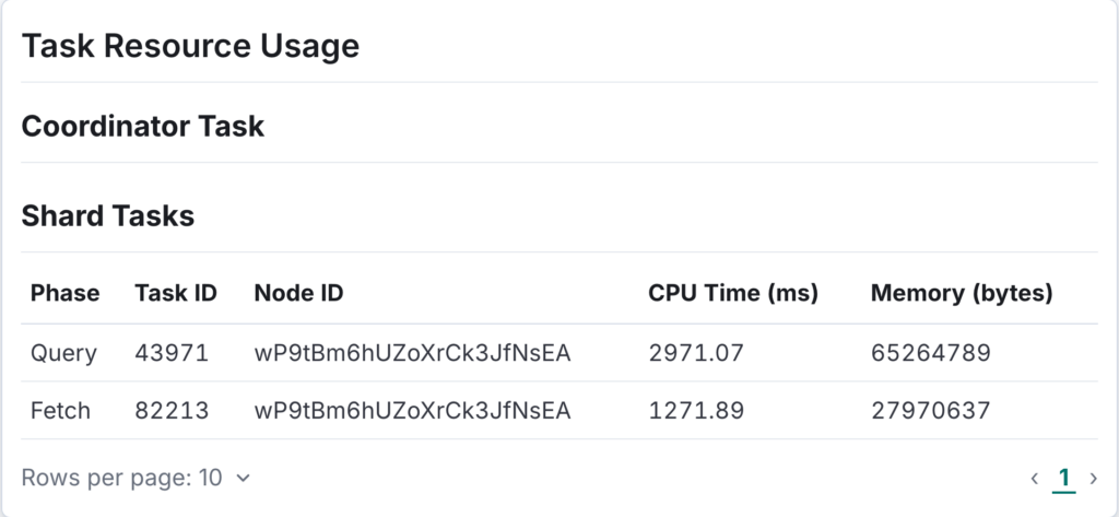 This view helps you pinpoint which shard-level tasks are consuming the most resources. If a single shard task shows significantly higher CPU or memory than others, it may indicate a data skew or a hot shard. Comparing resource usage across phases also reveals whether the bottleneck is in query execution or document fetching at the individual task level.
Below the task resource usage panel, the full query source (the DSL body) is displayed in a code block, making it easy to review and copy for further analysis.
Latency breakdown chart
One of the most valuable visualizations for troubleshooting is the latency breakdown chart, as shown in the following image.
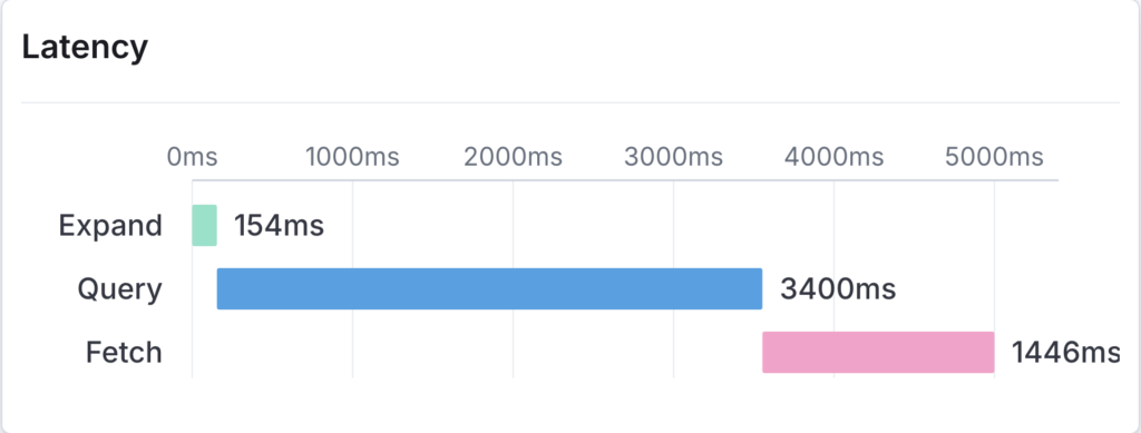 This waterfall-style chart displays each execution phase as a separate horizontal bar, showing how a query’s total latency is distributed across three phases:
- Query phase (blue): Time spent executing the query across shards.
- Fetch phase (pink): Time spent fetching the actual documents after the query phase identifies matches.
- Expand phase (teal): Time spent on any expand operations.
This chart reveals where a query spends its time. If the query phase dominates, the issue is likely in the query structure itself—perhaps an expensive aggregation or a wildcard query scanning too many terms. If the fetch phase dominates, the query may be retrieving too many large documents, suggesting that you should reduce the result size or use source filtering. This distinction is critical for choosing the right optimization strategy.
Query group details
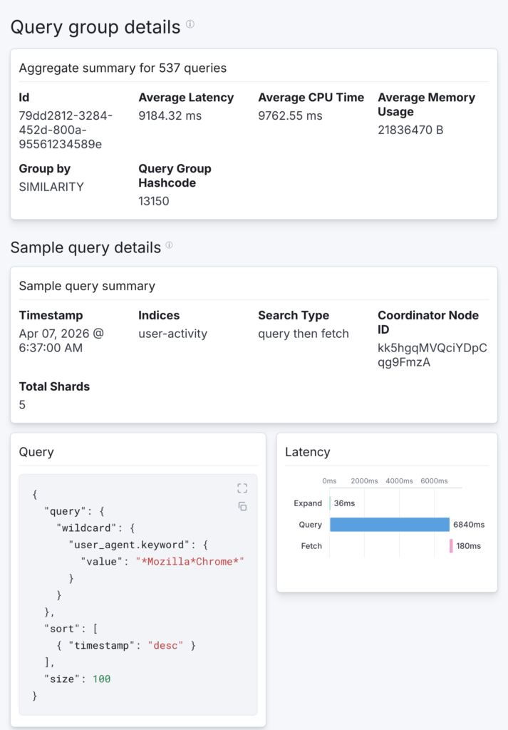
When you have grouping by similarity enabled, selecting a group ID opens the group details page instead, as shown in the following image.
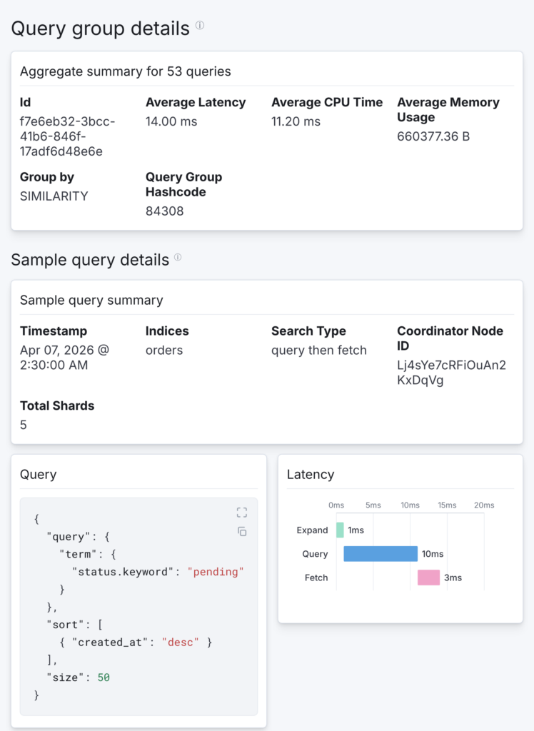 This page presents aggregate metrics—average latency, CPU time, and memory usage across all queries in the group—along with the total query count and the grouping method. A representative sample query is shown with its full source and latency breakdown, giving you a concrete starting point for analysis.
Group details help you focus on query patterns rather than individual instances. If a group shows high average latency with a high query count, optimizing that single query pattern could improve performance for hundreds or thousands of queries.
Putting it all together: A troubleshooting workflow
To show how these visualizations work together, the following example explores a typical troubleshooting scenario. Imagine you receive an alert that search latency has spiked across your cluster.
You start on the Live Queries page and immediately see a high active query count, as shown in the following image. The Queries by Node chart shows an even distribution, ruling out a hot-node issue. But the Queries by Index chart reveals that the user-activity index accounts for most of the traffic. Sorting the live queries table by elapsed time, you spot several long-running queries against that index and cancel them to stabilize the cluster, as shown in the following image.
 Next, you switch to the Top N Queries page and set the time range to the past two hours. The P99 latency panel confirms an elevated value. Switching to the line chart, you can see the max latency spike starting around 45 minutes ago, as shown in the following image.
 Switching to the heatmap and grouping by index with max latency as the metric, you confirm the issue is isolated to the
 user-activity index—dark cells appear only in that row, as shown in the following image.
 You select the highest-latency query ID to open the query details page, as shown in the following image. The latency breakdown chart shows the query phase consuming 95% of the total time. Reviewing the query source, you discover a wildcard query on a high-cardinality field.
 With grouping by similarity enabled, you notice in the data table that this query pattern has been executed over 500 times in the past hour—a clear optimization target, as shown in the following image.
 Selecting the group details confirms the recurring pattern and shows aggregate metrics across all matching queries, as shown in the following image.
 With a likely culprit in hand, you can take targeted action. The leading-wildcard query against a high-cardinality
 keyword field stands out as a strong optimization candidate, since this pattern forces OpenSearch to scan a large number of terms. From here, you might want to rewrite the query by replacing the wildcard with a more selective match or remapping the field to better support the access pattern. After applying those changes, you could return to the same line chart and percentile panels to check whether P99 latency drops back toward its baseline.
Conclusion
Query Insights dashboards combine real-time monitoring, historical analysis, and detailed query-level diagnostics in a single visual interface. Whether you’re responding to a live incident using the Live Queries page, identifying recurring patterns with the Top N Queries heatmap, or investigating a bottleneck using the latency breakdown chart, these tools help you move from symptom to root cause more efficiently.
To get started, see the query insights documentation.
We’d love to hear how you’re using these visualizations in your own troubleshooting workflows. Share your experiences and feedback on the OpenSearch forum.