You're viewing version 2.7 of the OpenSearch documentation. This version is no longer maintained. For the latest version, see the current documentation. For information about OpenSearch version maintenance, see Release Schedule and Maintenance Policy.
Event analytics
Event analytics in Observability is where you can use Piped Processing Language (PPL) queries to build and view different visualizations of your data.
Getting started with event analytics
To get started, choose Observability in OpenSearch Dashboards and then choose Event analytics. If you want to start exploring without adding any of your own data, choose Add samples, and Dashboards adds sample visualizations you can interact with.
Building a query
To generate custom visualizations, you must first specify a PPL query. OpenSearch Dashboards then automatically creates a visualization based on the results of your query.
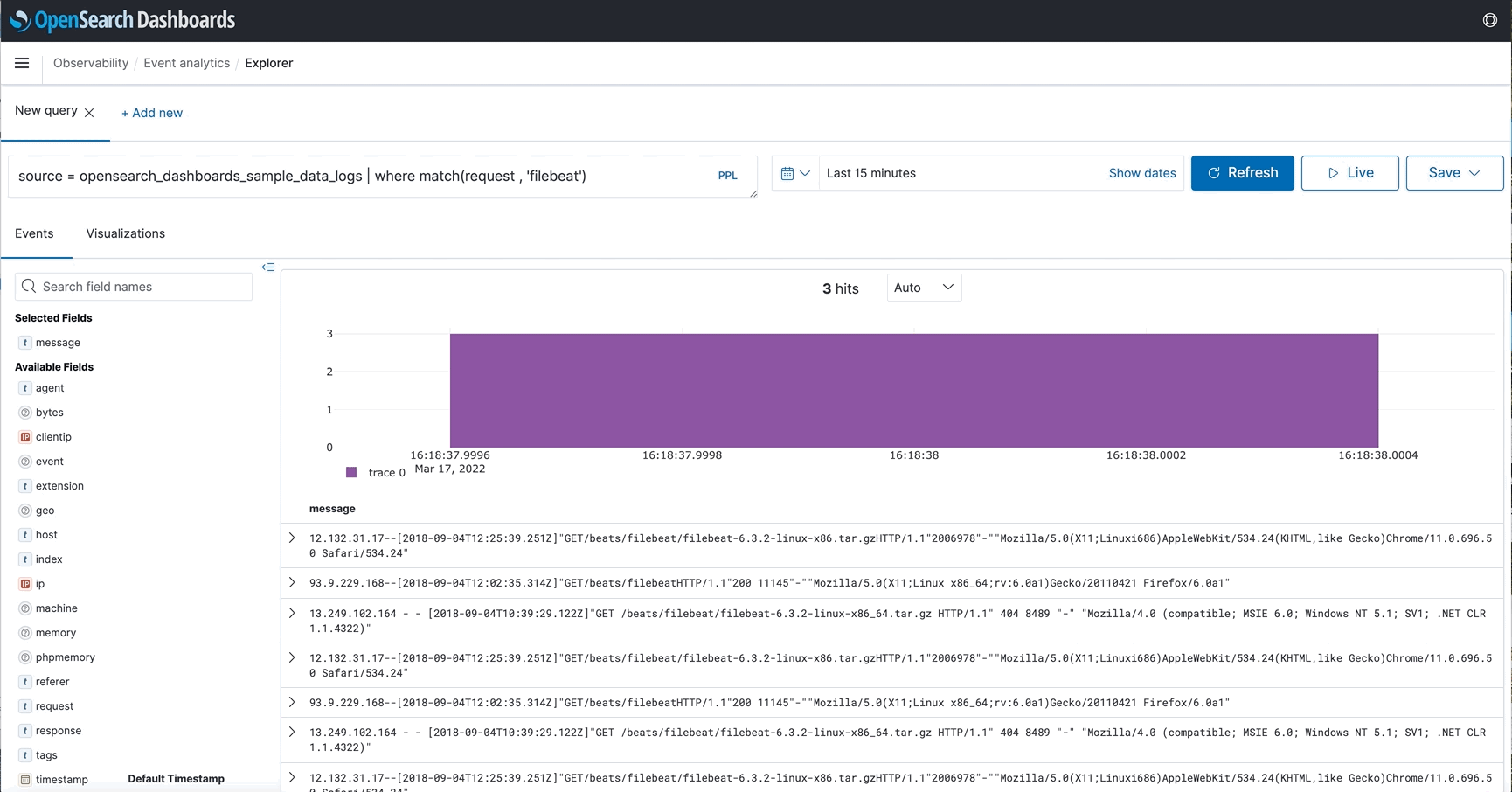
For example, the following PPL query returns a count of how many host addresses are currently in your data.
source = opensearch_dashboards_sample_data_logs | fields host | stats count()
By default, Dashboards shows results from the last 15 minutes of your data. To see data from a different time frame, use the date and time selector.
For more information about building PPL queries, see Piped Processing Language.
Saving a visualization
After Dashboards generates a visualization, you must save it if you want to return to it at a later time or if you want to add it to an operational panel.
To save a visualization, expand the save dropdown menu next to Refresh, enter a name for your visualization, then choose Save. You can reopen any saved visualizations on the event analytics page.
Creating event analytics visualizations and adding them to dashboards
This feature is available in OpenSearch Dashboards version 2.7 and later. It works with new visualizations created in version 2.7 or later that use PPL to query data from OpenSearch or federated data sources such as Prometheus.
Presenting your visualizations on a dashboard, instead of the event analytics page, makes it easier for users to understand and interpret the data at a glance.
To create a PPL visualization, follow these steps:
- On the main menu, choose Visualize > PPL.
- In the Observability > Logs > Explorer window, enter the index source in the PPL query field, for example,
source = opensearch_dashboards_sample_data_flights | stats count() by DestCountry. You must enter the query using PPL syntax. - Set the time filter, for example, This week, and then select Refresh.
- Choose the visualization type, for example, Pie, from the right sidebar dropdown menu.
- Select Save and enter a name for the visualization.
You’ve created a new visualization that can be added to a new or existing dashboard. To add a PPL query to a dashboard, follow these steps:
- Select Dashboard from the main menu.
- In the Dashboards window, select Create > Dashboard.
- In the Editing New Dashboard window, choose Add an existing.
- In the Add panels window, choose PPL and select the visualization. It is now displayed on your dashboard.
- Select Save and enter a name for the dashboard.
- To add more visualizations to the dashboard, choose Select existing visualization and follow the steps above. Alternatively, choose Create new and then select PPL in the New Visualization window. You’ll return to the event analytics page and follow steps 1–6 in the preceding instructions.
Limitations of event analytics visualizations
Event analytics visualizations currently do not support Dashboards Query Language (DQL) or query domain-specific language (DSL), and they do not use index patterns. Note the following limitations:
- Event analytics visualizations only use filters created using the dropdown interface. If you have DQL query or DSL filters in a dashboard, the visualizations do not use them.
- The Dashboard filter dropdown interface only shows fields from the default index pattern or index patterns used by other visualizations in the same dashboard.
Viewing logs
The following are methods you can use to view logs.
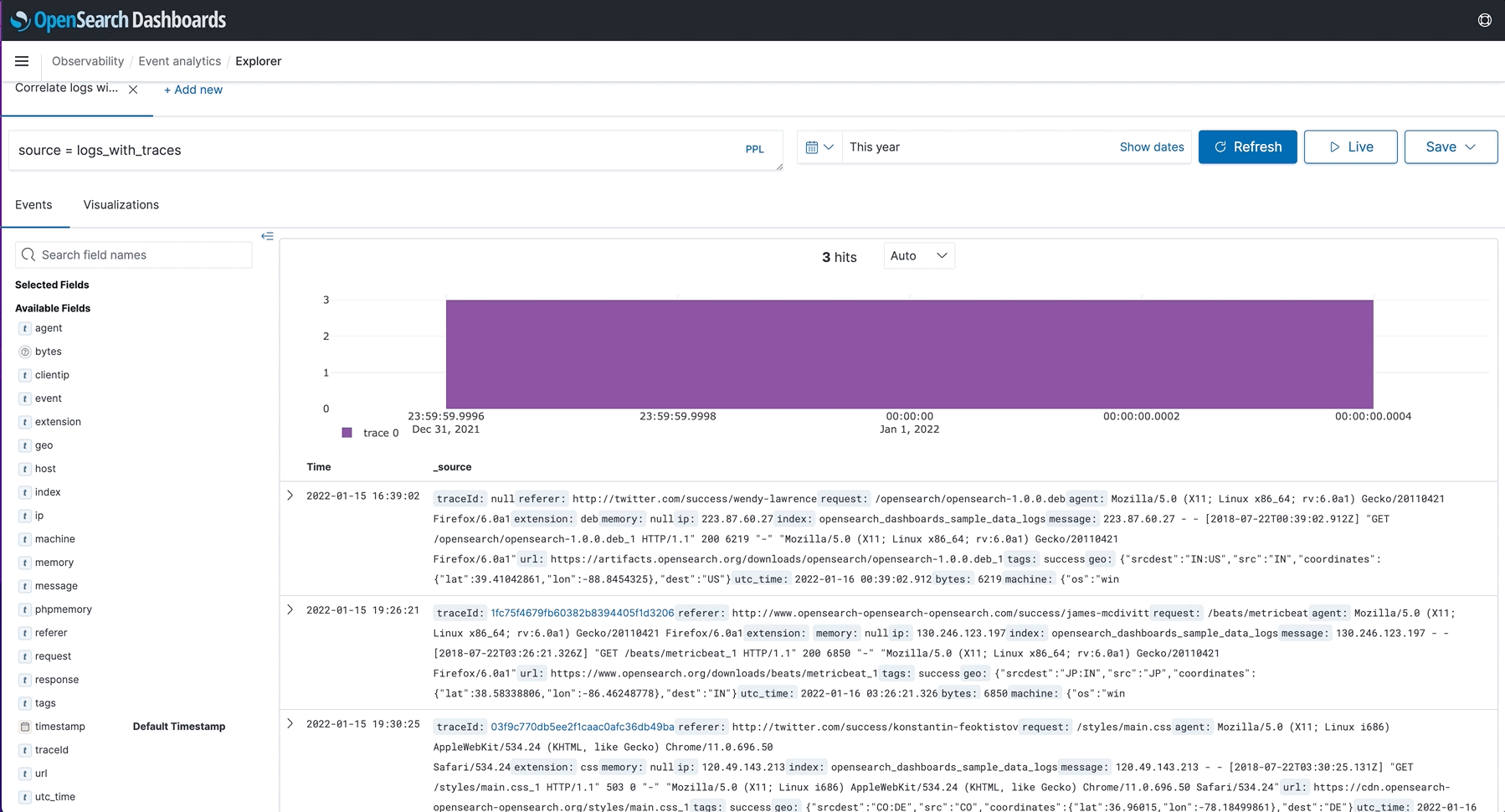
Correlating logs and traces
If you regularly track events across applications, you can correlate logs and traces. To view the correlation, you have to index the traces according to Open Telemetry standards (similar to trace analytics). Once you add a TraceId field to your logs, you can view the correlated trace information in the event explorer log details. This method lets you correlate logs and traces that correspond to the same execution context.
Viewing surrounding events
If you want to know more about a log event you’re looking at, you can select View surrounding events to get a bigger picture of what was happening around the time of interest.
Livestreaming logs
If you prefer watching events happen live, you can configure an interval so event analytics automatically refreshes the content. Live tail lets you stream logs live to OpenSearch observability event analytics based on the provided PPL query, as well as provide rich functionality such as filters. Doing so improves your debugging experience and lets you monitor your logs in real-time without having to manually refresh.
You can also choose intervals and switch between them to dictate how often live tail should stream live logs. This feature is similar to the CLI’s tail -f command in that it only retrieves the most recent live logs by possibly eliminating a large portion of live logs. Live tail also provides you with the total count of live logs received by OpenSearch during the live stream, which you can use to better understand the incoming traffic.