You're viewing version 2.5 of the OpenSearch documentation. This version is no longer maintained. For the latest version, see the current documentation. For information about OpenSearch version maintenance, see Release Schedule and Maintenance Policy.
Building data visualizations
By visualizing your data, you translate complex, high-volume, or numerical data into a visual representation that is easier to process. OpenSearch Dashboards gives you data visualization tools to improve and automate the visual communication process. By using visual elements like charts, graphs, or maps to represent data, you can advance business intelligence and support data-driven decision-making and strategic planning.
Understanding the visualization types in OpenSearch Dashboards
Dashboards has several visualization types to support your data analysis needs. The following sections provide an overview of the visualization types in Dashboards and their common use cases.
Area charts
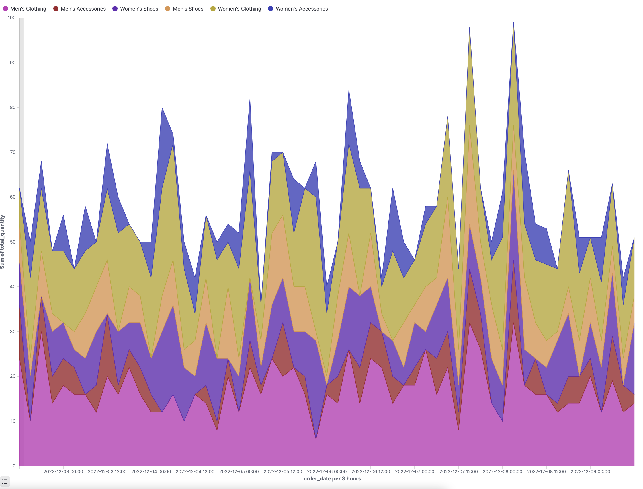
Area charts depict changes over time, and they are commonly used to show trends. Area charts more efficiently identify patterns in log data, such as sales data for a time range and trends over that time. See Using area charts to learn more about how to create and use them in Dashboards.
Bar charts
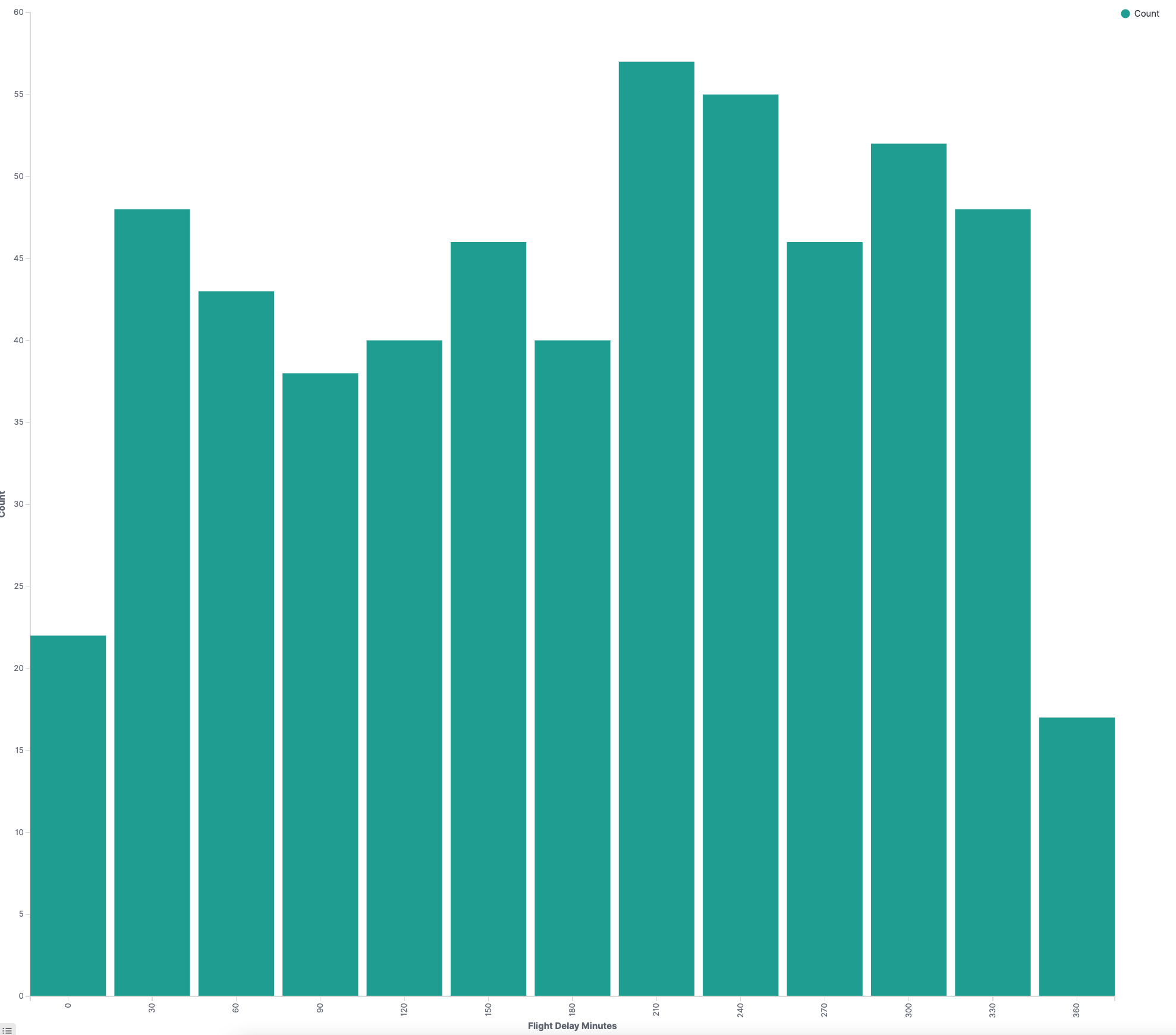
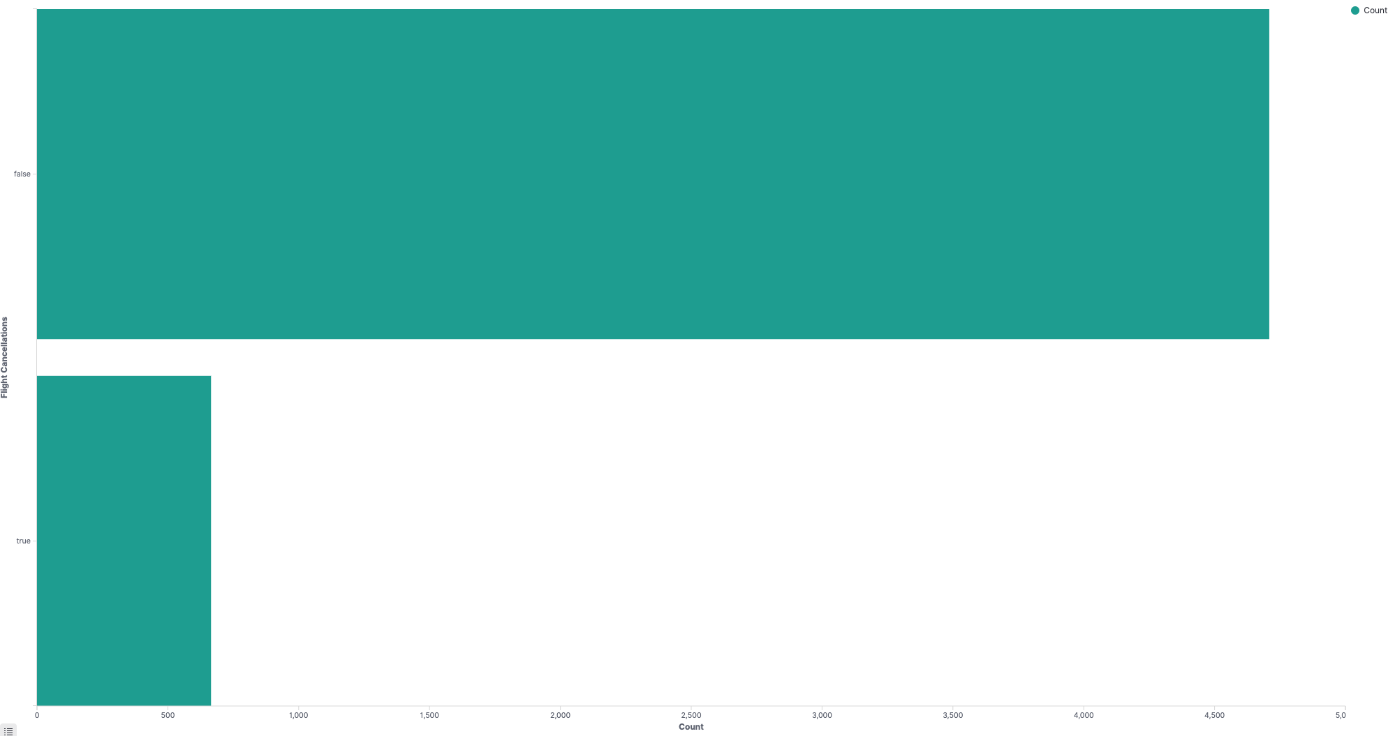
Bar charts (vertical or horizontal) compare categorical data and depict changes of a variable over a period of time.
| Vertical bar chart | Horizontal bar chart |
|---|---|
 |  |
Controls
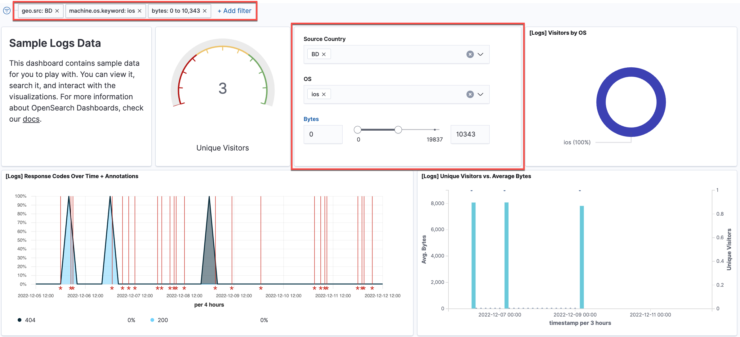
Controls is a panel, instead of a visualization type, added to a dashboard to filter data. Controls gives users the capability to add interactive inputs to a dashboard. You can create two types of controls in Dashboards: Options list and Range slider. Options list is a dropdown options list that allows filtering of data by a terms aggregation, such as machine.os.keyword. Range slider allows filtering within specified value ranges, such as hour_of_day.
Data tables
Data tables, or tables, show your raw data in tabular form.

Gantt charts
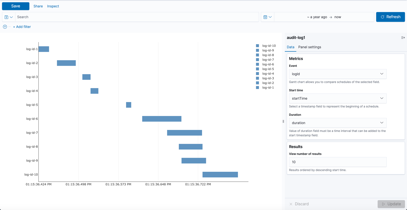
Gantt charts show the start, end, and duration of unique events in a sequence. Gantt charts are useful in trace analytics, telemetry, and anomaly detection use cases where you want to understand interactions and dependencies between various events in a schedule. Gantt chart is currently a plugin, instead of built-in, visualization type in Dashboards. See Gantt charts to learn how to create and use them in Dashboards.
Gauge charts
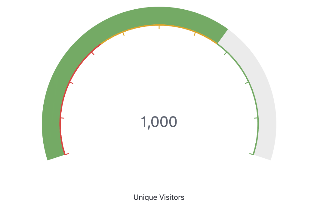
Gauge charts look similar to an analog speedometer that reads left to right from zero. They display how much there is of the thing you are measuring, and this measurement can exist alone or in relation to another measurement, such as tracking performance against benchmarks or goals.
Heat maps
A heat map is a view of a histogram (a graphical representation of the distribution of numerical data) over time. Instead of using bar height as a representation of frequency, as with a histogram, heat maps display data in a tabular form using colors to differentiate where values fall in a range.

Line charts
Line charts compare changes in measured values over a period of time, such as gross sales by month or gross sales and net sales by month.

Maps
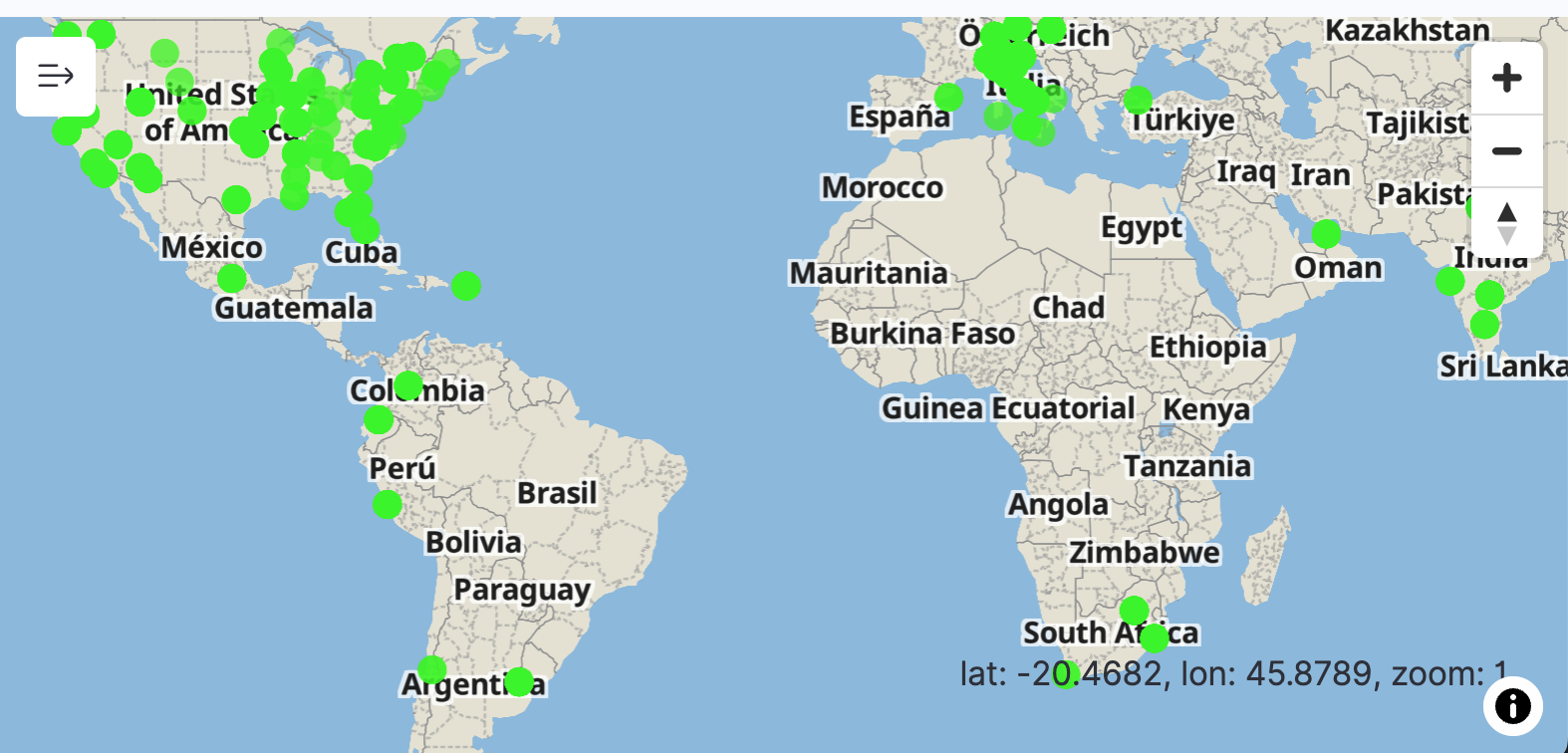
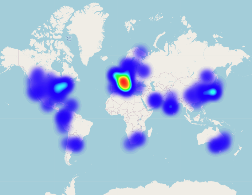
You can create two types of maps in Dashboards: Coordinate maps and Region maps. Coordinate maps show the difference between data values for each location by size. Region maps show the difference between data values for each location by varying shades of color. See Using the Maps plugin to learn more about maps capabilities in Dashboards.
Coordinate maps
Coordinate maps show location-based data on a map. Use coordinate maps to visualize GPS data (latitude and longitude coordinates) on a map. For information about OpenSearch-supported coordinate field types, see Geographic field types and Cartesian field types.
Region maps
Region maps show patterns and trends across geographic locations. A region map is one of the basemaps in Dashboards. For information about creating custom vector maps in Dashboards, see Using coordinate and region maps to learn how to create and use maps in Dashboards.
Markdown
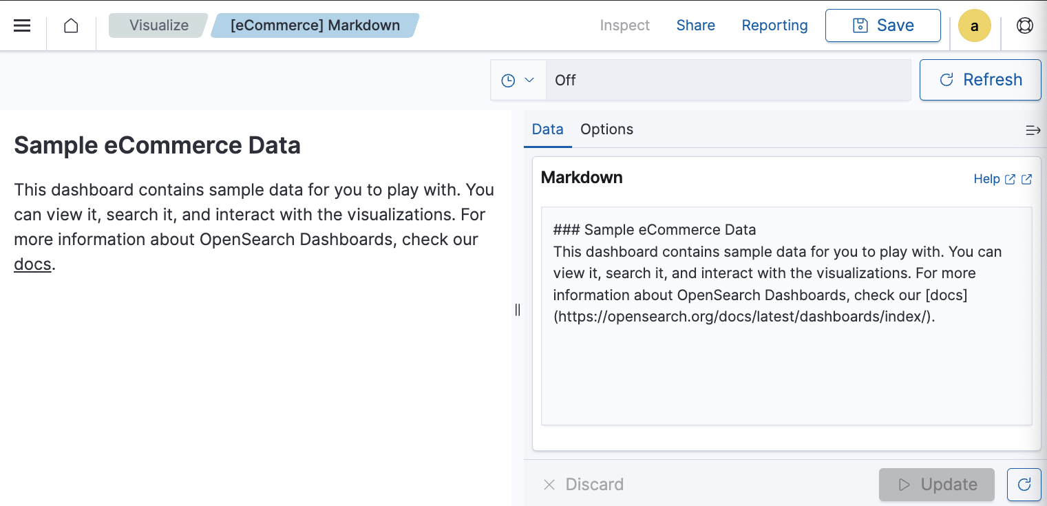
Markdown is a the markup language used in Dashboards to provide context to your data visualizations. Using Markdown, you can display information and instructions along with the visualization.
Metric values
Metric values, or number charts, compare values in different measures. For example, you can create a metrics visualization to compare two values, such as actual sales compared to sales goals.

Pie charts
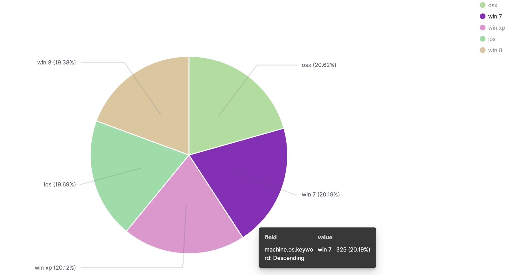
Pie charts compare values for items in a dimension, such as a percentage of a total amount.
TSVB
The time-series visual builder (TSVB) is a data visualization tool in Dashboards used to create detailed time-series visualizations. For example, you can use TSVB to build visualizations that show data over time, such as flights by status over time or flight delays by delay type over time. Currently, TSVB can be used to create the following Dashboards visualization types: Area, Line, Metric, Gauge, Markdown, and Data Table.

Tag cloud
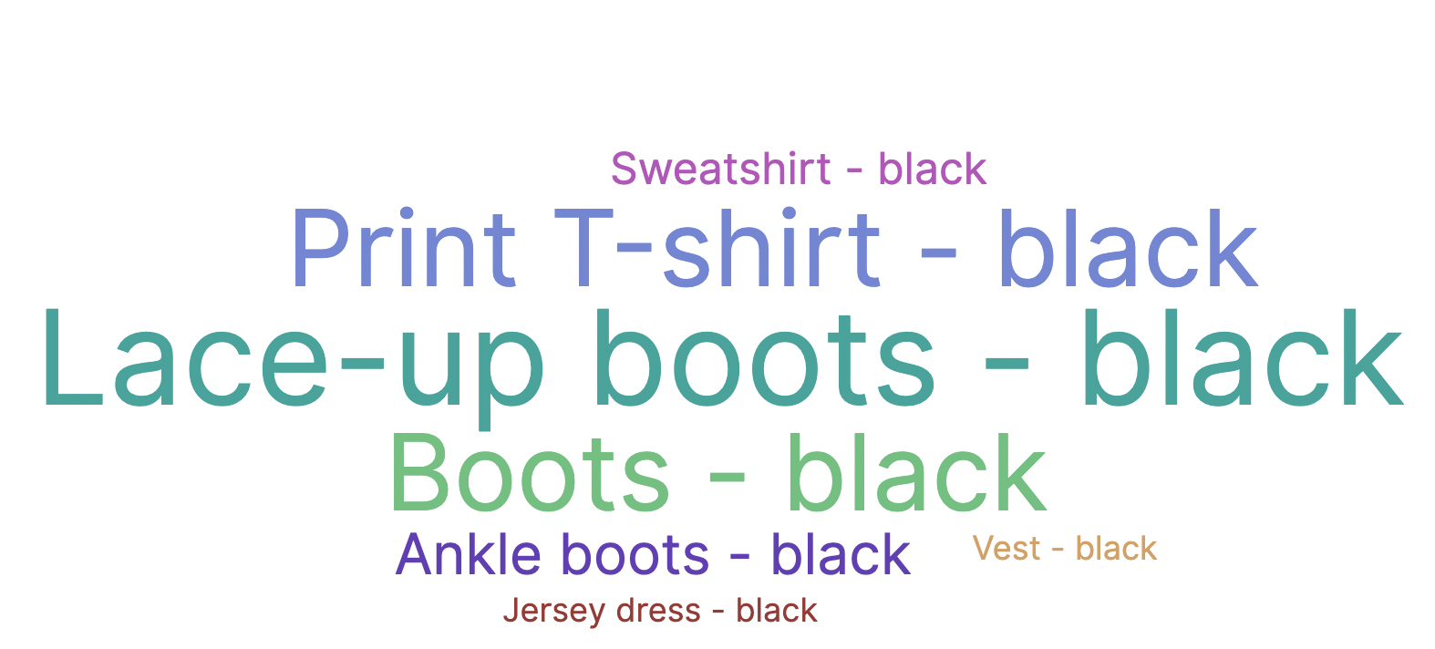
Tag (or word) clouds are a way to display how often a word is used in relation to other words in a dataset. The best use for this type of visual is to show word or phrase frequency.
Timeline
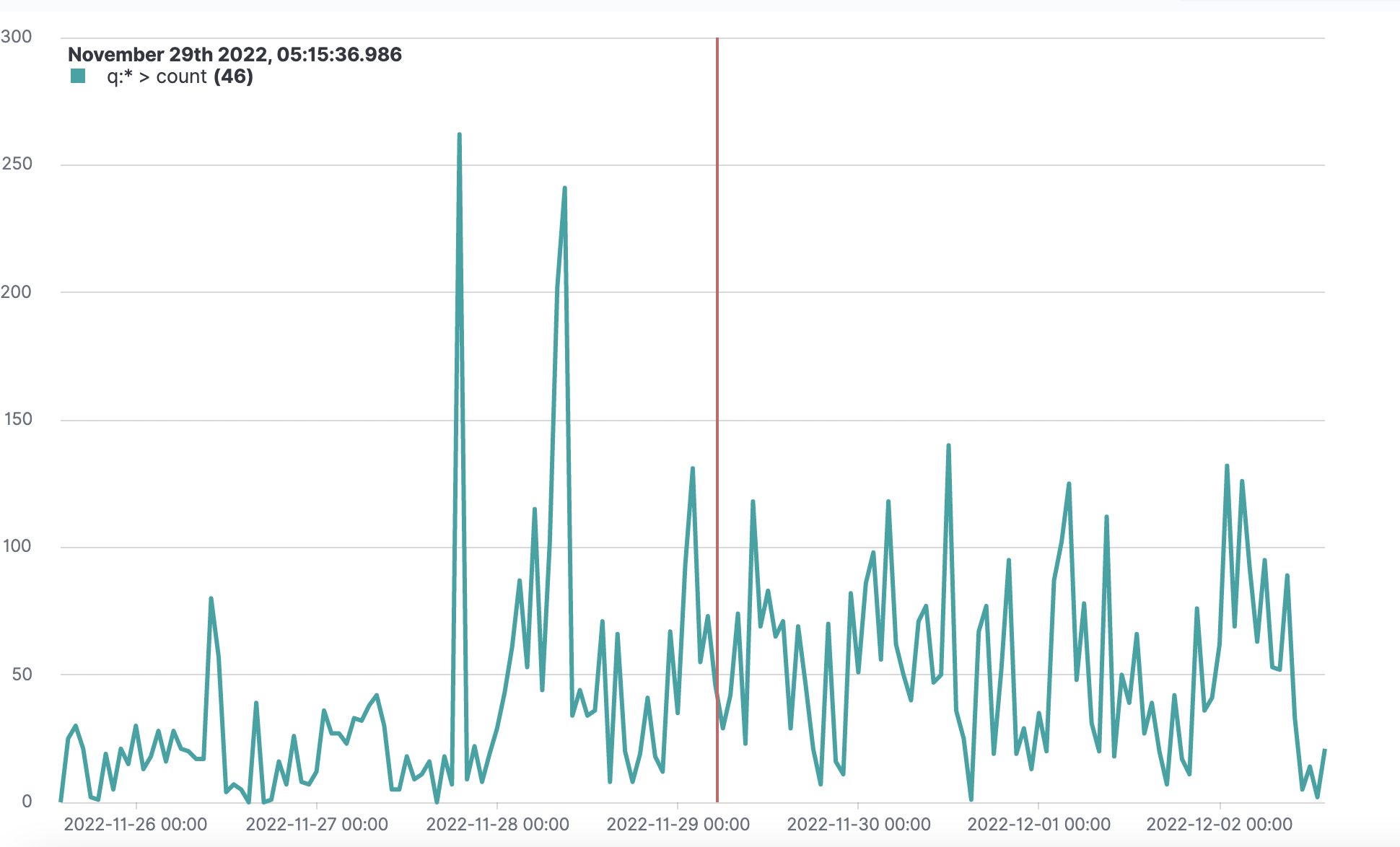
Timeline is a data visualization tool in Dashboards that you can use to create time-series visualizations. Currently, Timeline can be used to create the following Dashboards visualization types: Area and Line.
VisBuilder
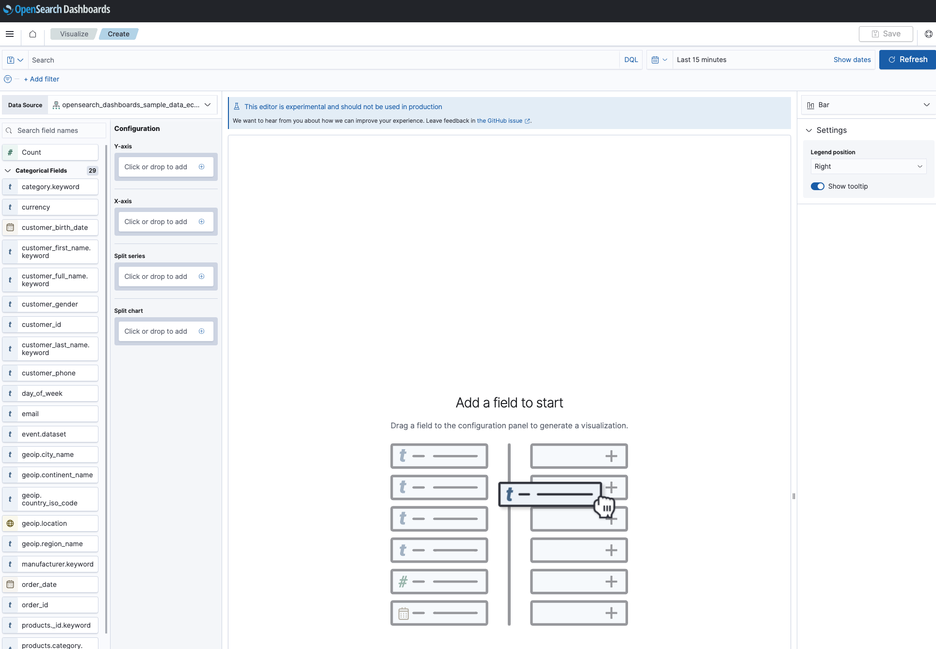
VisBuilder is a drag-and-drop data visualization tool in Dashboards. It gives you an immediate view of your data without the need to preselect the data source or visualization type output. Currently, VisBuilder can be used to create the following Dashboards visualization types: Area, Bar, Line, Metric, and Data Table. See VisBuilder to learn how to create and use drag-and-drop visualizations in Dashboards.
Vega
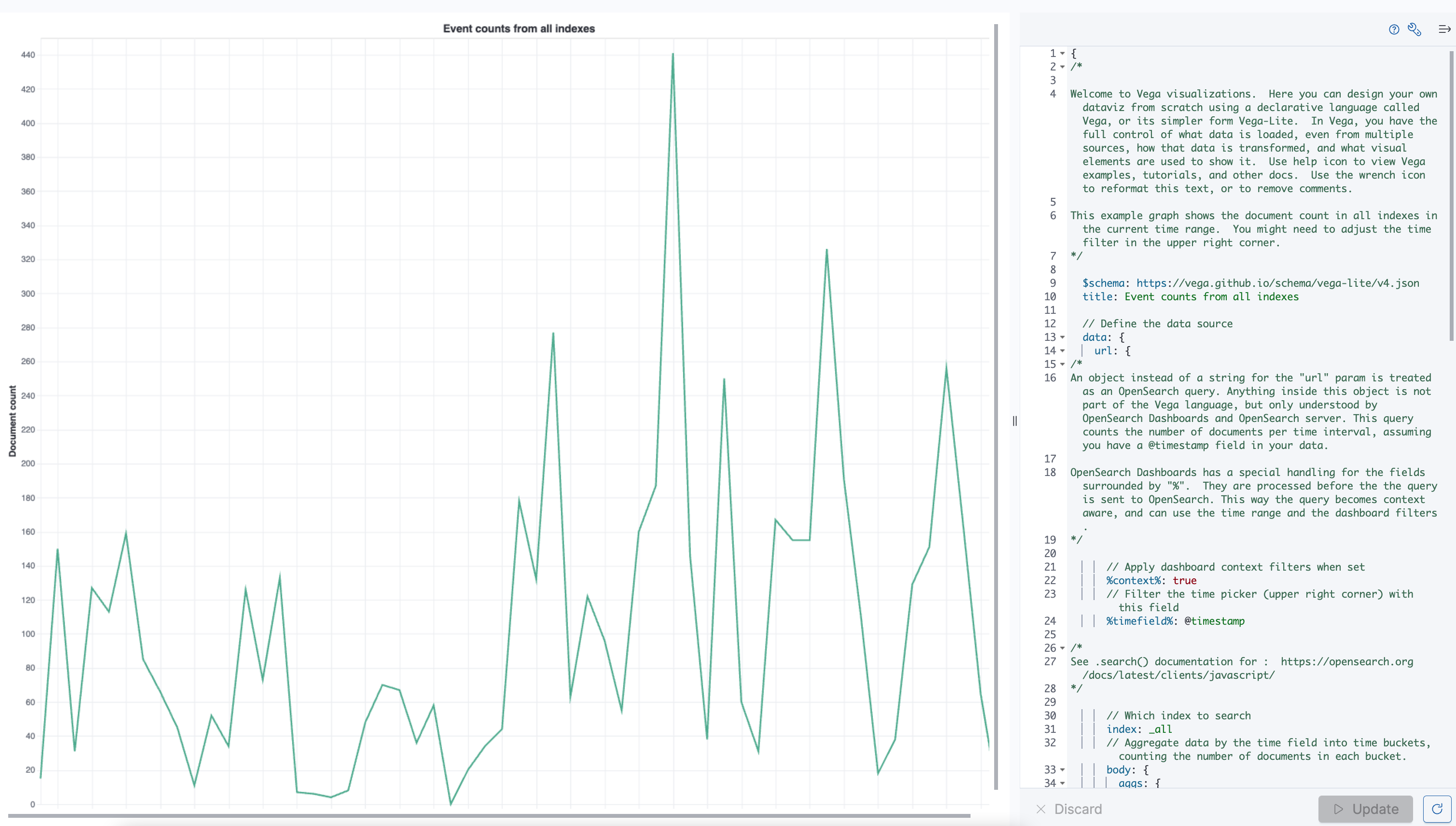
Vega and Vega-Lite are open-source, declarative language visualization grammars for creating, sharing, and saving interactive data visualizations. Vega visualizations give you the flexibility to visualize multidimensional data using a layered approach in order to build and manipulate visualizations in a structured manner. Vega can be used to create customized visualizations using any Dashboards visualization type.
