You're viewing version 1.3 of the OpenSearch documentation. For the latest version, see the current documentation. For information about OpenSearch version maintenance, see Release Schedule and Maintenance Policy.
Creating dashboards
The Dashboard application in OpenSearch Dashboards lets you visually represent your analytical, operational, and strategic data to help you quickly understand the trends in your data, giving you a high-level view of key metrics, simplifying data exploration, and delivering insights when and where you need them.
In this tutorial you’ll learn the basics of creating a dashboard using the Dashboard application and OpenSearch sample data. The sample dataset has existing sample visualizations, and you can use those visualizations or create new visualizations for the dashboard. In this tutorial, you’ll do both. Once you’ve completed this tutorial, you’ll have learned the foundations of creating a new dashboard with multiple panels in OpenSearch Dashboards.
This OpenSearch Playground dashboard example shows you what’s possible with OpenSearch Dashboards.
Getting familiar with the UI
Before getting started, let’s get familiar with the Dashboard UI. The UI comprises the following main components:
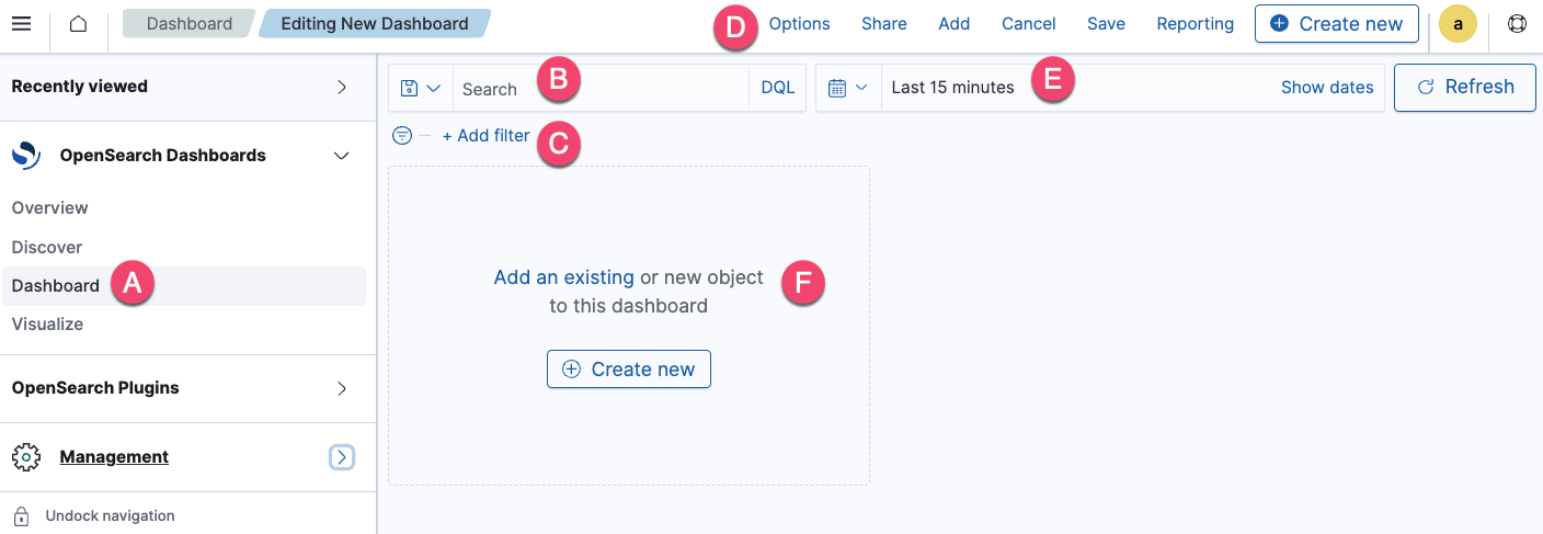
- The navigation panel (A) on the left contains the OpenSearch Dashboards applications.
- The search bar (B) lets you search for documents and other objects and add filters.
- The filter (C) lets you narrow a dashboard’s results.
- The toolbar (D) contains frequently used commands and shortcuts.
- The time filter (E) lets you customize the time and date.
- The panel (F) allows you to add existing visualizations to the dashboard or create new ones for the dashboard.
Defining terminology
The following is some useful terminology for working with OpenSearch Dashboards and the Dashboard application:
- Dashboards is the abbreviated name for OpenSearch Dashboards. OpenSearch Dashboards is an open-source visualization tool designed to work with OpenSearch.
- Dashboard is the OpenSearch Dashboards application used to track, analyze, and display data.
- dashboard or dashboards are common names for a tool used to visually display data.
- Panel is a term used to refer to a visualization displayed on a dashboard. The terms panel and visualization may be used interchangeably throughout this and other Dashboards documentation.
The following tutorial assumes you’re either using your existing installation of OpenSearch Dashboards or using the OpenSearch Playground. Depending on which one you use, certain capabilities may not be available. For example, sample datasets may not be included in your existing installation, and saving a dashboard isn’t an option in the OpenSearch Playground.
Creating a dashboard and adding an existing visualization
To create a dashboard and add a sample visualization:
- Connect to
https://localhost:5601. The username and password areadmin. Alternatively, go to the OpenSearch Playground. - On the top menu, go to OpenSearch Dashboards > Dashboard.
- From the Dashboards panel, choose Create Dashboard.
- Choose the calendar icon and set the time filter to Last 30 days.
- From the panel, choose Add an existing.
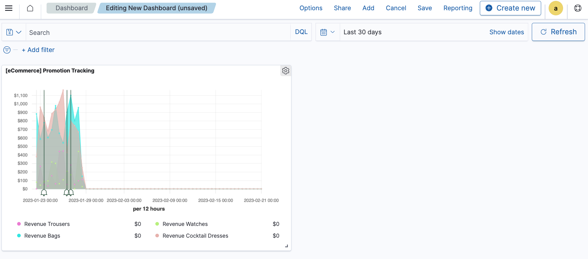
- From the Add panels window, choose [eCommerce] Promotion Tracking, and then choose
xto close the panel.
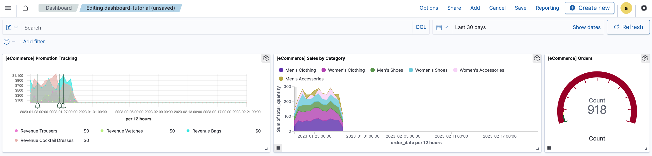
You’ve now created the following basic dashboard with a single panel, which you’ll continue using throughout this tutorial.
Creating visualizations
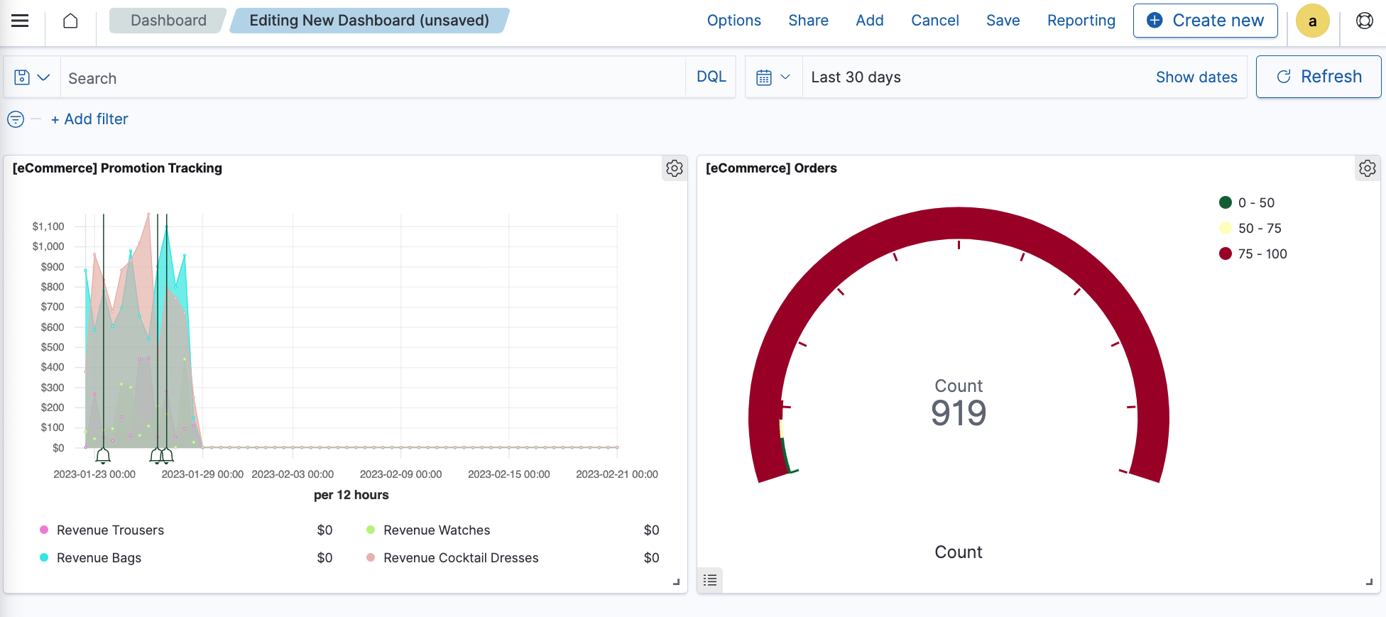
Continuing with the dashboard you created in the preceding steps, you’ll create a new visualization and save it to the dashboard:
- From the dashboard toolbar, choose Create new.
- From the New Visualization window, choose Gauge and then select the index pattern opensearch_dashboards_sample_data_ecommerce.
- From the toolbar, choose Save.
- In the Save visualization window, enter a title for the visualization. For example, the title for the gauge chart panel is [eCommerce] Orders.
- Choose Save and return.
The gauge chart visualization is now saved and you are taken back to the dashboard. You’ll see two visualizations on the dashboard, like the following.
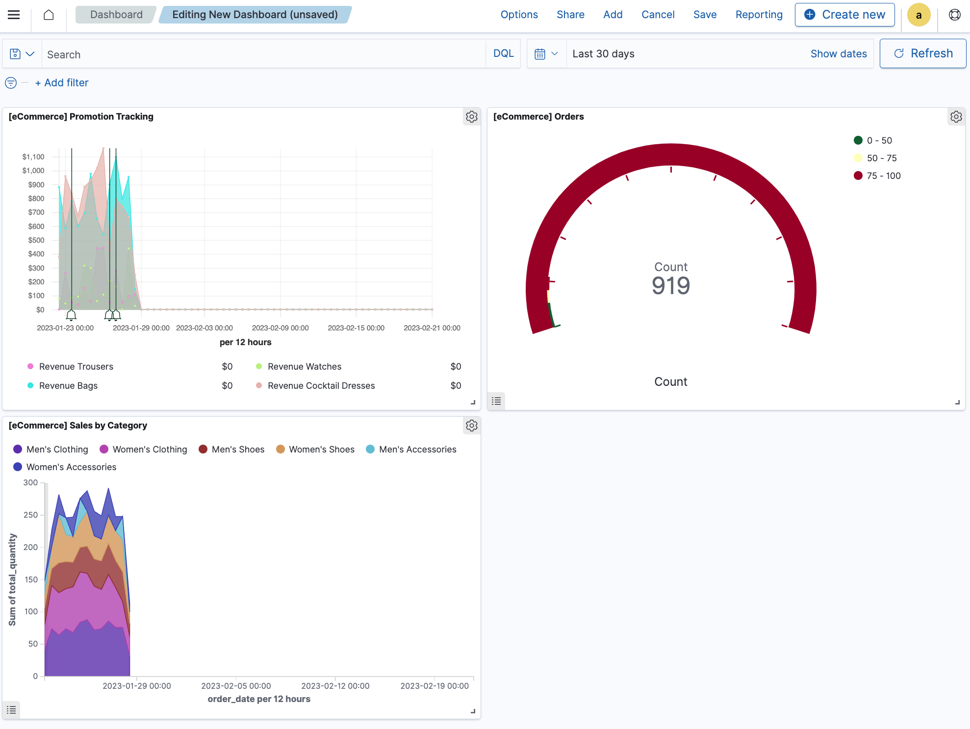
Adding subsequent panels
Continuing with the dashboard you created in the preceding steps, you’ll add an existing visualization to the dashboard:
- From the dashboard toolbar, choose Add.
- From the Add panels window, choose [eCommerce] Sales by Category.
- Choose
xto close the Add panels window.
You’ll see an area chart visualization display on the dashboard, as shown in the following image.
Saving dashboards
When you’ve finalized your dashboard, save it. If you’re saving a new dashboard:
- In the toolbar, choose Save.
- In the Save dashboard window, enter the Title. The Description is optional.
- To save the time filter to the dashboard, select Store time with dashboard.
- Choose Save.
Customizing the look of a panel
To customize the panels, you’ll need to be in edit mode:
- Choose Edit at the top right of the toolbar.
If you see Create new at the top right of the toolbar, you’re already in edit mode.
Displaying a legend can give readers more information, while hiding a legend can give the panel a cleaner look. If you want to display or hide the panel legend:
- Choose the list icon in the panel’s lower left corner.
If you want to change the color of the panel legend:
- From the visualization legend, select a category and then select a color from the flyout. The area chart updates with your change.
This color change is only saved for the current panel and dashboard and doesn’t affect the saved visualization.
If you want to change the color of the panel legend in the visualization:
- Choose the gear icon on the area chart panel.
- From the Options window, select Edit visualization.
- From the visualization legend, select a category and then select a color from the flyout. The area chart updates with your change.
- Choose Save and return.
This color change affects the saved visualization and any dashboard that links to the visualization.
If you want to display, hide, or customize the panel title:
- Choose the gear icon on the panel.
- From the Options window, select Edit panel title.
- From the Customize panel, enter a title under Panel title or toggle the Show panel title to hide the title.
- Choose Save.
Changing panel titles only affects the particular panel on the particular dashboard and won’t affect any other panel containing that same visualization or any other dashboard.
Arranging panels
To organize panels, arrange them side by side, or resize them, you can use these options:
- To move a panel, select and hold the panel title or the top of the panel and drag to the new location.
- To resize a panel, choose the resize icon in the panel’s lower-right corner and drag to the new dimensions.
- To view a panel in full screen mode, choose the gear icon (edit mode) or vertical ellipsis (⋮) at the top right of the panel and select Maximize panel. To minimize the full screen mode, choose the gear icon or vertical ellipsis and select Minimize.
The following is an example of a customized dashboard created by using this tutorial.