You're viewing version 1.3 of the OpenSearch documentation. For the latest version, see the current documentation. For information about OpenSearch version maintenance, see Release Schedule and Maintenance Policy.
Quickstart guide for OpenSearch Dashboards
This quickstart guide covers the core concepts that you need to understand to get started with OpenSearch Dashboards. You’ll learn how to:
- Add sample data.
- Explore and inspect data with Discover.
- Visualize data with Dashboard.
- Add sample data.
- Explore and inspect data with Discover.
- Visualize data with Dashboard.
Before you get started, make sure you’ve installed OpenSearch and OpenSearch Dashboards. For information on installation and configuration, see Install and configure OpenSearch and Install and configure OpenSearch Dashboards.
Adding sample data
Sample datasets come with visualizations, dashboards, and other tools to help you explore Dashboards before you add your own data. To add sample data, perform the following steps:
- Verify access to OpenSearch Dashboards by connecting to http://localhost:5601 from a browser. The default username and password are
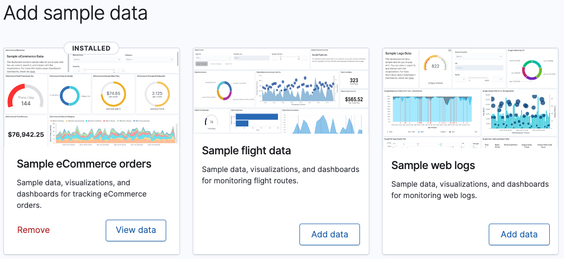
admin. - On the OpenSearch Dashboards Home page, choose Add sample data.
-
Choose Add data to add the datasets, as shown in the following image.
Exploring and inspecting data
In Discover, you can:
- Choose data to explore, set a time range for that data, search it using Dashboards Query Language (DQL), and filter the results.
- Explore the data, view individual documents, and create tables summarizing the data’s contents.
- Visualize your findings.
Try it: Getting familiar with Discover
- On the OpenSearch Dashboards Home page, choose Discover.
-
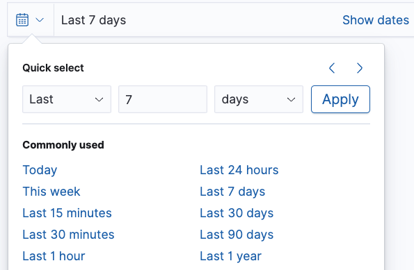
Change the time filter to Last 7 days, as shown in the following image.
-
Search using the DQL query
FlightDelay:true AND DestCountry: US AND FlightDelayMin >= 60and then choose Update. You should see results for US-bound flights delayed by 60 minutes or more, as shown in the following image.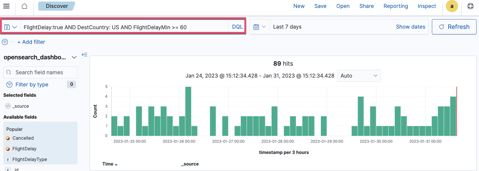
-
To filter data, choose Add filter and then select an Available field. For example, select
FlightDelayType, is, and Weather delay from the Field, Operator, and Value dropdown lists, as shown in the following image.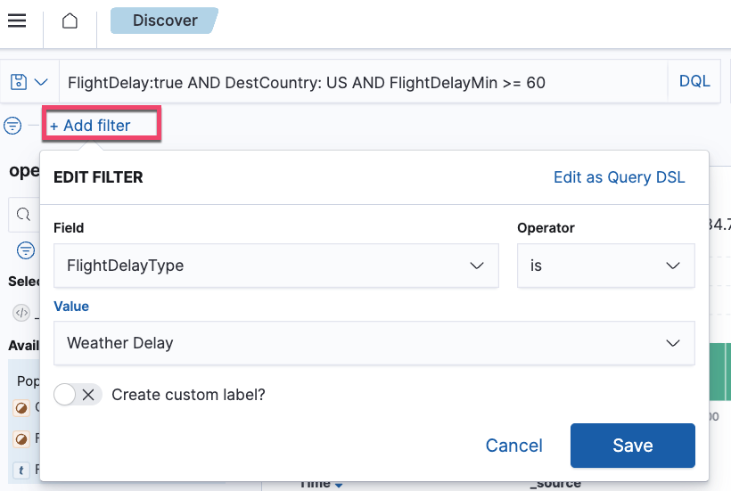
Visualizing data
Raw data can be difficult to comprehend and use. Data visualizations help you prepare and present data in a visual form. In Dashboard you can:
- Display data in a single view.
- Build dynamic dashboards.
- Create and share reports.
- Embed analytics to differentiate your applications.
Try it: Getting familiar with Dashboard
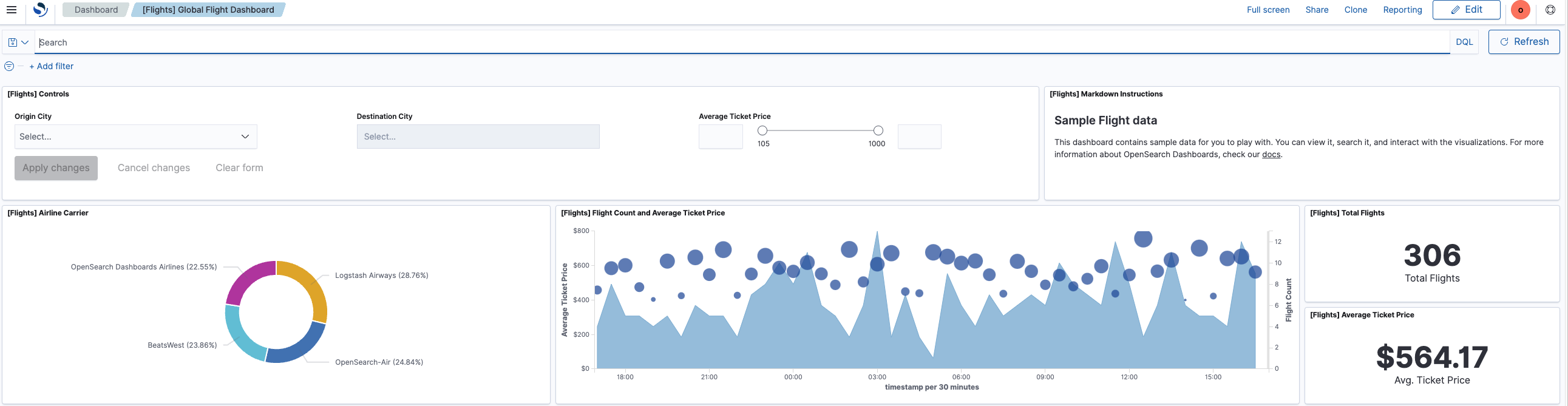
- On the OpenSearch Dashboards Home page, choose Dashboard.
-
Choose [Flights] Global Flight Data in the Dashboards window, as shown in the following image.
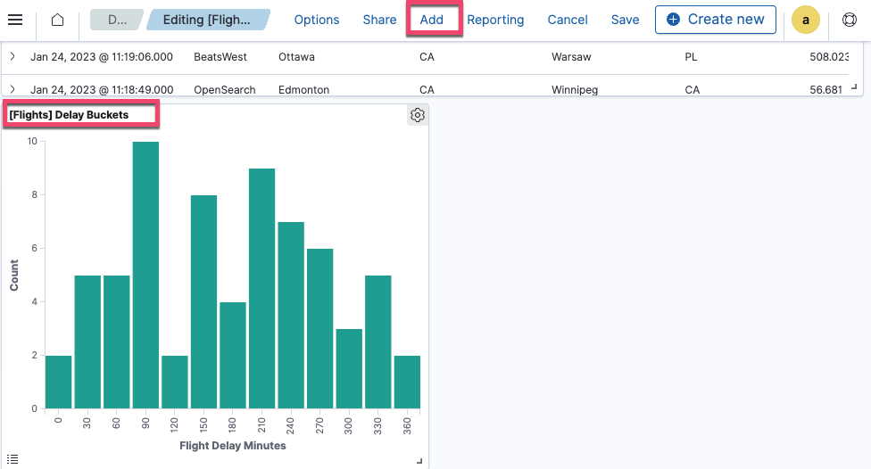
- To add panels to the dashboard, choose Edit and then Add from the toolbar.
- In the Add panels window, choose the existing panel [Flights] Delay Buckets. You’ll see a pop-up window on the lower right confirming that you’ve added the panel.
- Select
xto close the Add panels window. -
View the added panel [Flights] Delay Buckets, which is added as the last panel on the dashboard, as shown in the following image.
Try it: Creating a visualization panel
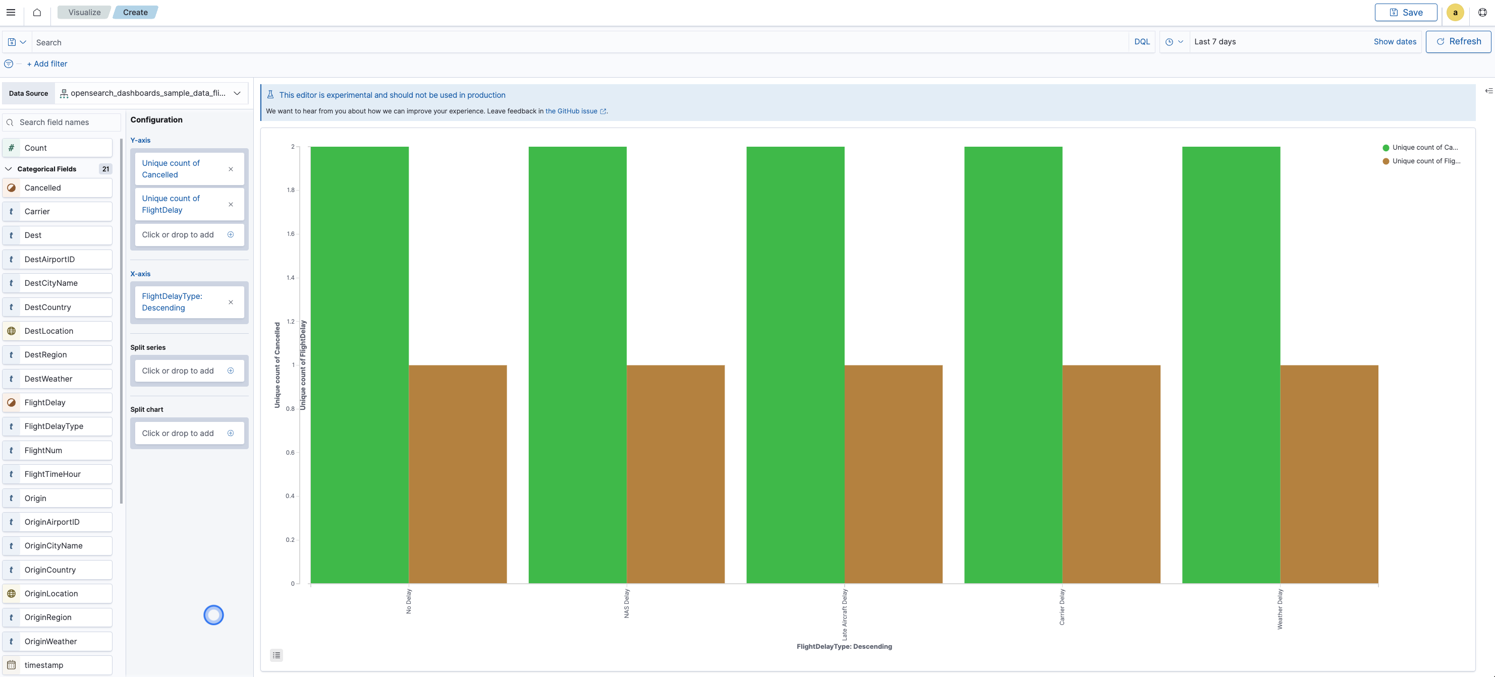
Continuing with the preceding dashboard, you’ll create a bar chart comparing the number of canceled flights and delayed flights to delay type and then add the panel to the dashboard:
- Change the default time range from 24 hours to Last 7 days.
- In the toolbar, choose Edit, then Create new.
- Select VisBuilder in the New Visualizations window.
- In the Data Source dropdown list, choose
opensearch_dashboards_sample_data_flights. - Drag the fields Cancelled and FlightDelay to the y-axis column.
- Drag the field FlightDelayType to the x-axis column.
- Choose Save and name the visualization in the Title field.
- Choose Save and return. The following bar chart is added as the last panel on the dashboard, as shown in the following image.
Interacting with data
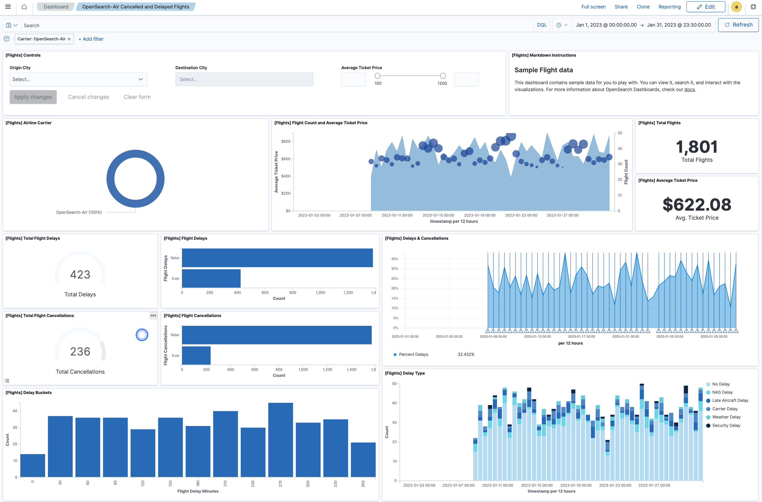
Interactive dashboards allow you analyze data in more depth and filter it in several ways. In Dashboards, you can interact directly with data on a dashboard by using dashboard-level filters. For example, continuing with the preceding dashboard, you can filter to show delays and cancellations for a specific airline.
Try it: Interacting with the sample flight data
- On the [Flights] Airline Carrier panel, choose OpenSearch-Air. The dashboard updates automatically.
- Choose Save to save the customized dashboard.
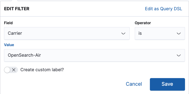
Alternatively, you can apply filters using the dashboard toolbar:
- In the dashboard toolbar, choose Add filter.
-
From the Field, Operator, and Value dropdown lists, choose Carrier, is, and OpenSearch-Air, respectively, as shown in the following image.
- Choose Save. The dashboard updates automatically, and the result is the dashboard shown in the following image.
Next steps
- Visualize data. To learn more about data visualizations in OpenSearch Dashboards, see Building data visualizations with Visualize.
- Create dashboards. To learn more about creating dashboards in OpenSearch Dashboards, see Creating dashboards with Dashboard.
- Explore data. To learn more about exploring data in OpenSearch Dashboards, see Exploring data with Discover.