UBI dashboard tutorial
Whether you’ve been collecting user events and queries for a while or you’ve uploaded some sample events, you’re now ready to visualize the data collected through User Behavior Insights (UBI) in a dashboard in OpenSearch.
To quickly view a dashboard without completing the full tutorial, do the following:
- Download and save the sample UBI dashboard.
- On the top menu, go to Management > Dashboard Management.
- In the Dashboards panel, choose Saved objects.
- In the upper-right corner, select Import.
- In the Select file panel, choose Import.
- Select the UBI dashboard file that you downloaded and select the Import button.
1. Start OpenSearch Dashboards
Start OpenSearch Dashboards. For example, go to http://{server}:5601/app/home#/. For more information, see OpenSearch Dashboards. The following image shows the home page. 
2. Create an index pattern
In OpenSearch Management, navigate to Dashboards Management > Index patterns or navigate using a URL, such as http://{server}:5601/app/management/OpenSearch-dashboards/indexPatterns.
OpenSearch Dashboards accesses your indexes using index patterns. To visualize your users’ online search behavior, you must create an index pattern in order to access the indexes that UBI creates. For more information, see Index patterns.
After you select Create index pattern, a list of indexes in your OpenSearch instance is displayed. The UBI stores may be hidden by default, so make sure to select Include system and hidden indexes, as shown in the following image. 
You can group indexes into the same data source for your dashboard using wildcards. For this tutorial you’ll combine the query and event stores into the ubi_* pattern.
OpenSearch Dashboards prompts you to filter on any date field in your schema so that you can look at things like trending queries over the last 15 minutes. However, for your first dashboard, select I don’t want to use the time filter, as shown in the following image. 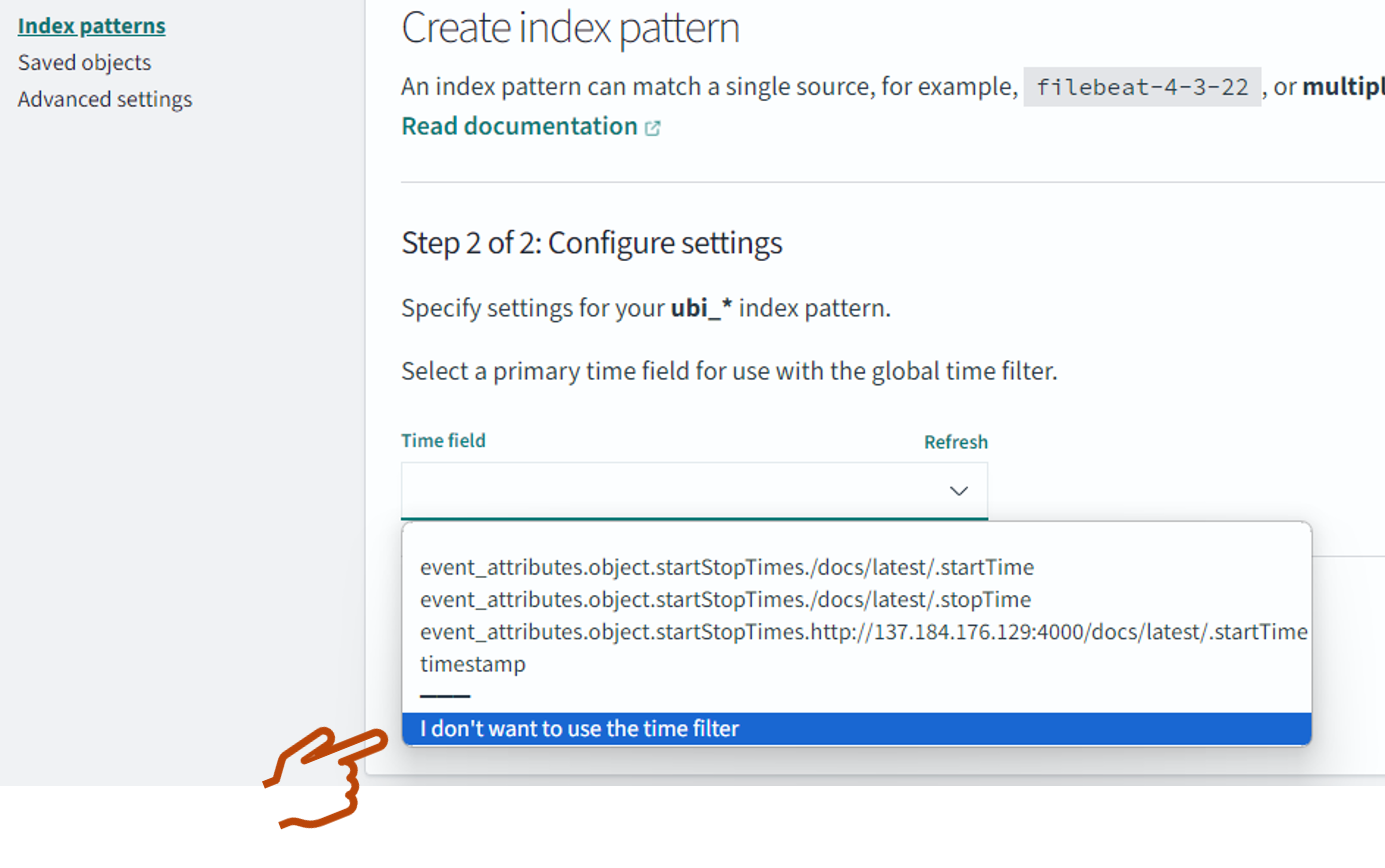
After selecting Create index pattern, you’re ready to start building a dashboard that displays the UBI store data.
3. Create a new dashboard
To create a new dashboard, on the top menu, select OpenSearch Dashboards > Dashboards and then Create > Dashboard > Create new. If you haven’t previously created a dashboard, you are presented with the option to create a new dashboard. Otherwise, previously created dashboards are displayed.
In the New Visualization window, select Pie to create a new pie chart. Then select the index pattern you created in step 2.
Most visualizations require some sort of aggregate function on a bucket/facet/aggregatable field (numeric or keyword). You’ll add a Terms aggregation to the action_name field so that you can view the distribution of event names. Change the Size to the number of slices you want to display, as shown in the following image. 
Save the visualization so that it’s added to your new dashboard. Now that you have a visualization displayed on your dashboard, you can save the dashboard.
4. Add a tag cloud visualization
Now you’ll add a word cloud for trending searches by creating a new visualization, similarly to the previous step.
In the New Visualization window, select Tag Cloud, and then select the index pattern you created in step 2. Choose the tag cloud visualization of the terms in the message field where the JavaScript client logs the raw search text. Note: The true query, as processed by OpenSearch with filters, boosting, and so on, resides in the ubi_queries index. However, you’ll view the message field of the ubi_events index, where the JavaScript client captures the text that the user actually typed.
The following image shows the tag cloud visualization on the message field. 
The underlying queries can be found at SQL trending queries.
The resulting visualization may contain different information than you’re looking for. The message field is updated with every event, and as a result, it can contain error messages, debug messages, click information, and other unwanted data. To view only search terms for query events, you need to add a filter to your visualization. Because during setup you provided a message_type of QUERY for each search event, you can filter by that message type to isolate the specific users’ searches. To do this, select Add filter and then select QUERY in the Edit filter panel, as shown in the following image. 
There should now be two visualizations (the pie chart and the tag cloud) displayed on your dashboard, as shown in the following image. 
5. Add a histogram of item clicks
Now you’ll add a histogram visualization to your dashboard, similarly to the previous step. In the New Visualization window, select Vertical Bar. Then select the index pattern you created in step 2.
Examine the event_attributes.position.ordinal data field. This field contains the position of the item in a list selected by the user. For the histogram visualization, the x-axis represents the ordinal number of the selected item (n). The y-axis represents the number of times that the nth item was clicked, as shown in the following image.

6) Filter the displayed data
Now you can further filter the displayed data. For example, you can see how the click position changes when a purchase occurs. Select Add filter and then select the action_name:product_purchase field, as shown in the following image. 
You can filter event messages containing the word *laptop* by adding wildcards, as shown in the following image.  .
.