Working with the correlation graph
The correlation graph is a security findings knowledge graph. It provides a visualization of information generated by the correlation engine and allows you to focus on specific correlations and inspect them in greater detail. Information on the graph includes findings by log type, the severity levels for the findings, the correlations drawn between findings, and the relevance of the correlations, among other details. You can also manipulate the graph to gain further insight into specific events of interest. This includes filtering findings by date and time, zooming in on the relationship between specific findings and their correlations, and filtering by log type and severity level. Use this section to learn more about using the graph.
Acccessing the graph
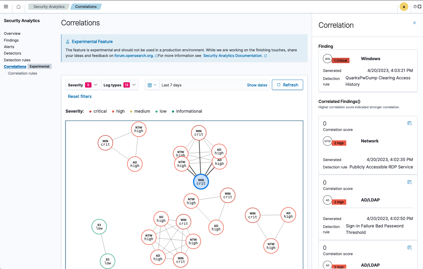
Begin by selecting Security Analytics in the OpenSearch Dashboards main menu. Then select Correlations from the Security Analytics menu on the left side of the screen. The Correlations page is displayed, as shown in the following image.
Interpreting the graph
The graph displays findings as nodes with colored borders expressing their severity level. A three-letter abbreviation inside the node indicates the log type. The lines that connect the findings represent the correlations between them. A heavy line indicates a strong correlation, while a light line shows a weaker connection.
Using the graph
You can control which findings are displayed on the graph by filtering by severity level, log type, and time filter. The time filter controls the findings that appear on the graph by setting a date range in which they were generated.
- Use the Severity dropdown list to select which findings appear on the graph according to their severity level. The number beside the list name indicates how many severity levels are being shown on the graph.
- Use the Log types dropdown list to select which log types to show on the graph. The number beside the list name indicates how many log types are being shown on the graph.
- Select Reset filters to return the dropdown lists to their default settings, showing all items.
- Use the time filter to set the date range and show only those findings that were generated within that time span. Select Refresh to bring the current number of findings up to date.
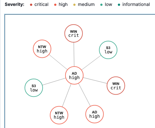
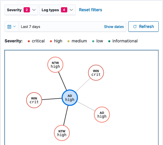
You can focus on a particular area of the graph to look at correlations associated with a specific finding by selecting the finding on the graph. The graph then changes to show only the selected finding along with the constellation of findings correlated to it, as shown in the following image.
After narrowing the focus of the graph, informational cards for each of the findings appear on the right-hand side of the screen. The selected finding appears at the top of the cards, and the correlated findings are listed underneath it in order of their correlation relevance, represented by a correlation score, as shown in the following image.
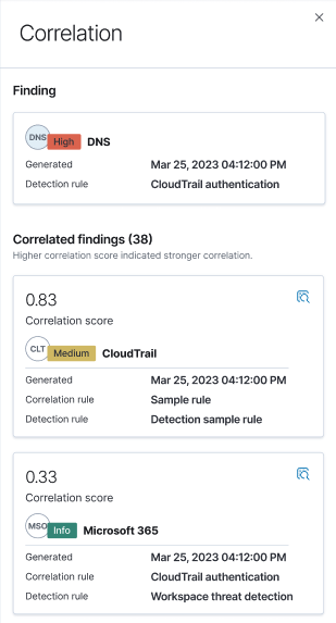
You can select one of the correlated findings on the graph to shift the perspective of the correlation relationships. This sends the newly selected finding to the top of the informational cards and displays the other findings as relative correlations.
The cards display the following details about each finding:
- The severity level of the finding: 1, critical; 2, high; 3, medium; 4, low; 5, informational.
- A correlation score for correlated findings. The score is based on the proximity of relevant findings in the threat scenario defined by the correlation rule.
- The detection rule that generated the finding.
- For correlated findings, the correlation rule used to associate it with the selected finding.