Using area charts
An area chart is a line chart with the area between the line and the axis shaded with a color, and is a primary visualization type used to display time series data. You can create area charts in Dashboards using the Area visualization type or using the Time Series Visual Builder (TSVB), Vega, or VisBuilder visualization tools. For this tutorial, you’ll use the Area visualization type.
Try it: Create a simple aggregation-based area chart
In this tutorial you’ll create a simple area chart using sample data and aggregations in OpenSearch Dashboards by connecting to http://localhost:5601 from a browser.
You have several aggregation options in Dashboards, and the choice influences your analysis. The use cases for aggregations vary from analyzing data in real time to using Dashboards to create a visualization dashboard. If you need an overview of aggregations in OpenSearch, see Aggregations before starting this tutorial.
Make sure you have installed the latest version of Dashboards and added the sample data before continuing with this tutorial. This tutorial uses Dashboards version 2.4.1.
Set up the area chart
- Access Dashboards by connecting to http://localhost:5601 from a browser.
- Select Visualize from the menu and then select Create visualization.
- Select Area from the window.
- Select opensearch_dashboards_sample_data_flights in the New Area/Choose a source window.
- Select the calendar icon and set the time filter to Last 7 days.
- Select Update.
Add aggregations to the area chart
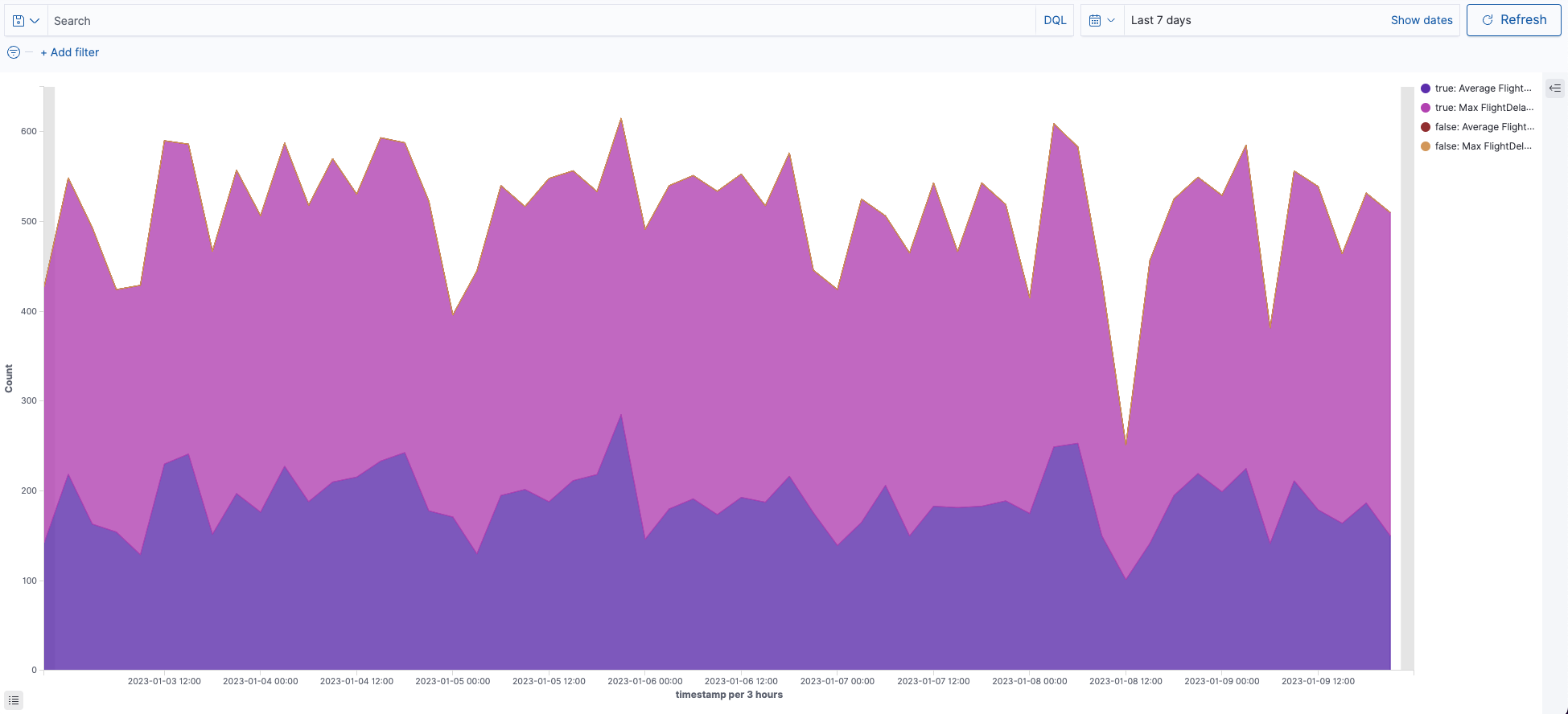
Continuing with the area chart created in the preceding steps, you’ll create a visualization that displays the top five logs for flights delayed for every three hours over the last seven days:
- Add a Metrics aggregation.
- Under Metrics, select the Aggregation dropdown list and choose Average and then select the Field dropdown list and choose FlightDelayMin.
- Under Metrics, select Add to add another Y-axis aggregation.
- Select the Aggregation dropdown list and choose Max and then select the Field dropdown list and choose FlightDelayMin.
- Add a Buckets aggregation.
- Select Add to open the Add Bucket window and then select X-axis.
- From the Aggregation dropdown list, select Date Histogram.
- From the Field dropdown list, select timestamp.
- Select Update.
- Add a sub-aggregation.
- Select Add to open the Add Sub-Buckets window and then select Split series.
- From the Sub aggregation dropdown list, select Terms.
- From the Field dropdown list, select FlightDelay.
- Select Update to reflect these parameters in the graph.
You’ve now created the following aggregation-based area chart.
Related links
- Visualize
- Visualization types in OpenSearch Dashboards
- Install and configure OpenSearch Dashboards
- Aggregations