Gantt charts
OpenSearch Dashboards includes a Gantt chart visualization. Gantt charts show the start, end, and duration of unique events in a sequence. Gantt charts are useful in trace analytics, telemetry, and anomaly detection use cases, where you want to understand interactions and dependencies between various events in a schedule.
For example, consider an index of log data. The fields in a typical set of log data, especially audit logs, contain a specific operation or event with a start time and duration.
To create a Gantt chart, perform the following steps:
- In the visualizations menu, choose Create visualization and Gantt Chart.
- Choose a source for the chart (e.g. some log data).
- Under Metrics, choose Event. For log data, each log is an event.
- Select the Start Time and Duration fields from your dataset. The start time is the timestamp for the beginning of an event. The duration is the amount of time to add to the start time.
- Under Results, choose the number of events to display on the chart. Gantt charts sequence events from earliest to latest based on start time.
- Choose Panel settings to adjust axis labels, time format, and colors.
- Choose Update.
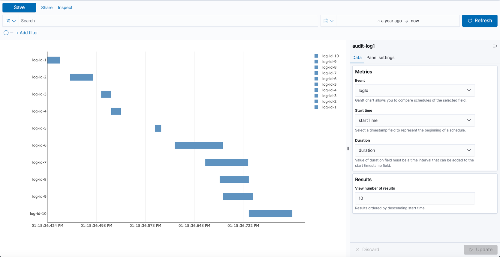
This Gantt chart displays the ID of each log on the y-axis. Each bar is a unique event that spans some amount of time. Hover over a bar to see the duration of that event.